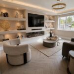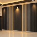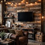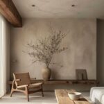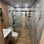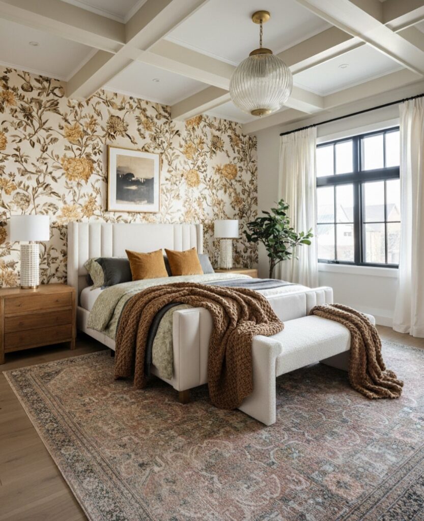
These ideas run from a single framed panel you hang in an afternoon to arches that need a full weekend.
The deciding factor is how much of your wall you are willing to give over; a bed wall or powder room can handle a full scene, while a hallway might only get one framed strip.
A top board paired with board-and-batten below shows how even a papered wall can stay budget-friendly by breaking the surface into smaller pieces.
[link-whisper-related-posts]1. Soft Blues and Greens Wallpaper Accent Wall
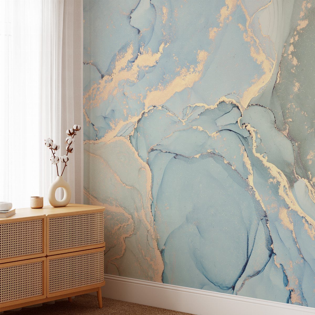
Soft blues and greens settle a room faster than any other color family.
I would pick these for a bedroom that faces east or sits on a darker side of the house, where the light needs all the help it can get.
If your room gets strong afternoon sun, you can go deeper into teal or sage without the space turning flat. The marble or watercolor prints work best at large scale; small repeats fight the calm effect.
Pair with warm wood and brass rather than chrome to keep it from feeling clinical.

💛 Size and Real Vision➡ Marble contact paper, this thick self adhesive wallpaper is 15.8 x 78.7 inches, covers an area of 8.6 sq.ft. This smooth marble wallpaper peel and stick paper restores the real marble texture.White, cyan and yellowish colors make for a very bright jade texture pattern.

[Fresh Country Floral Design]-- Add warmth and depth to your walls with this charming blue and white floral wallpaper. Soft colors and delicate flowing floral patterns blend modern farmhouse charm with Grandma Chic style, creating a cozy atmosphere with nostalgic appeal and timeless beauty. Perfect for bedrooms, living rooms, dining areas, home offices, and more.
2. Textured Wallpaper
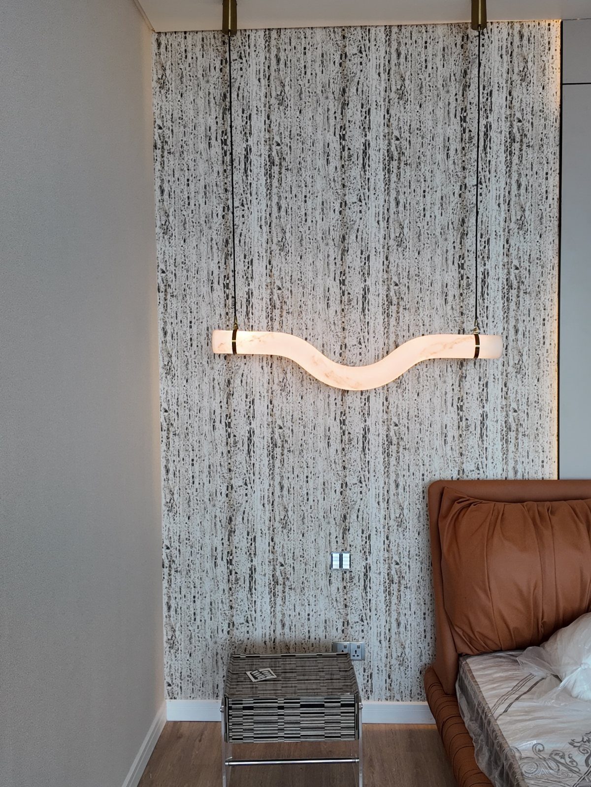
Grasscloth and other textured wallpapers add depth without demanding attention the way a bold pattern does. The vertical weave catches morning light differently than evening light, so the wall changes through the day.
I like it behind a leather headboard or near a linen curtain, where the materials talk to each other. Installation takes patience; the seams show if the strips do not line up exactly, and the texture hides nothing.
Renters should know that removal is harder than smooth paper, though a single panel behind a bed stays manageable.

【Size】24in x 393in, ±2%/roll (about 61 cm x 10 m, ±2% per roll).Thickness about 0.5mm.【Color】: mainly white, but not pure white, with grey, beige and silver....
3. Wallpaper Murals
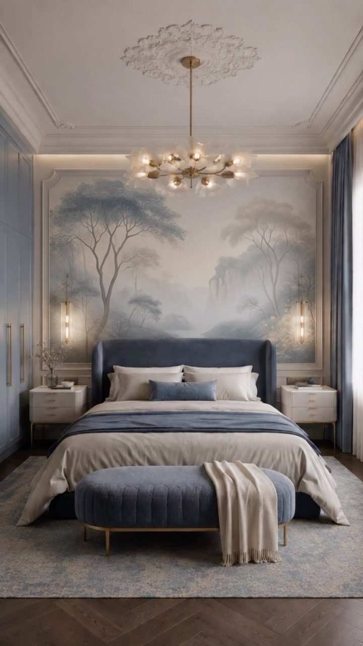
A mural-style wallpaper turns one wall into a scene rather than a pattern, which means you can skip the gallery wall entirely. The landscape versions read like a window in a room that lacks one.
Center the bed or sofa to the mural itself, not the wall, since the image carries its own focal point. Scale matters more than with repeating paper: order a sample and tape it up full size before committing.
Some murals come in numbered panels that install left to right; mark your wall first so the sequence stays straight.

MURAL SIZE - Approx.137" x 96"(Wx H), This wall mural wallpaper stick and peel cut into 6 strips. All is marked with number under each strip. You can put it in sequential order before you install it

【Forest Landscape Design】 Inspired by classic French Toile de Jouy artwork, this forest wallpaper features a seamless woodland scene in soft dusty blue tones. The delicate tree pattern adds timeless vintage charm and a peaceful natural touch to your space. Perfect for accent walls or full-room makeovers, it effortlessly complements a variety of home decor styles

MISTY BLUE FOREST PEEL AND STICK WALLPAPER: This forest wallpaper features a misty blue and green forest trees create a soft woodland mural look for bathrooms, bedrooms, nurseries and calm accent walls. The design feels quiet, airy and easy to pair with natural decor
4. Framed Wallpaper
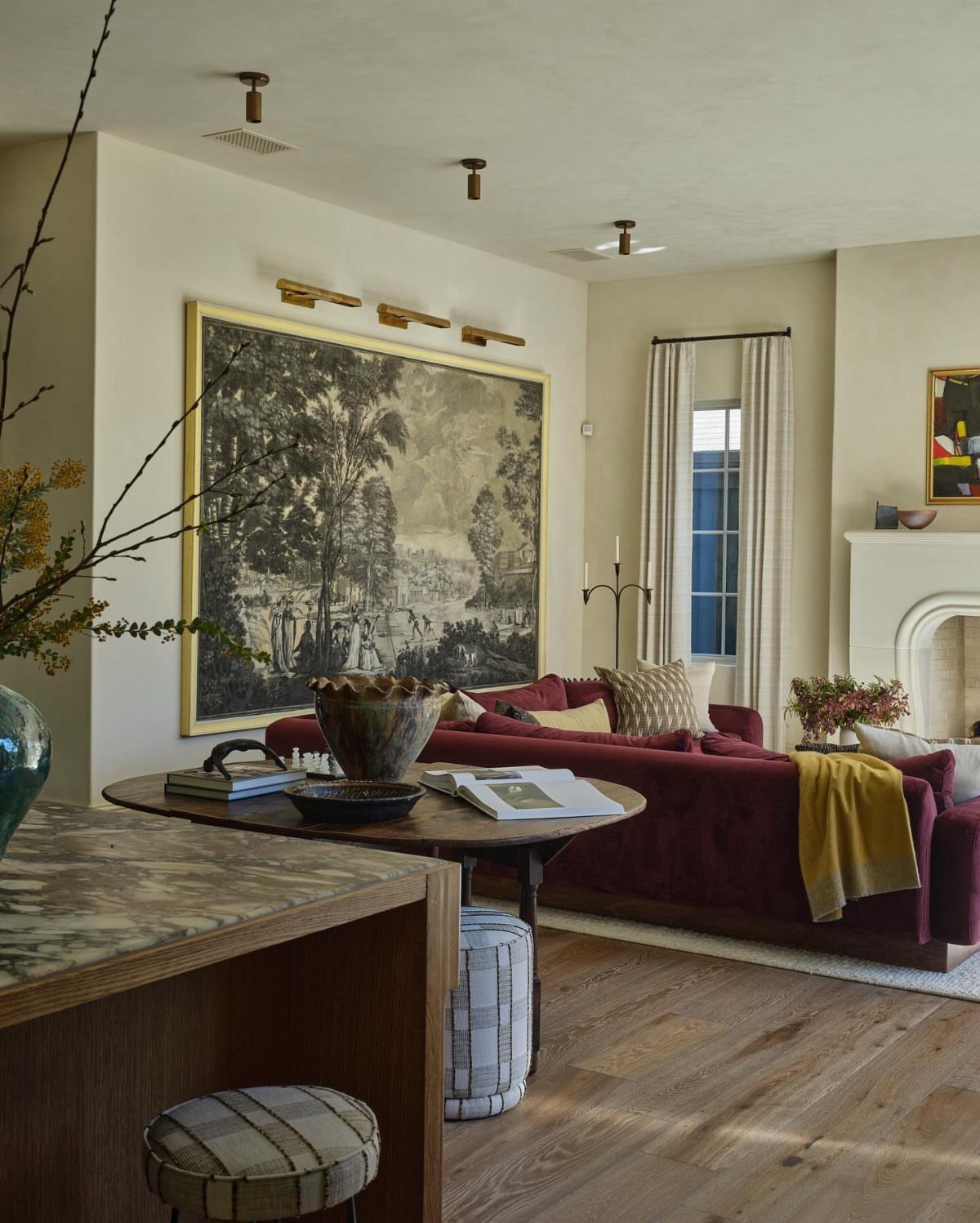
Framing a section of wallpaper treats it as art instead of architecture, which changes everything about where it can go.
A framed panel hangs where paper cannot, like above a fireplace or in a hallway, so a full wall or even a flat wall is not required.
For a kid’s space, I would pick something graphic and bold, then let the frame contain it so the room does not spin out. A thin metal frame keeps it modern; a wide gilt one pushes toward traditional.
Either way, the cost is the paper plus framing, not a whole room’s worth of either.

Premium Stainless Steel : Crafted from high-quality 201 Stainless Steel, our trim offers a perfect blend of functionality and aesthetics. It allows you to personalize your home with a color-decorative style that is both visually appealing and useful. Say goodbye to dull white floors and walls and embrace a complete transformation, giving your house a fresh and invigorating new look

Pre-cut Wall Molding Kit : Our wall moldings include 22 pieces of 24 inch decorative strips and 12 pieces of 30 inch decorative strips.Can be freely matched according to your needs,bringing an elegant finished appearance to doors or walls

Real 3D Design: Diamond pattern with 1 inch raise design makes our wall panels more eye-catching. A box comes in 33 tiles, which covers 32.Sq.Ft.
5. Maximalist Botanicals
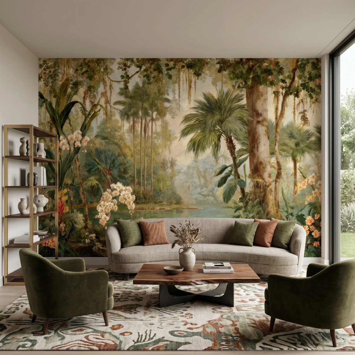
Maximalist botanicals demand a room that can handle them, which means enough empty space elsewhere to let the wall breathe.
The tropical versions with deep greens and layered palms work best in a room with high ceilings or at least one oversized piece of furniture to match the scale.
I would not add competing patterns nearby; let the mural be the pattern and build solids and textures around it. If the print reads dark, balance it with light upholstery and warm wood.
The risk is hotel-lobby; the reward is waking up somewhere that feels like a trip.
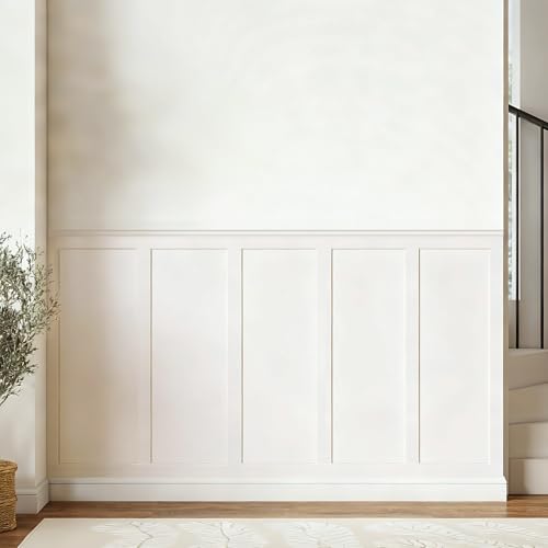
【Coverage】Includes 10 pre-cut wall molding slats and 2 shelf edge strips to create a clean board & batten look. (No peel-and-stick adhesive or nails included)

Premade Board and Batten Paintable Wainscoting Kit: Package includes 20 premade molding trim slats, 4 decorative edge strips, and two pairs of gloves for convenient installation

FINISH: This product is printed on smooth, flat, self-adhesive vinyl with a satin finish
6. Wallpaper Accent Wall Behind a Bed
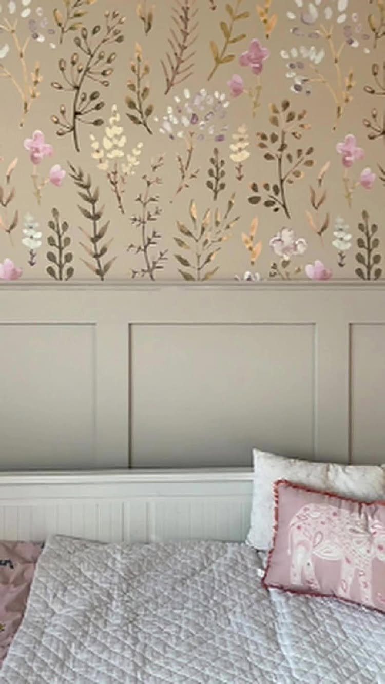
The wall behind the bed is the obvious choice because it is already the visual anchor of the room, but the details change how you paper it.
A recessed bed nook, like a former closet, turns the wallpaper into a frame for sleeping. Board-and-batten below the paper breaks the wall into manageable pieces and saves on paper cost.
I would avoid walls chopped up by doors or windows; the pattern interrupts too often and the eye tires out. In a rental, this is also the wall least likely to show damage at move-out if you install carefully.
“Accent walls can easily overpower a bedroom, so the goal here was balance,” says Allison Garcy, the founder of Allison Garcy Interiors in New York. “Layering mural-like wallpaper, texture, and jewel-toned upholstery allowed the room to feel expressive without losing its sense of ease.”

Dynamic Ocean Inspired Design: This wallpaper features a striking blend of blue-green fluid patterns with golden-brown veins and shimmering specks. Inspired by ocean waves and energy whirlpools, it conveys natural power and movement, adding a dramatic and elegant touch to any interior.


【 Peel and Stick Wallpaper Size 】:1 Roll = 17.3 inches wide x 118.1 inches long, each roll covers about 14.5 square feet. Material is high-quality PVC, find the correct pattern repeat first, then match directly, no overlapping, very easy for beginners. Tips:The edge pattern of the pvc material may shrink a little during the cutting process, which is normal
7. Bold Patterns
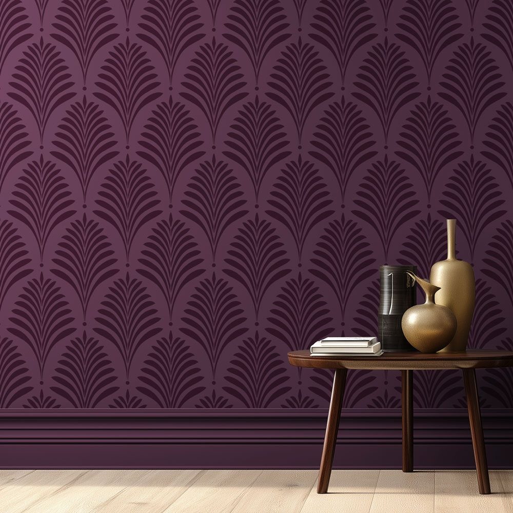
A single wall of deep purple fan-patterned paper does the heavy lifting in an otherwise quiet room.
Let the wallpaper be the only loud thing: keep furniture low and simple, floors pale, and trim either matching the paper’s ground color or staying neutral.
I would not try this in a room that already has ornate molding, a busy rug, or competing focal points; it needs one clear stage.
For renters, this pattern reads as intentional rather than temporary, and it covers well in a weekend with standard prep. Best for someone who wants drama without collecting objects.

【Size】:Grasscloth wallpaper 17.3in x 120in/roll (14.4 square feet)

【Warm Tips】 1.According to the experiment, even if it is a different model of the same brand of mobile phone, its display wallpaper color will have a slight difference, so the real color please refer to the actual object. 2. Wallpaper is suitable for pasting on dry and smooth surfaces. It is recommended to clean the surface before use.
8. Use Wallpaper in Small Spaces
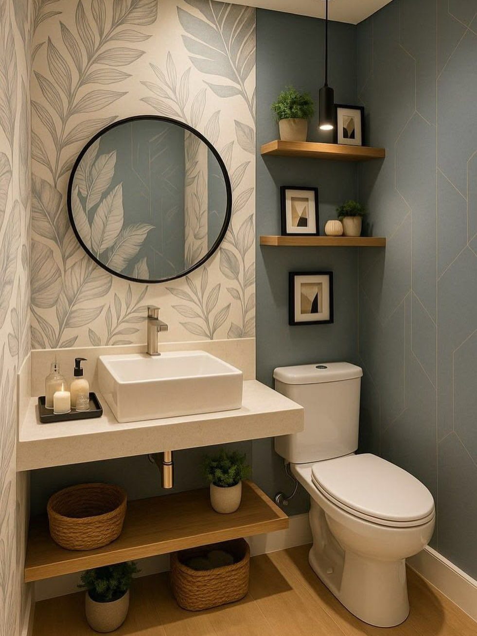
Small rooms swallow large patterns better than small ones. A single leaf-print wall behind a floating vanity opens a narrow bathroom because the eye reads the big shapes as distance, not clutter.
Two different papers in one small space works only when they share a color; the blue geometric and the green leaf talk to each other because both stay cool and muted.
I would stick to one accent paper per room unless you are deliberately building a patchwork look.
For a rental, removable paper on the wet wall behind a sink lets you test whether you can live with pattern at close range.

1. [CUSTOM SIZE FOR PERFECT FIT] Say goodbye to awkwardly fitting wall decor! We offer custom size wall murals to perfectly match your exact dimensions. Whether you need a massive living room background or a cozy bedroom accent wall, our customizable large wallpaper ensures seamless alignment without unnecessary waste or awkward trimming. Contact us to customize your dream space!

𝐌𝐚𝐣𝐞𝐬𝐭𝐢𝐜 𝐏𝐞𝐚𝐜𝐨𝐜𝐤 & 𝐏𝐚𝐥𝐚𝐜𝐞 𝐒𝐜𝐞𝐧𝐞𝐫𝐲: Elevate your interior with a touch of regal elegance. This exquisite Chinoiserie wallpaper features graceful blue peacocks perched among lush trees, set against a backdrop of historic Indian palaces and architecture. The sophisticated color palette of cream, deep sapphire blue, and forest green creates a timeless, hand-painted mural look that fits perfectly with vintage, maximalist, or classic home aesthetics

Floral Design: Soft watercolor roses take the lead, with petite buds and muted gray-green leaves adding a light, garden-inspired feel. Thoughtfully scaled and spaced, the blooms create a full pattern that feels open rather than busy, while the seamless repeat ensures a smooth, cohesive flow. A generous off-white background reflects light to brighten rooms with limited sunshine and serves as a versatile neutral that pairs effortlessly with any décor
9. Wallpaper on Ceilings
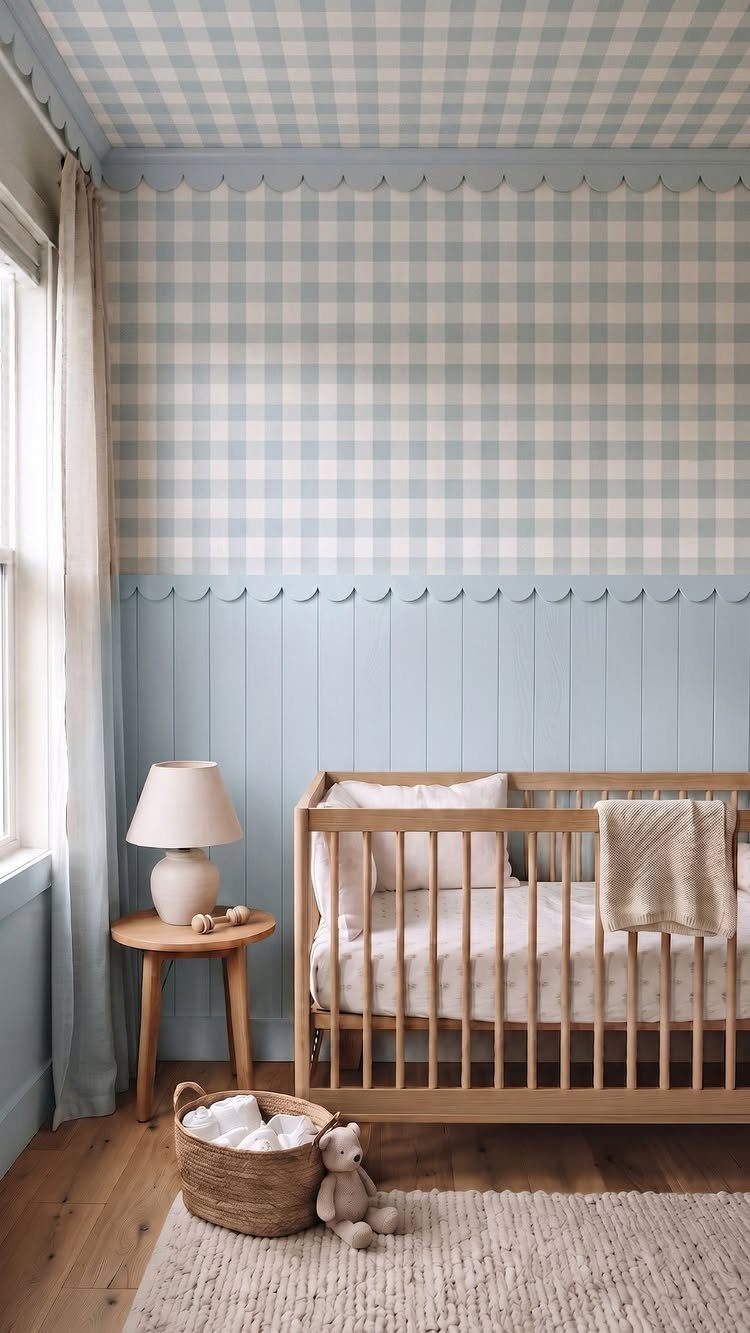
Carrying gingham from wall to ceiling turns a nursery corner into a tent-like envelope, but the success depends entirely on what happens below.
The paper stops at a crisp trim line, and everything under that line is calm: plain paneling, simple crib, no competing pattern. Without that hard boundary, the room goes circus.
Ceilings with crown molding, soffits, or angled planes make this harder because the paper has nowhere to land cleanly.
Check your ceiling height first; low ceilings read cozy with this treatment, very low ones turn claustrophobic, and tall ones lose the intimacy that makes it work. I would test a single corner before committing to the full wrap.

PACKING QUANTITY: Come in box of 12 panels which cover 32 square feet, individual size is 19.7” X 19.7”

SIZE: 17 in x 11.8 in, 4 packs included which is a suitable size for you to hang in various places.

EXCELLENT ART: All artwork stretched to fit on durable and shrink-resistant framed canvas. Totally 3 pieces and each piece is 24"x36".
10. Gallery Wall on Wallpaper Accent Wall
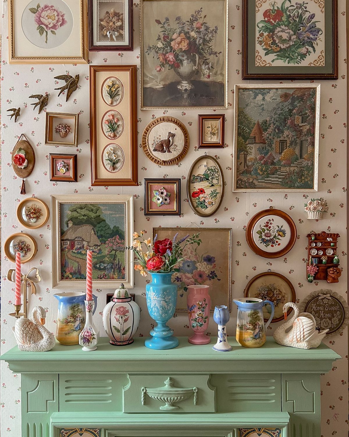
Patterned wallpaper behind a gallery wall solves the blank-space problem that haunts most collections. The paper becomes the matting, so frames can stay simple and mismatched without looking accidental.
Scale matters: the wallpaper pattern needs to read as texture from across the room, not fight the art for attention. A floral with open, light spacing lets botanical prints sit on top comfortably without either layer winning.
I would avoid dark or dense wallpaper unless every frame contains light, simple images. Picture lights help, but battery-operated ones work fine for renters who cannot hardwire.

FINISH: This product is printed on smooth, flat, self-adhesive vinyl with a satin finish
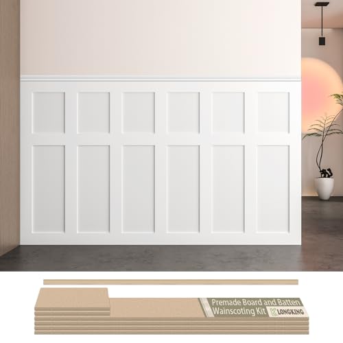
Board and Batten Wainscoting Kit – LONGKING pre-cut MDF wall panel kit is designed for easy DIY installation. Create a stylish accent wall with classic board and batten molding trim, perfect for modern and traditional home décor.
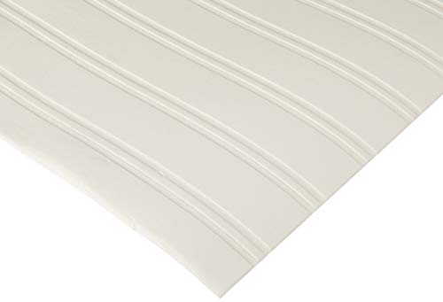
This Pre-Pasted Bead Board Wallpaper Gives The Beautiful, Streamline Effect Of Bead Board Without All Of The Work
11. Bold Wallpaper in Bathrooms
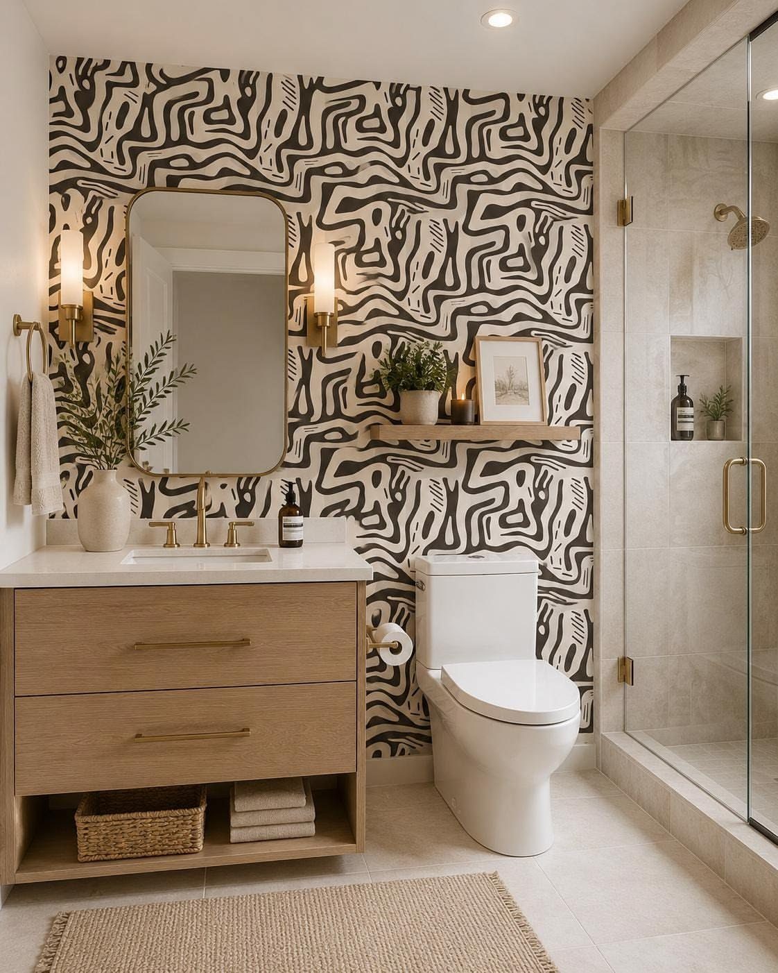
A powder room is the safest place to go loud. Bathrooms forgive patterns that would throb in a living room because you pass through rather than settle in; a black-and-white wave reads as energizing instead of exhausting.
Keep the fixtures quiet: light wood, clean lines, no chrome flourishes. Bathrooms with showers need vinyl or coated paper, not standard paste-up, or the seam edges lift in months.
For a rental, peel-and-stick holds up fine in a half bath with no tub.
12. Arched Wallpaper Panels
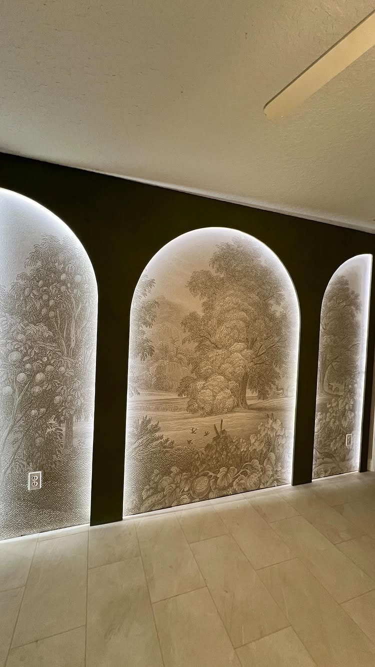
Three arched cutouts lined with landscape paper turn a flat wall into a shallow vista, but this lives or dies on the recess depth. Deep arches hold light and cast shadow; shallow ones read as decals.
Building the arches means either finding existing niches or framing false ones, so this is carpentry, not just papering. The dark surround matters: it pushes the landscape forward and hides the edges where paper meets drywall.
A desaturated print inside an arch, like sepia trees, lets the architecture stay in charge; color inside the frame fights for attention. Best for a hallway or dining room where you want pause without clutter.
13. Striped Wallpaper Accent Wall
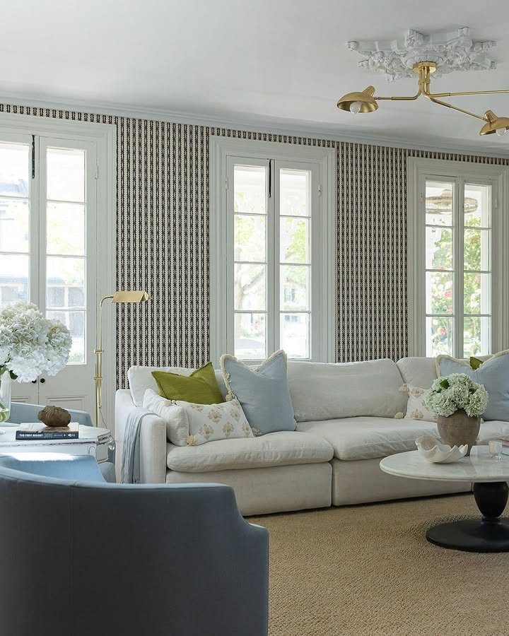
Vertical stripes pull the eye upward, which makes a low ceiling feel less squat without touching a single beam. Narrow, evenly spaced stripes read as structure rather than circus tent, and a black and white palette keeps the effect quiet.
Peel-and-stick striped paper comes in enough widths that renters can find one that fits the wall without cutting every strip to size.
Wider bands feel calmer and hide seams better in my experience; narrow ones get busy fast unless the room has almost nothing else competing.
Taping a sample vertically on the wall and living with it through morning and evening light beats holding a small swatch at arm’s length.
Horizontal stripes do the opposite, widening a narrow room, but they also show every level imperfection in your wall. If your place has the usual lumps of an older rental, vertical is the forgiving choice.
14. Marble Pattern Wallpaper
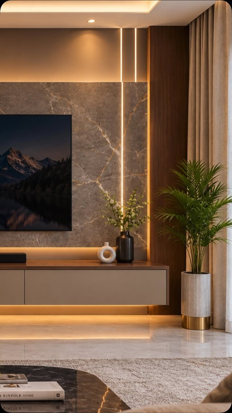
Marble wallpaper lets you build a feature wall that reads as stone slab without the weight, the cost, or the structural headache of real marble.
The grey version behind this TV has enough veining to look intentional, not like a printed photograph, and that distinction matters up close.
I would add those only if the wall already has power run for a mount; otherwise a plug-in picture light above the console or a floor lamp to one side achieves a similar glow for less electrical work.
Matte-finish marble paper hides the plastic sheen better than glossy. In a bathroom, vinyl-backed paper handles humidity; in a living room, standard non-woven holds up fine.
Check that your wall is smooth first, though. Real marble’s natural variation forgives flaws; wallpaper’s repeating pattern does not, and every bump telegraphs through.
Installation Tips for Wallpaper
A crooked first panel throws off every panel after it, so mark a straight vertical line with a level and pencil before the first strip touches the wall.
Dust and dirt block adhesion; wash the wall and let it dry completely. Working slowly matters more than speed; I smooth air bubbles as I go with a plastic scraper or my hand wrapped in a soft cloth.
Peel-and-stick paper lifts and repositions if you misalign, which saves the cost of a wasted strip. Standard paste-up does not forgive the same way.
Choosing Wallpaper Patterns
Botanical prints, watercolor florals, and soft geometrics move the eye without exhausting it.
In a bedroom, I paper the wall opposite my pillow rather than the one I face while lying down; the visual interest stays there without overstimulating my wind-down. Modern furniture pairs well with bold pattern because the contrast creates tension.
Traditional or bohemian rooms already hold detail, so florals and vintage-inspired prints fit without fighting what is already in the space. Metallics catch light without reading flashy; they work across contemporary and classic spaces.
Budget Considerations
One accent wall costs less than papering a full room, which matters when my budget is tight and my timeline is a weekend.
A single wall behind the bed or in a powder room lets you use a pricier paper than you could afford at scale. Paint remains the cheapest accent-wall option and the easiest to change later.
Wood paneling costs more in materials and labor, and you will feel the effort if you change your mind in a few years.
Mixing Styles Effectively
Your furniture does not need to match your wallpaper. A vintage print against modern pieces, or a sleek geometric behind soft, curved shapes, builds a room with layers rather than a catalog set.
One strong focal point pulls the eye; everything else settles around it. Metallics help here: subtle gold or silver in the paper catches light and bridges warm and cool tones without demanding attention.
Do not overthink coordination. Choose paper you want to live with, and let the contrast do the work.
Frequently Asked Questions
Are wallpaper accent walls out?
No. Accent walls have been around since people first painted cave walls, and wallpaper keeps the same purpose: one surface that carries the visual weight so the rest of the room can stay calm.
Styles shift, but the idea of giving one wall more attention than the other three never really leaves.
What is the best wallpaper for an accent wall?
The right wallpaper for an accent wall depends on what the room is missing: light, depth, or a focal point that isn’t the TV.
Bold patterns with strong color or busy geometry draw the eye and work best when furniture stays low and simple. Muted palettes, soft blues and greens, or textured grasscloth calm a space instead of shouting.
Match the paper to the room’s existing light and scale, not to a trend.