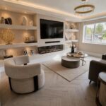
Wainscoting in a living room runs from a single weekend of picture frame molding in white to geometric wall paneling that needs a skim-coated wall.
Most of these ideas stay under a thousand dollars in materials, and several use nothing more than flat stock painted to match the walls, like the 60-inch height that lands just above most mounted TVs.
[link-whisper-related-posts]1. Wainscoting with Wallpaper
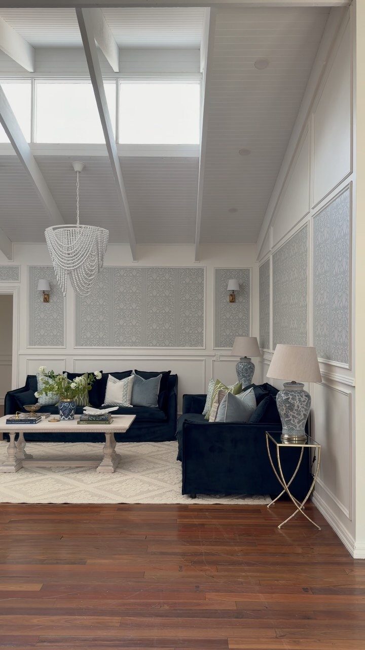
Wallpaper above wainscoting lets you test a bold pattern without committing a whole room to it.
The lower boards stay white or pick up one tone from the paper so the two halves read as one decision, not two stuck together.
Nail up your molding first, gap-fill and paint, then paper the inset panels. One maker added a floral border detail from a second sample after her readers voted; that layering is easier than finding one paper that does everything.
This suits anyone who wants pattern but lives with scuffs, kids, or a dog. The boards take the damage; the paper stays at shoulder height and above.

Wall Molding Kit: The package includes 24 pcs wall molding (24in-14 pcs, 54in-6 pcs, 48in-4 pcs), which can be combined into 6 frames, allowing you to easily create a stylish accent wall. The 6-frame layout shown is designed for a wall measuring approximately 10 feet high by 11 feet wide. Please measure your wall and plan the layout before installation.

SHOWCASE YOUR STYLE: Display picture frames, vases, books, plants, and decorative knickknacks with this set of 4 black floating shelves - includes 6, 12, 20, and 24 inch shelves, each 1.75 in tall and 4 in deep

【Long-Lasting & Paintable】Crafted from high-quality polystyrene, this wall moulding frame is waterproof and moisture-proof, and will not deform or crack. Unlike soft PVC molding trim, it's hard and sturdy, the edges won't lift up, which can stay straight and align seamlessly for a professional finish. Its smooth white surface is paintable and easy to clean, allowing full customization to match your home décor style
2. Wainscoting Accent Wall
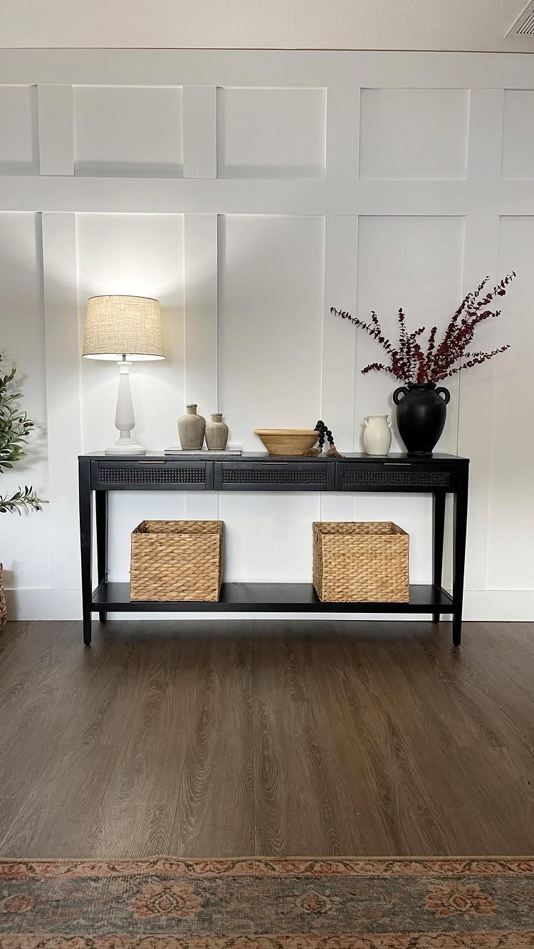
One wall of paneling behind a console or sofa does the work of a whole room’s worth. The rest of the walls stay quiet, so you spend on boards for 1/4 the footage and still get the effect.
A crisp white like White Wisp OC-54 against the molding reads clean; pair it with a deep color on the remaining walls if you want contrast, or keep everything soft for a smaller space.
Large rectangular panels read modern rather than country, which matters if your furniture runs straight-lined too.
Best for open-plan rooms that need a visual anchor, or for renters who want one permanent-looking upgrade they can paint over later.

Stylish Wall Upgrade: This wainscotting wall panel kit adds texture and charm to any space. The 37.8” tall beadboard panels create a beautiful decorative accent for living rooms, bedrooms, kitchens, studies, and more

Transformative - Art3d pre-cut molding trim adds depth and character to walls, gives traditional elegance with a hint of contemporary refinement

【Premium Polystyrene Wall Molding】Crafted from high-density PS (polystyrene), these panels are lightweight yet significantly more rigid and durable than foam or PVC alternatives. The sturdy, deformation-resistant structure provides a sophisticated wood-like finish that elevates your interior wall decor for years to come.
3. Beadboard Wainscoting
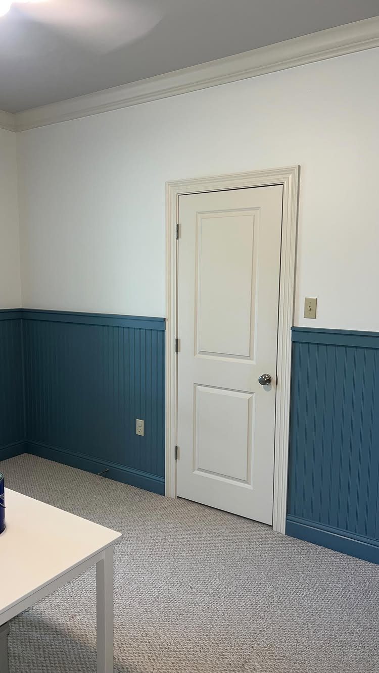
Beadboard is the narrow-plank cousin to flat paneling, and it catches light differently across each ridge.
Boards painted blue read beach-house, but an off-white with warm gray undertones like Revere Pewter HC-172 shifts modern if you keep hardware brass or gold.
The slats add texture without pattern, which helps a room that already has a busy rug or printed sofa.
If your living room is small, match the beadboard to your wall color in the same white family; the shadow lines still show but the space stays bright.
One acoustic panel option pairs a white wood veneer over felt backing, which softens echo in apartments with hard floors.

No More Plain Walls: Turn flat interior walls into vertical beadboard wainscoting panels that instantly add texture and dimension without complicated layout planning

What You Will Receive:Wall molding kit includes 8 pieces 9.8x37.8 inch PS wall panels + 2 pieces 1.8x37.8 inch decorative edge strip. Assemble into a 39 x 79 inch shaped wall panel,total coverage area is 21.5 sq. ft
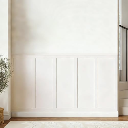
【Coverage】Includes 10 pre-cut wall molding slats and 2 shelf edge strips to create a clean board & batten look. (No peel-and-stick adhesive or nails included)
4. Classic Neutral Wainscotting
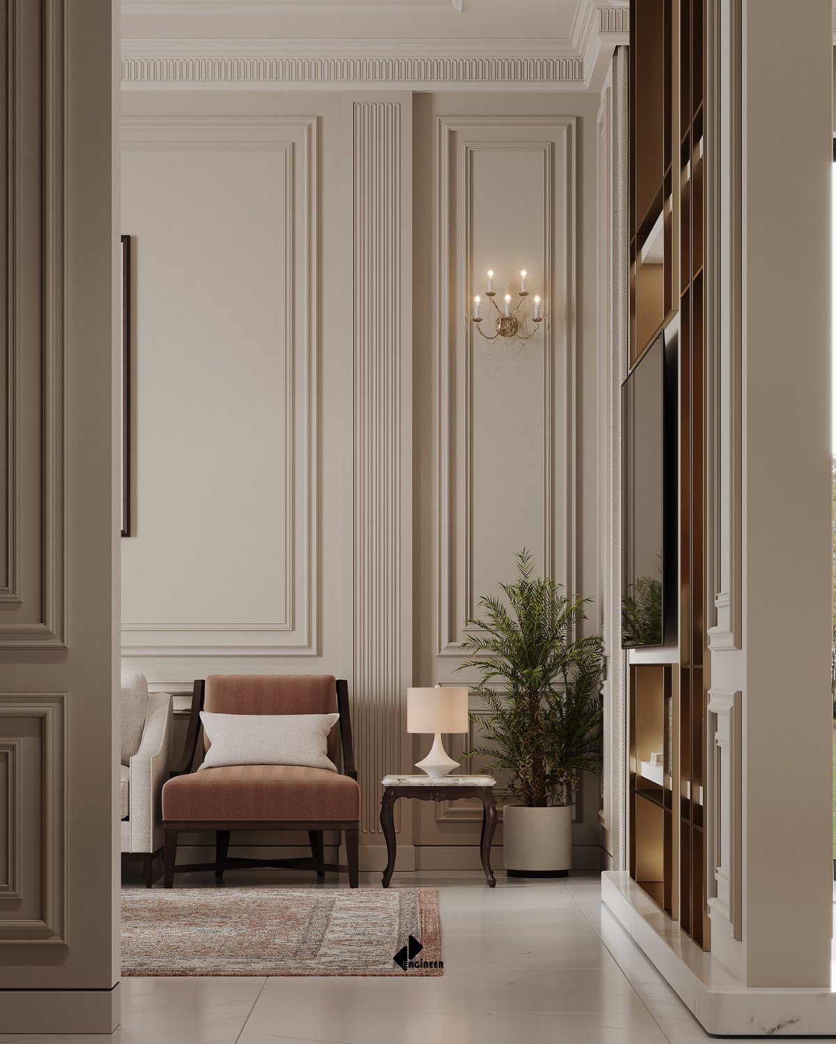
Neutral wainscoting borrows from Georgian proportions without borrowing their formality. Portland Stone, a warm gray-beige, runs with traditional oak floors and lets an orange chair or a patterned pillow do the talking.
Fluted pilasters and a crown detail at the top add more architecture than board-and-batten. That extra labor costs, but the room looks finished before you hang art.
For a budget version, flat stock painted the same tone as your walls gives the shadow lines without the lumber bill.
This is the safe choice that still looks intentional, good for resale or for anyone who changes accent colors seasonally.
Whether you favor a streamlined approach, the royal treatment, or something that calls to mind the storied charm of Colonial buildings—and whatever size, weight, height, and color you go for—wainscoting is sure to anchor a room, provide architectural charm, and create visual interest.

🏠Peel and Stick Wall Molding Kit: This package comes with 3 sets of pre-cut wall decorative panels, 10 panels per set for a total of 30 panels. You can freely match and combine the panels as needed. Featuring simple installation, it can create an elegant decorative effect on various interior wall surfaces.

Wall Molding Kit: you will receive 3 sets of pre-cut peel and stick molding for walls, a total of 12 pieces, which can be easily matched and connected to give a sophisticated look to a door or wall, meeting your various decoration needs

Complete Wall Decoration Kit: you will receive 3 sets of peel and stick wall molding, 10 pieces per set, 30 pieces total, 1 roll French blue and white wallpaper, and an 8 piece wallpaper smoothing tool set; It supports personalized cutting, easily creating elegant door and wall finishes
5. Dark Lower Wall with Light Wall Above
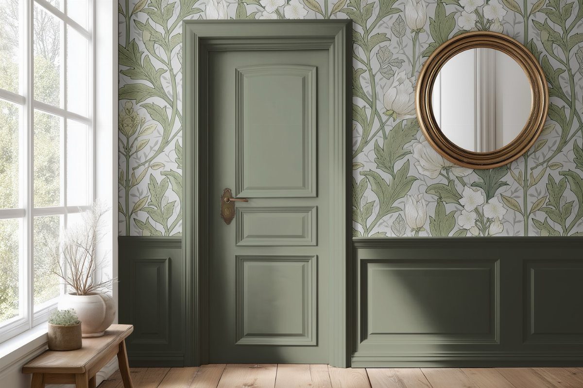
Sage green with floral paper above reads cottage; the same split in charcoal against warm white turns graphic and modern.
This trades some visual height for durability. In a room with low ceilings, keep the dark section low so the upper wall still reads as height.
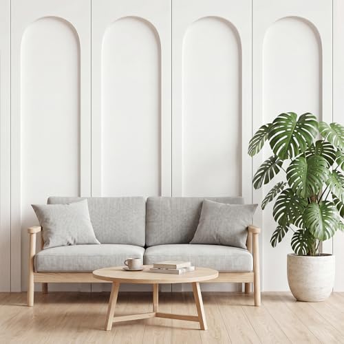
Transform Your Space with Ease - The wall panels for interior wall decor will help bring blank walls to life and create a sophisticated wall paneling look that elevates your home's aesthetic

MDF Material for Lasting Use: this board and batten wall panel kit is made from MDF, offering sturdiness and water resistance; The surface is smooth, providing a comfortable touch for interior wall applications

Batten Paintable Wainscoting Kit: you will receive 18 MDF strips and 40 unpainted solid wood beaded strips, can be freely matched according to your needs, bringing an elegant finished appearance to doors or walls
6. Sage Green Wainscoting
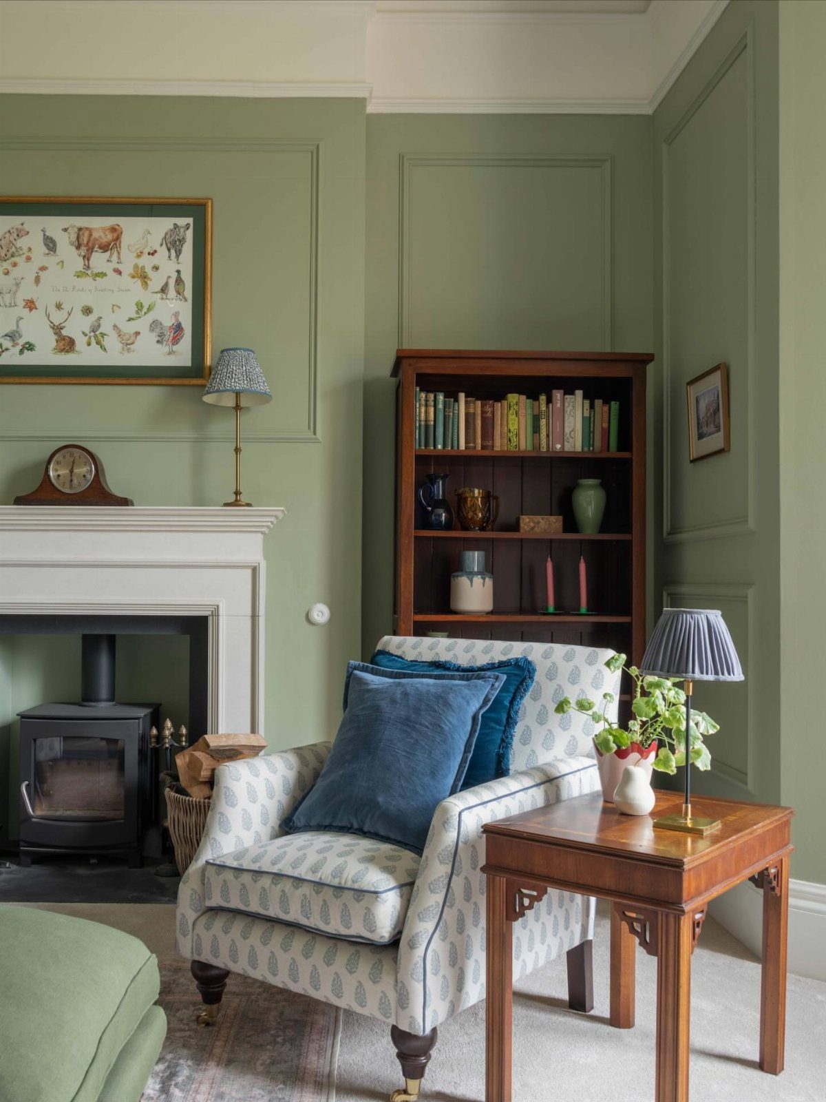
Sage green paneling around a fireplace reads settled and old-house whether the house is old or not.
Rectangular molding rather than beadboard keeps the look tailored; pair it with white trim and a wood stove or mantel for contrast that still feels soft.
For the color, Book Room Green is a muted classic, or go slightly deeper with Sage Green on the lower half only if you want subtle shift rather than full saturation.
White Heron OC-57 or Cotton Balls OC-122 on adjacent walls keeps the green from going muddy.
This suits rooms with good natural light and traditional furniture proportions. In a dark room the color can read institutional; add lamps before you commit.

Transformative Design - This peel and stick wall molding kit features pre-cut wainscoting panels that add classic charm and depth to any room; perfect for creating a stylish accent wall with easy installation using peel and stick molding trim for walls

Precise Positioning – We provide right angle auxiliary measuring cardboard for precise positioning when installing inside and outside frames

PRE-CUT FOR EASY DIY WALL UPGRADES: Skip the hardest part of traditional wall molding projects. This pre-cut wall molding kit helps reduce measuring, sawing, and miter-cutting work, making it easier to create a clean, balanced wall frame layout. A smart choice for DIY accent walls, bedroom makeovers, living room walls, dining rooms, hallways, and entryways
7. Vertical Slat Wainscoting
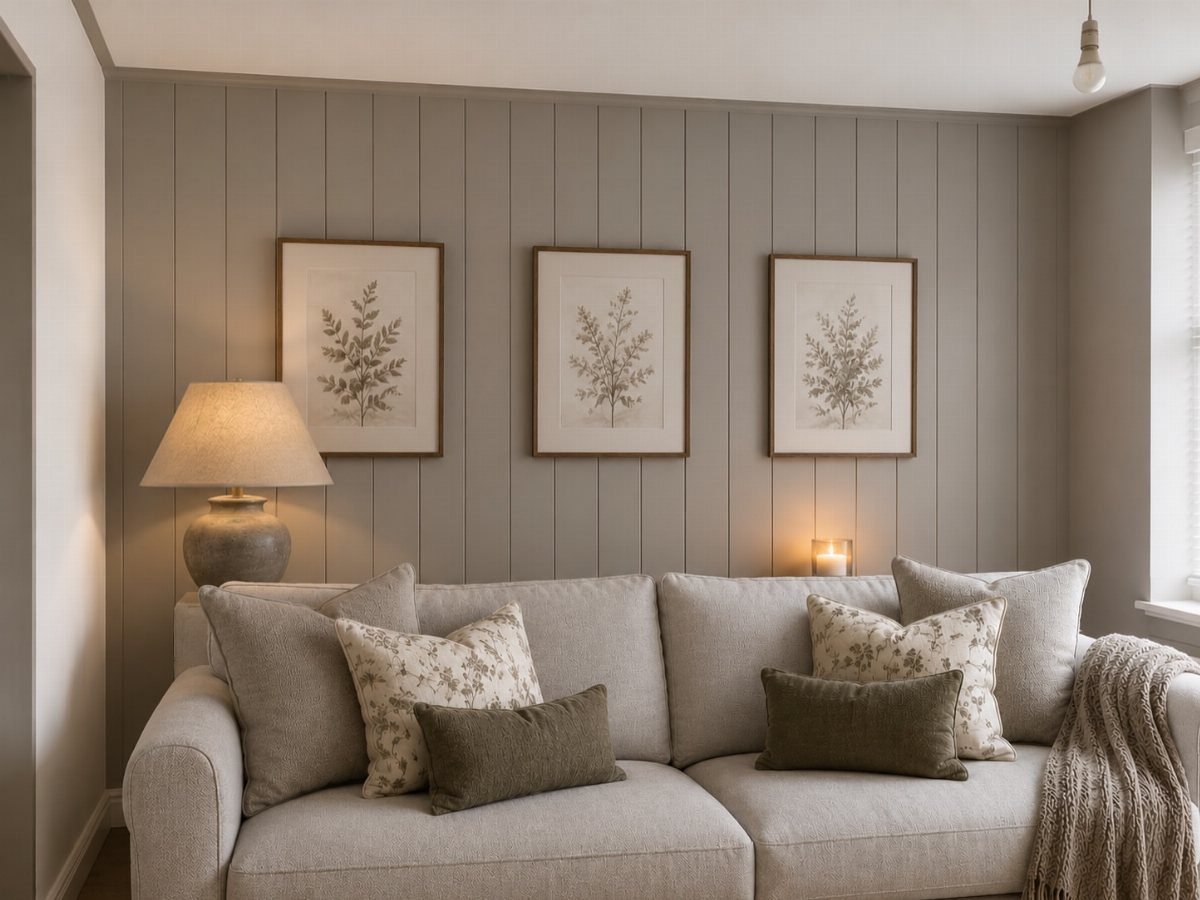
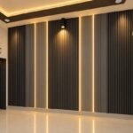
Taupe vertical slats behind a sofa draw the eye up without shouting for attention. Shadow gaps between the slats do the detail work on their own, so you can skip extra moulding entirely.
Solid hardwood slats on a felt backer cut down cleanly to whatever height matches your sofa back.
This reads more structured than shiplap, less rustic. Pair it with cream upholstery and brass accents, or go warmer with a cozy taupe like Affogato on the upper wall if you want the whole room wrapped in the same tone.
Best for renters who can install a single feature wall and call the room done.

Wall Molding Kit: you will receive 6 sets of pre-cut peel and stick molding for walls, which can be easily matched and connected to give a sophisticated look to a door or wall, meeting your various decoration needs

Elevate Your Walls Instantly – These fluted PS wainscoting panels add a clean, modern architectural look to any space, perfect for accent walls, half walls, and decorative wall upgrades in living rooms, dining rooms, and hallways

Transformative Design - This peel and stick wall molding kit features pre-cut wainscoting panels that add classic charm and depth to any room; perfect for creating a stylish accent wall with easy installation using peel and stick molding trim for walls
8. Picture Frame TV Wainscoting
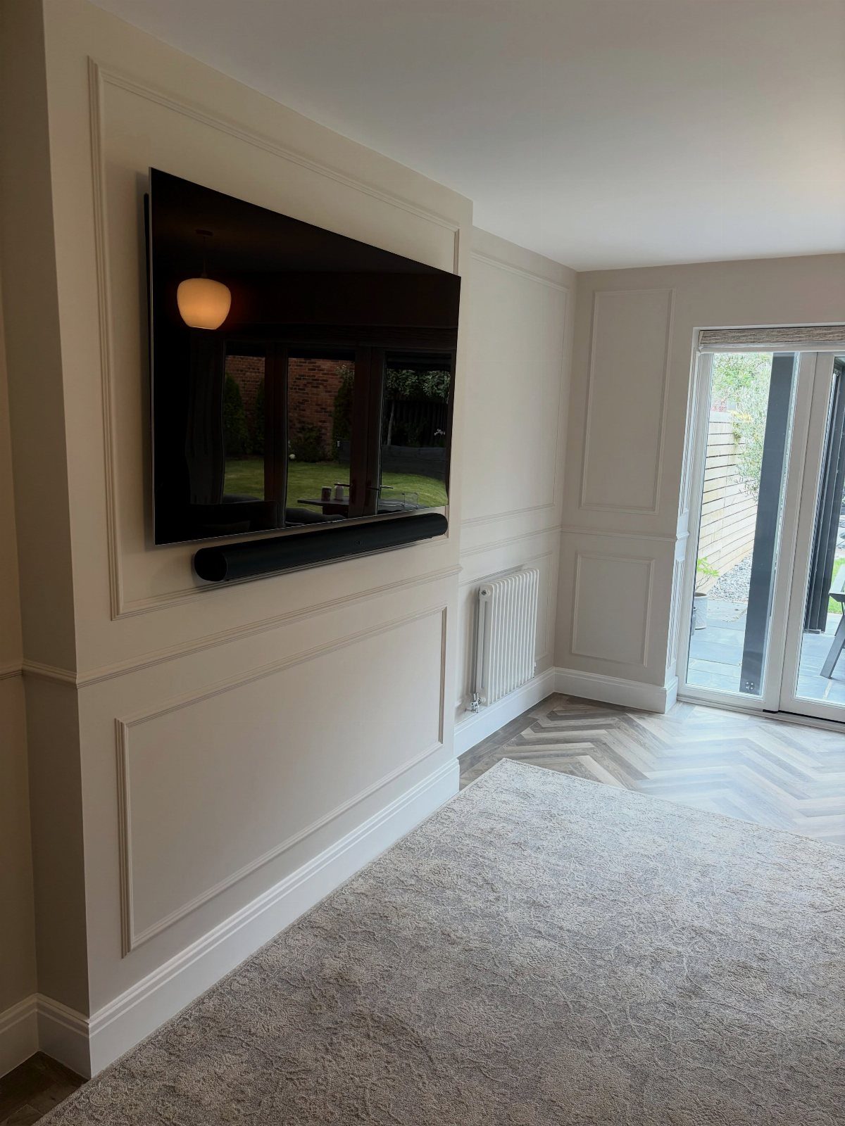
A wall-mounted TV sinks into picture frame wainscoting instead of floating on bare drywall. The panels give the screen a frame it did not earn on its own.
Run the wainscoting to about 60 inches, which lands just above most mounted screens. The recessed panels break up the wall so the TV reads as one rectangle among several, not a black hole.
A soundbar tucks onto the lower rail or sits on a slim shelf if you build one in.
Herringbone floors and glass doors already dress this room; the wainscoting keeps the wall from going empty without competing. I’d skip art on that wall entirely and let the paneling do the work.
Suits anyone tired of staring at a screen on a blank wall.

PVC WALL PANELS, 6-PIECE KIT: Elevate your walls with Plastpro’s 3-ft wainscoting panel kit. The complete solution for bathrooms, kitchens, bedrooms & living rooms. Includes 6 reversible PVC panels (3 ft high × 7¼ in wide), each pre-finished, pre-grooved, and ready to interlock. No nails or adhesive required.
9. Gold-Trimmed Wall Paneling
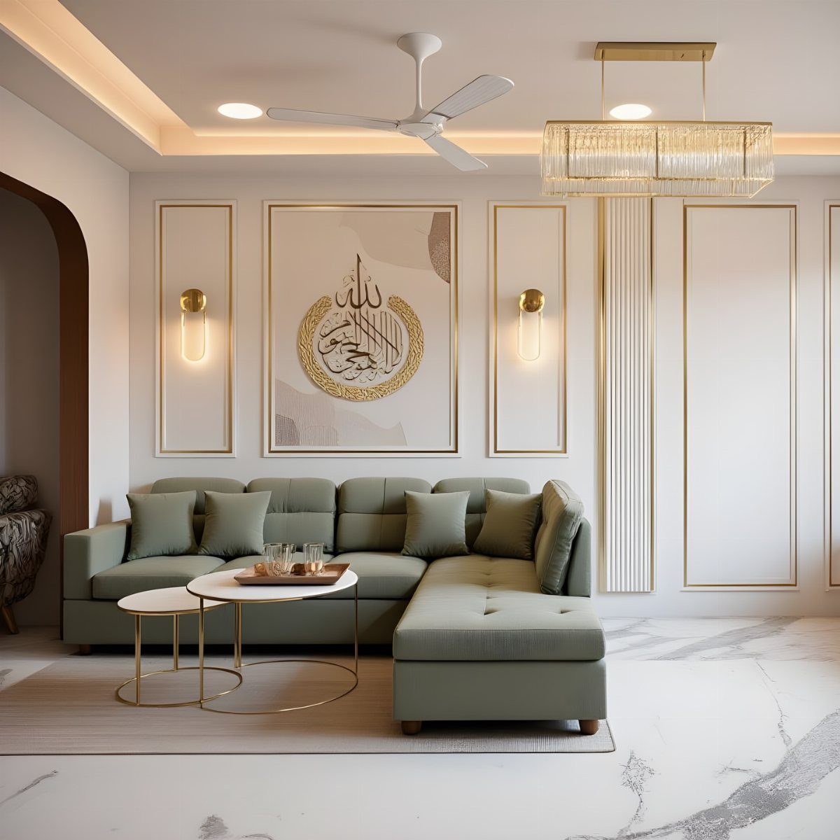
Gold trim on white panels turns standard picture frame molding into something that reads intentional against a green sofa and marble floor. The metal line catches lamp light and repeats the gold of a chandelier without matching it exactly.
Most wainscoting paint jobs stop at color. Adding a thin gold edge, either metallic paint or tape, means the panel lines stay visible in evening light when flat white would disappear.
Keep the panels large and few; too many gold rectangles and the wall starts to glitter.
I’d use this in a room that already has one other gold piece, a light fixture or coffee table edge, so the trim answers something rather than introducing a whole new note.

Wall Molding Kit: you will receive 6 sets of pre-cut peel and stick molding for walls, which can be easily matched and connected to give a sophisticated look to a door or wall, meeting your various decoration needs

COMPLETE 3-SET PACKAGE: Includes 12 pre-cut polystyrene molding strips, with 4 pieces per set, for creating three coordinated wall or door frame designs. This listing is for the 12 x 24 in size option.

The size of the wallpaper is 135" wide x 96" high and divided into 6 panels.
10. Dark Teal Picture Frame Wainscoting
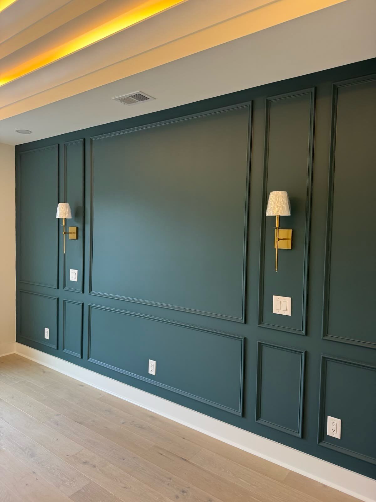
Dark teal wainscoting with picture frame molding and brass sconces reads formal without going stiff. The color is deep enough that the wall recedes, so the molding and the light fixtures step forward.
Two sconces with white shades, mounted on the paneling itself, break the grid and give you reading light that does not rely on ceiling fixtures.
Light wood floors keep the room from going too heavy; I’d hesitate on this color with dark flooring unless the room gets strong daylight.
The panels here are classic rectangles, nothing experimental. That restraint matters, because teal already carries enough weight.
Paint the baseboards white to match the upper wall and the room stays crisp at the floor line.
Best for a living room that doubles as an evening space and needs to feel dressed after dark.

What You Will Receive: includes 3 sets of white pre cut geometric wall molding kits; Each set includes pre cut trim pieces that assemble into one upper frame, one center diamond accent and one lower frame panel, with an overall assembled size of approximately 30 x 67 inches; Ideal for creating an elegant decorative accent wall

Peel and Stick Wall Molding Kit : Our wall moldings include 18 pieces of 24 inch decorative strips and 12 pieces of 27 inch decorative strips.Can be freely matched according to your needs,bringing an elegant finished appearance to doors or walls
11. Mauve Picture Frame Wainscoting
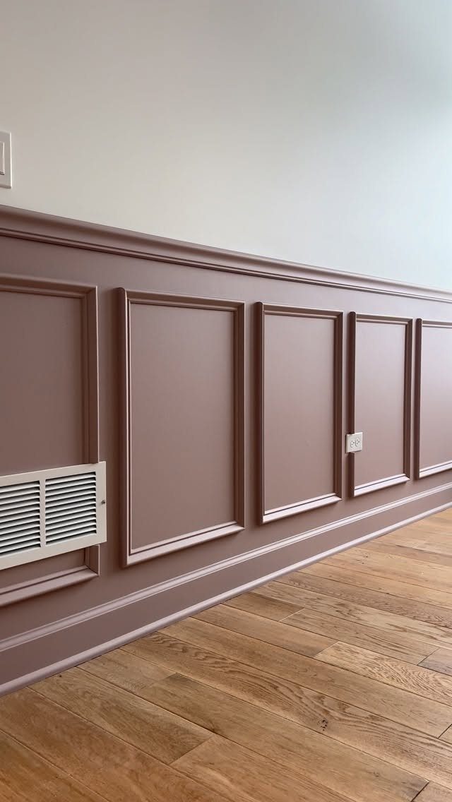
Mauve wainscoting on the lower half, white above, splits the wall at a natural stopping point.
The color is muted enough that it reads as warmth, not statement, and the picture frame molding keeps the lower section from looking like a solid block.
A floor vent and outlet, both white, disappear against the base color. That is the trick with two-tone walls: the hardware you cannot move should match the half it sits on.
Light wood flooring bridges the two colors without picking sides.
I’d set the divide low for a standard ceiling, or push it higher if you want the darker tone to dominate and the white to function as a tall trim.
The higher split works in rooms where you need the wall to feel taller than it is.
Suits anyone who wants color but flinches at bold walls floor to ceiling.
12. Modern Gray Picture Frame Molding
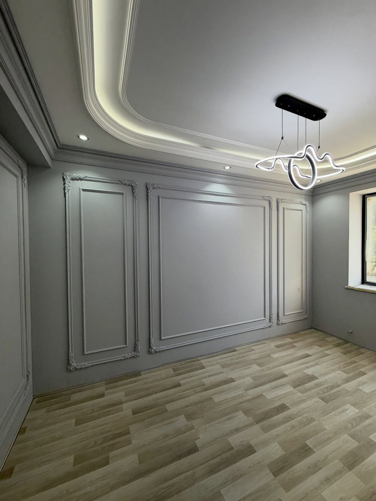
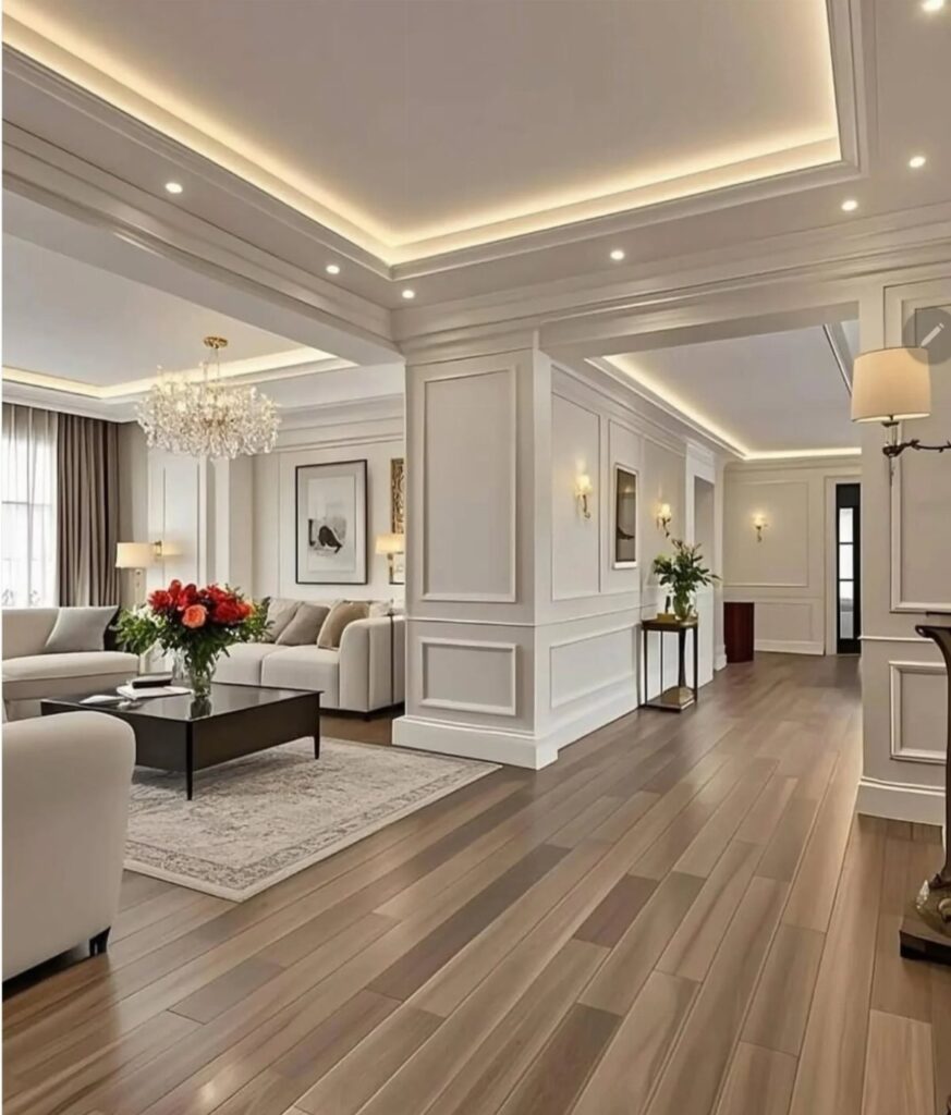
Gray picture frame molding against light gray walls adds texture without contrast. The tone-on-tone approach lets the ceiling fixture and the curved LED tray above it take the attention, while the wall holds its own up close.
Ornate molding in a modern room works when the color stays quiet. Revere Pewter or a similar warm gray with a slight cast keeps the panels from reading as leftover traditional detail.
The sculptural light and the illuminated ceiling do the contemporary work; the wainscoting provides the grid that grounds them.
I’d use this in a room with some ceiling architecture to show off. Flat ceiling, flat effect.
The light wood floors here are necessary; gray on gray on dark would close the room in.
13. White Picture Frame Molding
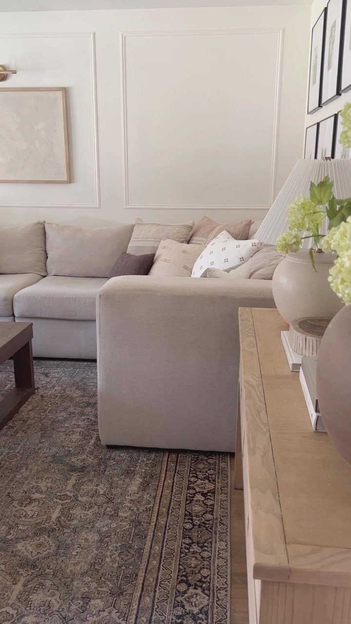
White picture frame molding fills the wall on its own, so the rest of the room can stay simple.
The boxes break up a solid surface into something that reads as architecture, not decoration, which matters in a living room where you already have a sofa, a rug, and lamps competing for attention.
I would run the molding in paint about half a shade warmer than the wall itself so the shadow lines show without shouting.
Flat white on flat white goes muddy in low light; something with a drop of cream or grey in it catches the eye better.
The boxes sit wherever you want them, but I like them aligned to furniture edges, with the bottom rail clearing the sofa back by a few inches.
This suits renters who can patch nail holes and owners who want permanence without the cost of actual paneling. A single wall takes a full weekend to lay out, cut, and caulk clean.
14. Geometric Wall Paneling
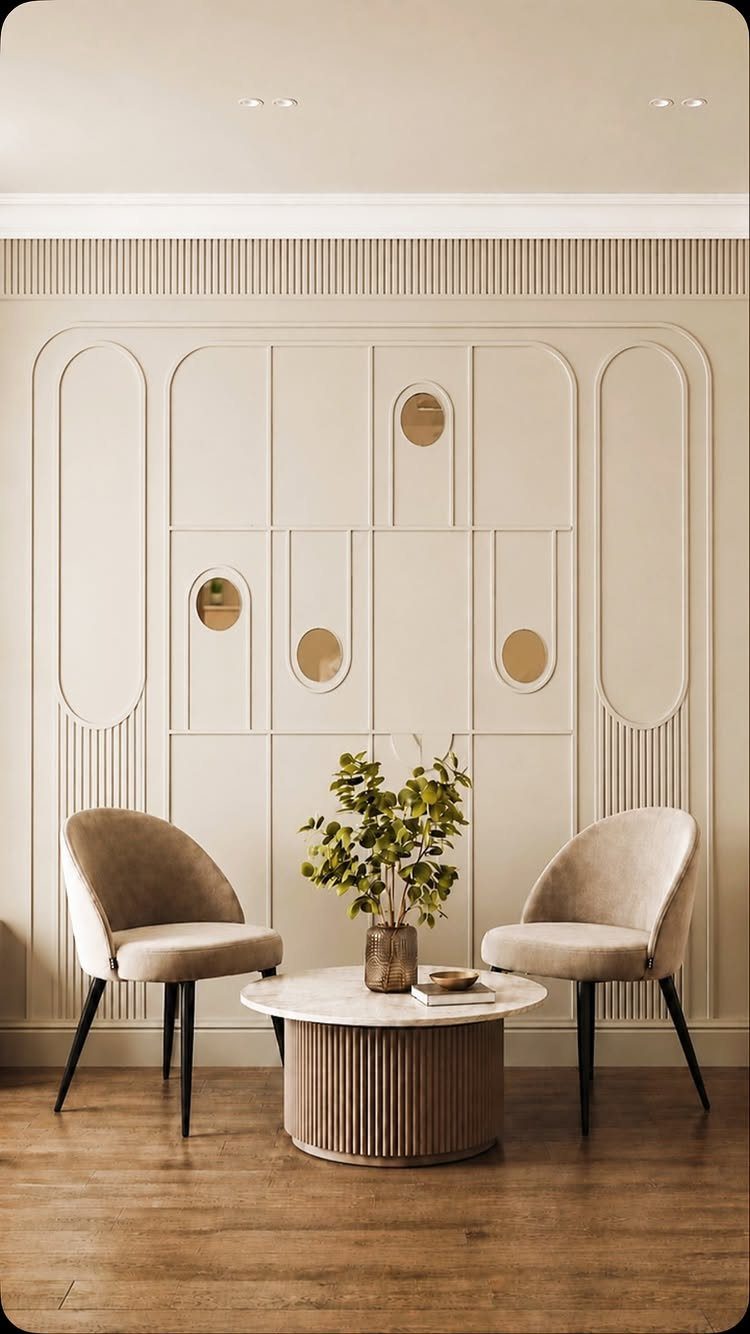
Curved arches and circles in wall paneling soften a living room more than straight picture frames manage. The geometry reads as intentional, not accidental, because the shapes repeat at a regular rhythm rather than scattering randomly.
Two tones here would fight the shapes for attention, and the shapes are what you want to notice.
Installation means a router or buying pre-cut pieces, so this sits at the higher end of weekend difficulty. If your walls are textured, you’ll need to skim first; the curves catch light and shadow, which also catches every bump.
Budget for that step or pick a flatter idea.
Best for someone who wants one strong wall and keeps the rest simple. The rest of the room should stay lower in detail; let this wall carry the load.
15. White Wainscoting with Grey Walls
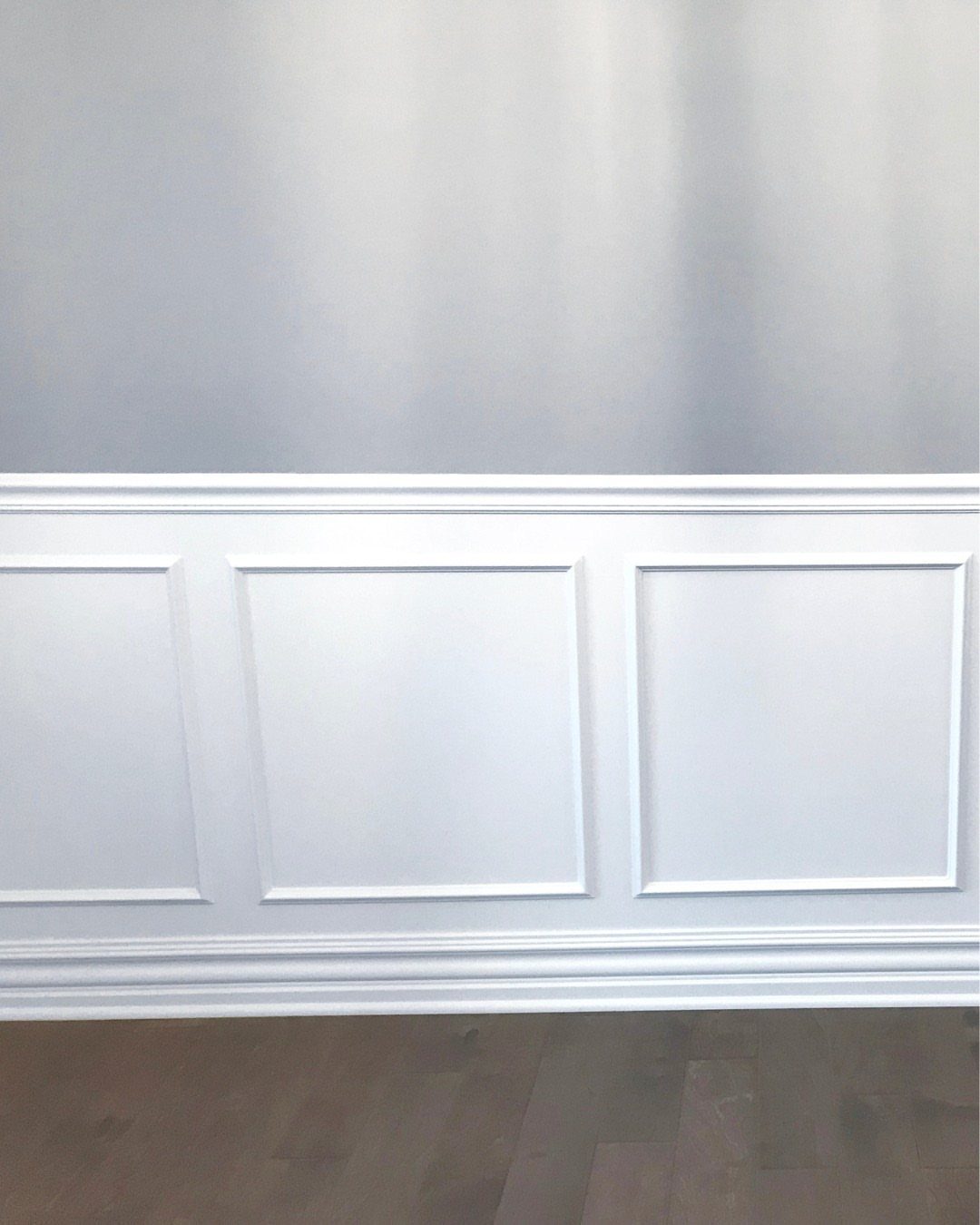
Raised white panels below and smooth grey above splits the wall into two zones without two colors shouting at each other. The grey recedes, the white advances, and the trim line gives your eye a place to rest.
I like this for rooms where the furniture is neutral and you want the architecture to supply the interest.
Benjamin Moore’s White Wisp OC-54 is a clean white that doesn’t turn cold against cooler greys, though any white with a touch of warmth works if your grey runs green or brown.
The panels run to standard chair-rail height, though I’d push a little higher if your ceilings are tall enough. That extra 6 inches changes the proportion from afterthought to intentional.
This is forgiving work. Paint the lower section in a semigloss for scrubbability, the upper in eggshell, and the transition hides at the rail.
16. White Wainscoting with Accent Console
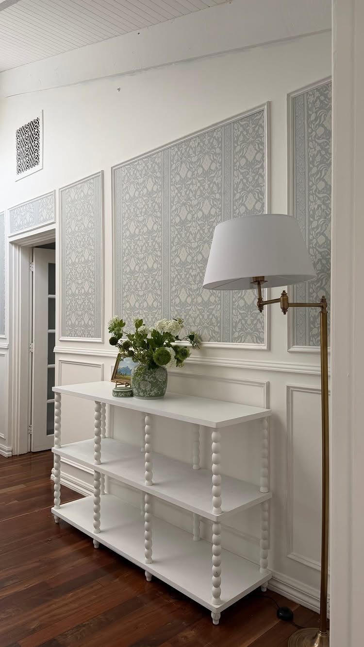
White wainscoting behind a white console melts the furniture into the wall, which is useful when the console is narrow or the room is small. The eye reads it as one plane, so the space feels larger than it is.
The patterned panels above the wainscoting add the actual interest; without them, this would go flat. I’d keep the panels in a tone just off from the wainscoting, not a contrast color, so the texture shows without breaking the calm.
A floor lamp with a white shade, like the one visible, repeats the vertical lines and keeps the palette honest.
This setup asks for discipline in what you put on the console. One vase, one stack of books, done.
The wall is already doing the work; clutter here would read as noise.
Costs run low if you paint existing wainscoting and add the upper panels in MDF. The console is the flexible piece; thrift, paint, match.
Wainscoting Styles
Wainscoting started as insulation for cold stone walls, but the reason it survived is simpler: it protects the part of the wall that takes the hits. Chair backs, vacuum bumps, and dog tails all land below the 36-inch line.
Wood, MDF, or beadboard each handle that damage differently. Solid hardwood dents and can be sanded; MDF swells if water sits on it but takes paint smoothly; beadboard ridges hide the small scuffs that show on flat surfaces.
Traditional wainscoting runs raised panels with matching baseboard and cap, while modern versions flatten the panels or lose the cap entirely. A mix might keep traditional proportions but paint everything one color so the molding reads as texture, not era.
The material choice matters more than the style label. MDF in a traditional pattern still costs less than hardwood in a flat one, and once painted, most visitors will not know which you picked.
Color Combinations
Two-tone walls work when the split line already exists. Wainscoting gives you that line for free, so the color choice becomes the only decision.
The contrast does not need to be loud. I would test the pair at the actual height the wainscoting will sit; colors look different when one is at your feet and the other at eye level.
Acorn and Hopper, a stronger pairing, works in an entry where you want the shift to announce itself. In a living room you live inside for hours, I would pull back.
Wainscoting Height Guidelines
For an 8-foot ceiling, divide by 3 and land near 32 inches. That is the starting point, not the rule.
A cap that stops just below the sofa back disappears; one that clears it by an inch or two reads as intentional architecture. Dry-fit every piece before you commit the saw.
Low furniture keeps the classic chair-rail proportion at 32 to 36 inches. A media wall or a tall sofa back pushes you to 48 to 54 inches so the paneling still reads as intentional.
Ceilings above 9 feet can take 60 to 66 inches, which is two-thirds up rather than one-third. The baseboard and cap trim eat into the finished height, so mark the wall a few inches above where you want the eye to land.
I would go smaller rather than larger when uncertain. Underscale paneling looks like a choice; overscale looks like a mistake.
In a room with 8-foot ceilings or less, a cap at the midpoint of the wall cuts the room in half visually. That is the height to avoid.
Functional Benefits of Wainscoting
Wainscoting still does the job it was built for. The lower wall takes damage that upper walls never see, and a scuffed baseboard is cheaper to repaint than patched drywall.
In a living room with traffic from kids or pets, that practical layer matters more than the look.
The texture breaks up flat drywall without adding pattern that competes with a rug or artwork. Panel edges catch light differently across the day, so the wall changes slightly as lamps come on.
That movement keeps a neutral room from going static.
Insulation value is minor in modern construction, but the air gap behind traditional raised panels still dulls sound compared to solid drywall. In an apartment with hard floors, that small acoustic help adds up.
The real benefit is visual: the paneling marks the room as finished before you hang a single frame.
Frequently Asked Questions
What is the golden rule for wainscoting?
The traditional rule is one-third up the wall, or push to two-thirds for a more dramatic proportion. Never split the wall exactly at its midpoint, which lands awkwardly on most standard 8-foot ceilings and throws off the room’s vertical balance.
Go slightly higher than standard chair-rail height if your ceilings allow, since that extra 6 inches shifts the look from afterthought to intentional.
What does wainscoting do for a room?
It breaks up flat wall space into architecture that reads as built-in detail, not added decoration.
The boards protect the lower wall from scuffs and marks, which matters with kids or pets, while the panel lines give your eye a resting place among furniture, rugs, and lamps.
In a living room especially, it can anchor an open plan or make a single wall carry the design load so the rest stays simple.
What are some ideas for wainscoting in a living room?
Picture frame molding, beadboard, vertical slats, board-and-batten, geometric arches, and two-tone splits like white below with grey or paper above all work in a living room.
An accent wall behind a sofa or console saves on material while still delivering the effect. For pattern without commitment, run wallpaper above traditional wainscoting and keep the boards in a tone pulled from the paper.
Which rooms should have wainscoting?
Any room can take it, though living rooms are where it solves specific problems: anchoring open plans, framing a wall-mounted TV, or adding texture without competing with bold furniture.
The protective lower wall matters most in high-traffic spaces, and the visual weight helps rooms that feel empty or undressed after dark.