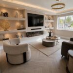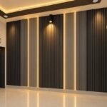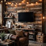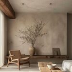
Modern accent walls run from a quart of terracotta paint and a cardboard template to stacked stone that needs sealing and a bathroom fan that actually moves air.
Painted color blocks or peel-and-stick wallpaper come down when you move; slat panels or natural stone behind a toilet commit you to the wall and whatever upkeep they need.
One crooked tape line throws off the whole shape, and rushing the second coat only makes it worse.
[link-whisper-related-posts]1. Geometric Paint Patterns
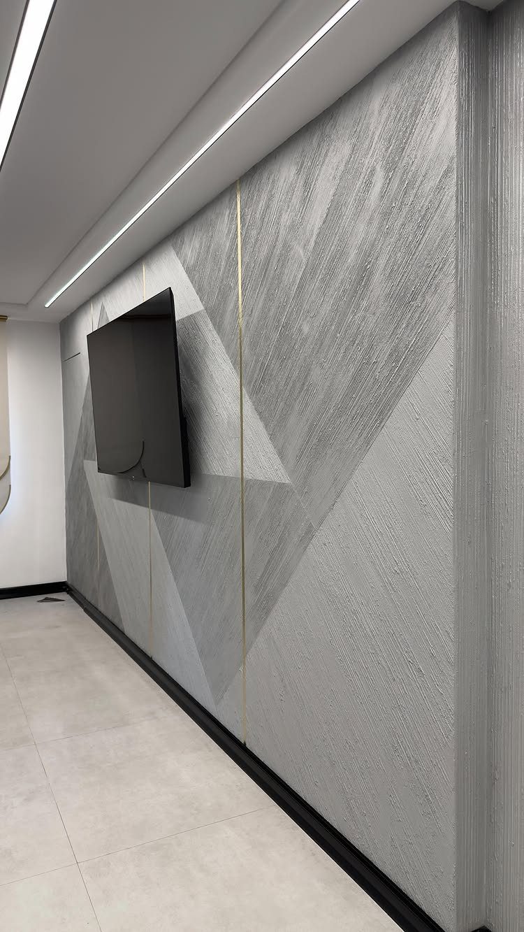
A geometric paint pattern turns a flat wall into architecture without adding thickness.
Overlapping shapes in two tones of grey with thin brass strips at the seams keep this pattern from reading as busy; the contrast stays low and the lines stay large.
Painter’s tape and a level matter more than artistic skill here. I would map the full layout on paper before buying paint, since overlapping shapes have to meet at edges you cannot shift later.
Two quarts in related tones usually covers a wall with a base coat already down.
This suits renters who can paint and repaint, and anyone who wants the look of paneling without the lumber bill. Time is the real cost: a single missed tape line ruins the geometry, and the second coat has to wait.

Special Gentle Adhesive – Safe for Latex Paint Walls– Designed with a gentle adhesive that sticks securely but won’t damage your wall paint. It leaves no residue, prevents peeling, no harm to walls. Self-adhesive vinyl material, Not intended for repeated use.

EASY TO USE: Our wall stencil is incredibly easy to use, even for those who have never used a stencil before. Simply apply the stencil to your desired surface, and paint over it with your favorite colors. Repeat the pattern using the edges of the design.

EASY TO USE: Our wall stencil is incredibly easy to use, even for those who have never used a stencil before. Simply apply the stencil to your desired surface, and paint over it with your favorite colors!
2. Textured Wall Panels
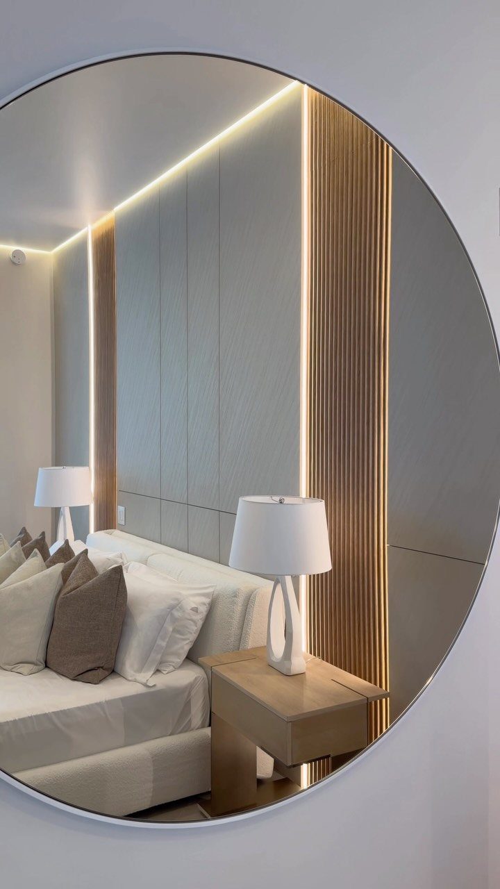
Vertical slats with a light behind them turn a bedroom wall into something that glows.
You can buy slat panels ready-made now, or rip 1 by 2s yourself if you own a saw. The gap behind the slats hides the wiring and casts the shadow that makes the texture read.
I would keep the wood tone close to the panel color rather than fighting for contrast.
This works best on the wall you face from the bed, not the one behind it, since the light is the feature. Budget depends on whether you panel the full wall or frame a section.

𝑪𝒖𝒔𝒕𝒐𝒎 5𝑪𝑪𝑻 𝑪𝒐𝒎𝒇𝒐𝒓𝒕 𝑳𝒊𝒈𝒉𝒕𝒊𝒏𝒈: These slat wall lights offer 2700K, 3000K, 3500K, 4000K and 5000K to match real daily living—from cozy bedroom evenings to bright office focus lighting. One fixture adapts to every season, mood, and room style while reducing the guesswork of choosing the wrong light color. 𝐍𝐨𝐭𝐞: 𝐀𝐥𝐥 𝟔 𝐥𝐢𝐠𝐡𝐭 𝐛𝐚𝐫𝐬 𝐚𝐥𝐰𝐚𝐲𝐬 𝐝𝐢𝐬𝐩𝐥𝐚𝐲 𝐭𝐡𝐞 𝐬𝐚𝐦𝐞 𝐜𝐨𝐥𝐨𝐫 𝐭𝐞𝐦𝐩𝐞𝐫𝐚𝐭𝐮𝐫𝐞. 𝐖𝐡𝐞𝐧 𝐬𝐰𝐢𝐭𝐜𝐡𝐢𝐧𝐠 𝐂𝐂𝐓 𝐦𝐨𝐝𝐞𝐬, 𝐚𝐥𝐥 𝐥𝐢𝐠𝐡𝐭 𝐛𝐚𝐫𝐬 𝐜𝐡𝐚𝐧𝐠𝐞 𝐬𝐢𝐦𝐮𝐥𝐭𝐚𝐧𝐞𝐨𝐮𝐬𝐥𝐲 𝐭𝐨 𝐭𝐡𝐞 𝐬𝐞𝐥𝐞𝐜𝐭𝐞𝐝 𝐜𝐨𝐥𝐨𝐫 𝐭𝐞𝐦𝐩𝐞𝐫𝐚𝐭𝐮𝐫𝐞
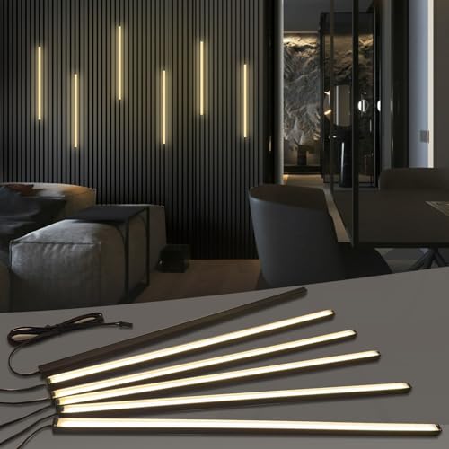
𝐅𝐮𝐬𝐞𝐝 𝐁𝐥𝐚𝐜𝐤 𝐂𝐨𝐥𝐥𝐞𝐜𝐭𝐢𝐨𝐧: This wall panel lights set Includes 6-piece of 16-inch 12V black LED strip lights. These slat wall lights feature black aluminum profiles, matte black diffuser covers and 3.1m black extension cables for flexible wiring. The 𝟎.𝟒-𝐢𝐧𝐜𝐡 𝐰𝐢𝐝𝐞 all-black wall panel LED lights seamlessly blends into slat panel gaps, easy to conceal and ideal for decorative black, matte black, gray oak, teak and black walnut wood slat wall panels etc. (𝐍𝐨𝐭𝐞: 𝐈𝐏𝟑𝟎 𝐍𝐨𝐭 𝐖𝐚𝐭𝐞𝐫𝐩𝐫𝐨𝐨𝐟 𝐖𝐢𝐫𝐞𝐝 𝐋𝐢𝐠𝐡𝐭 𝐒𝐭𝐫𝐢𝐩 𝐡𝐞𝐢𝐠𝐡𝐭: 𝟎.𝟒". 𝐏𝐚𝐧𝐞𝐥 𝐭𝐡𝐢𝐜𝐤𝐧𝐞𝐬𝐬 ≥𝟎.𝟒𝟑" 𝐢𝐬 𝐫𝐞𝐪𝐮𝐢𝐫𝐞𝐝 𝐟𝐨𝐫 𝐟𝐥𝐮𝐬𝐡 𝐢𝐧𝐬𝐭𝐚𝐥𝐥𝐚𝐭𝐢𝐨𝐧.)
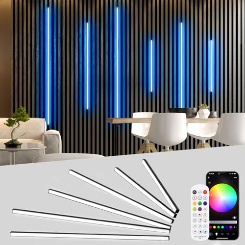
6 Pcs RGB Black led recessed lights for acoustic panel: The black acoustic panel LED Strip measures 0.394 * 0.394 in and is available in various lengths, including 16 in, 24 in, and 36 in. Each configuration accommodates six parallel led panel lights. The LED strip's input cable is 2 M/6.56FT , allowing for more flexible wiring options. The black smart recessed lighting is particularly suitable for acoustic panels, slat wall panel, wooden acoustic panels, cabinet and shelf lighting
3. Gallery Walls
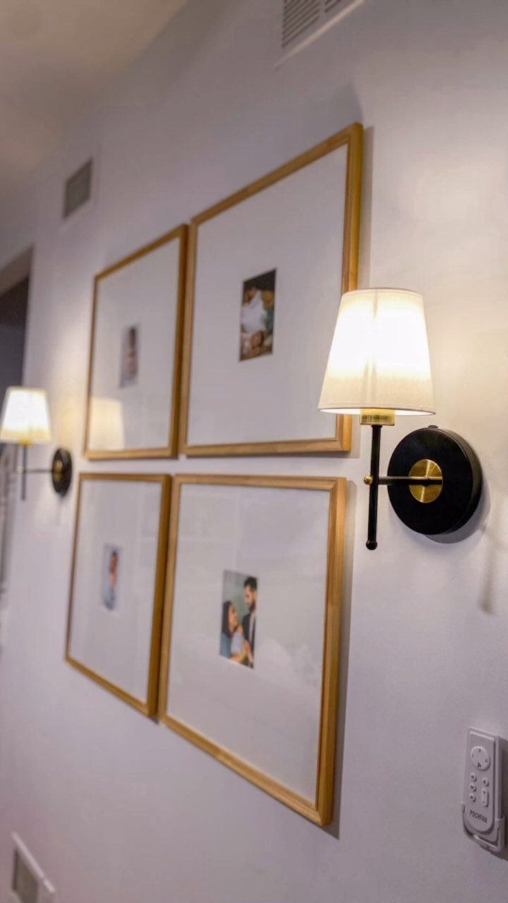
A gallery wall only works if the frames agree.
The discipline is what makes it modern. Mixed-frame galleries look fine in eclectic rooms, but the cleaner version wins for a modern accent wall.
Measure your wall, subtract the total frame width, and divide by the number of gaps; do not eyeball it.
Check your photo sizes before ordering mats.

Warm Tips: Colors may vary slightly due to different lighting conditions and screen settings. We recommend purchasing enough rolls at once to ensure they come from the same batch for a consistent color match. Apply to a clean, dry, and smooth surface for the best adhesion
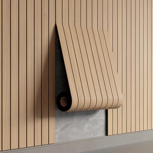
Effortless Peel & Stick Installation--Enjoy hassle-free setup with our self-adhesive PVC slat panels! Just measure, peel off the backing, and press onto any clean, flat surface—no tools or expertise needed. Perfect for DIY beginners and quick home makeovers.

【SIZE&MATERIAL】17.3In X118.In=14.16sq.ft.Floral wallpaper,upgrading and thickening. Adopt vinyl and the latest removable glue,wallpaper sticks to any smooth, flat ,clean surface,No residue after removal.
4. Sage Green Bedroom Accent Walls
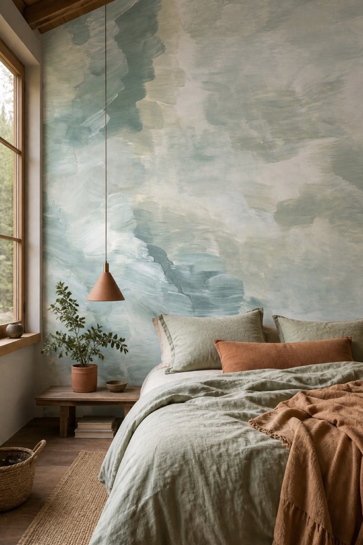
Sage green behind a bed does what stronger colors cannot: it recedes instead of pushing forward. A soft, brushed pattern in sage and white reads as texture more than image, which keeps it from feeling like a mural you inherited.
Paint is the cheaper path.
A gallon of sage with a matte finish covers the average bedroom wall cheaply, and you can add thin wood slats in an asymmetrical pattern if you want the detail from some of the reference shots.
I would test the color at floor level, where morning light hits it, since sage shifts warm or cool depending on the batch.
This suits anyone who wants calm without boredom.

Moody Blue Botanical & Floral Pattern:This peel and stick wallpaper features a lush, layered design of white hydrangea-like blooms, silvery foliage, and deep green leaves on a rich navy blue background. The moody, sophisticated color palette and intricate botanical details create a serene, elegant atmosphere, making it the ultimate statement piece for modern, bohemian, and nature-inspired decor enthusiasts.
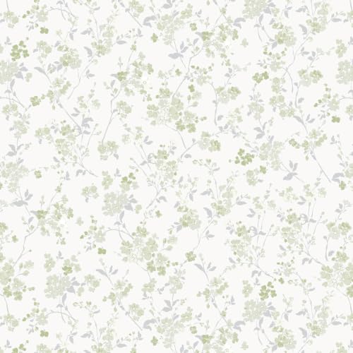
【Organic & Grounded Botanical Charm】Bring a sense of fresh nature into your home with this sage green and silver-gray floral wallpaper. The muted earthy tones and soft blooms on a clean white background create a sophisticated, organic look. This refreshing design instantly makes any study, living room, or bedroom feel more vibrant and natural

Peel and Stick Wallpaper: Unlike most wallpapers, this self-adhesive wall mural requires no glue, saving you time and effort. It can be easily applied by one person. Simply peel off the backing paper and stick it directly onto a clean, smooth wall. The fabric is stretch-resistant, making installation straightforward and ensuring seamless connections.
5. Upholstered Panels
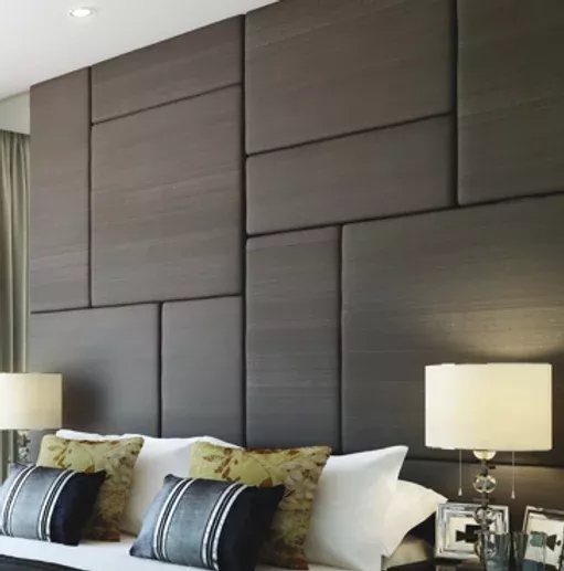
Fabric on a wall is usually a mistake, but upholstered panels in a tight geometric grid read as headboard, not afterthought. Dark grey rectangles with seams that align keep the look intentional; misaligned padding looks like a car seat.
You can buy ready-made panels with mounting hardware, or build a frame from 1/2-inch plywood and wrap it in fabric with a staple gun.
LED strips are an option, but I would skip them here, since the texture is already the point and colored light fights the calm.
This is a bedroom-only idea, and it costs more than paint. A queen-width wall runs up depending on fabric choice.
Voices and street noise soften against the padding, which matters in thin-walled apartments.


20 sheets solid PVC mixed metal tiles, 11.7"x5.9"x0.12" each, covering about 9.6 square feet.

20 sheets solid PVC mixed metal tiles, 11.7"x5.9"x0.12" each, cover 9.36 square feet.
6. Chalkboard Walls
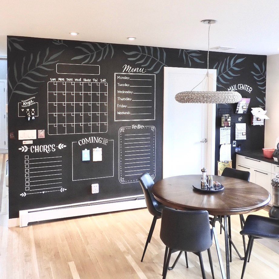
A chalkboard wall is only as good as your handwriting. Drawn frames for a calendar, menu, and chore list give the black surface a structure it otherwise lacks; without those borders, it becomes a smudged void fast.
Chalkboard paint goes on like any flat finish, but I would do 3 coats for density and sand lightly between them. Real slate paint exists now and erases cleaner than the latex versions, at about one price per quart.
Use a chalkboard accent wall in your home office if your work benefits from visible lists; for creative projects, the blank wall invites doodling that never gets erased.
This idea trades permanence for flexibility. You cannot hang art on that section later without patching, so choose a wall with no competing purpose.

EASY TO USE: Our wall stencil is incredibly easy to use, even for those who have never used a stencil before. Simply apply the stencil to your desired surface, and paint over it with your favorite colors

Wall Molding Kit: the MDF board and batten wall panel kit includes 1 set of wall trim strips; The strips are 4cm wide and 9mm thick, consisting of 21 strips of 87cm width, 12 strips of 100cm width, and 6 strips of 75cm width, for a total of 39 strips; The finished size is 118 x 103 inches; You can paint, stain, or further decorate them according to your preferences to achieve your desired style and color

Complete Mixed Size Kit: this wood slat wall decor kit includes 37 pre-cut wood slats (each 1.6" wide x 0.4" thick) in 7 lengths: 8 pieces at 5.9", 8 at 7.9", 8 at 9.8", 4 at 11.8", 4 at 13.8", 2 at 17.7", and 3 at 21.7"; Also includes four 5.9 x 5.9 x 0.8-inch accent boards; Note: adhesive and hardware are not included
7. Subway Tile Backsplashes
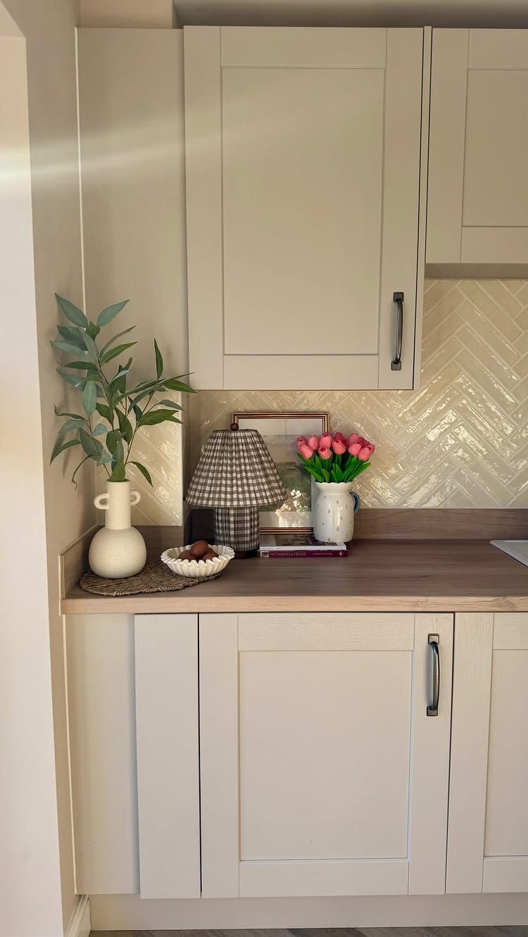
A herringbone subway tile backsplash turns a kitchen corner into something worth looking at while you wait for coffee. The pattern does the work; the tile itself stays cheap and found at any home center.
I like glazed ceramic for this because splatter wipes off without drama, and the grout lines stay narrow enough to stay clean.
Beige or cream keeps it friendly with cabinets you already own, whether they’re white, wood, or the sage green that keeps showing up in my feed.
The herringbone layout eats more tile and more cuts than a straight stack. My contractor quoted the difference at more labor, and I did the math on waste twice before I agreed.
If your budget is tight and your saw skills aren’t, a running bond subway pattern gets most of the effect for half the headache.
This one suits renters with a landlord who allows peel-and-stick tile, which now comes in convincing herringbone sheets, or homeowners ready to commit.
Behind the stove or across the whole counter wall; either works, but a partial wall behind open shelving gives you the look without the full kitchen disruption.

Faux Wood Grain Texture: PGVALXOR 3D wall panels use raised textures and a thin PVC wood grain surface to create a slat-look finish without using real wood

Perfect Fit for Wood Slat Wall & Acoustic Panel Recessed Lighting: Specially designed for narrow grooves in wood slat walls, acoustic panels and LED wall panels, this silicone strip light creates a seamless, flush wall panel light effect. Its low-profile body fits snugly into standard recessed lighting channels, avoiding the bulky protruding look of regular light strips.
8. Waterproof Wallpaper in Bathrooms
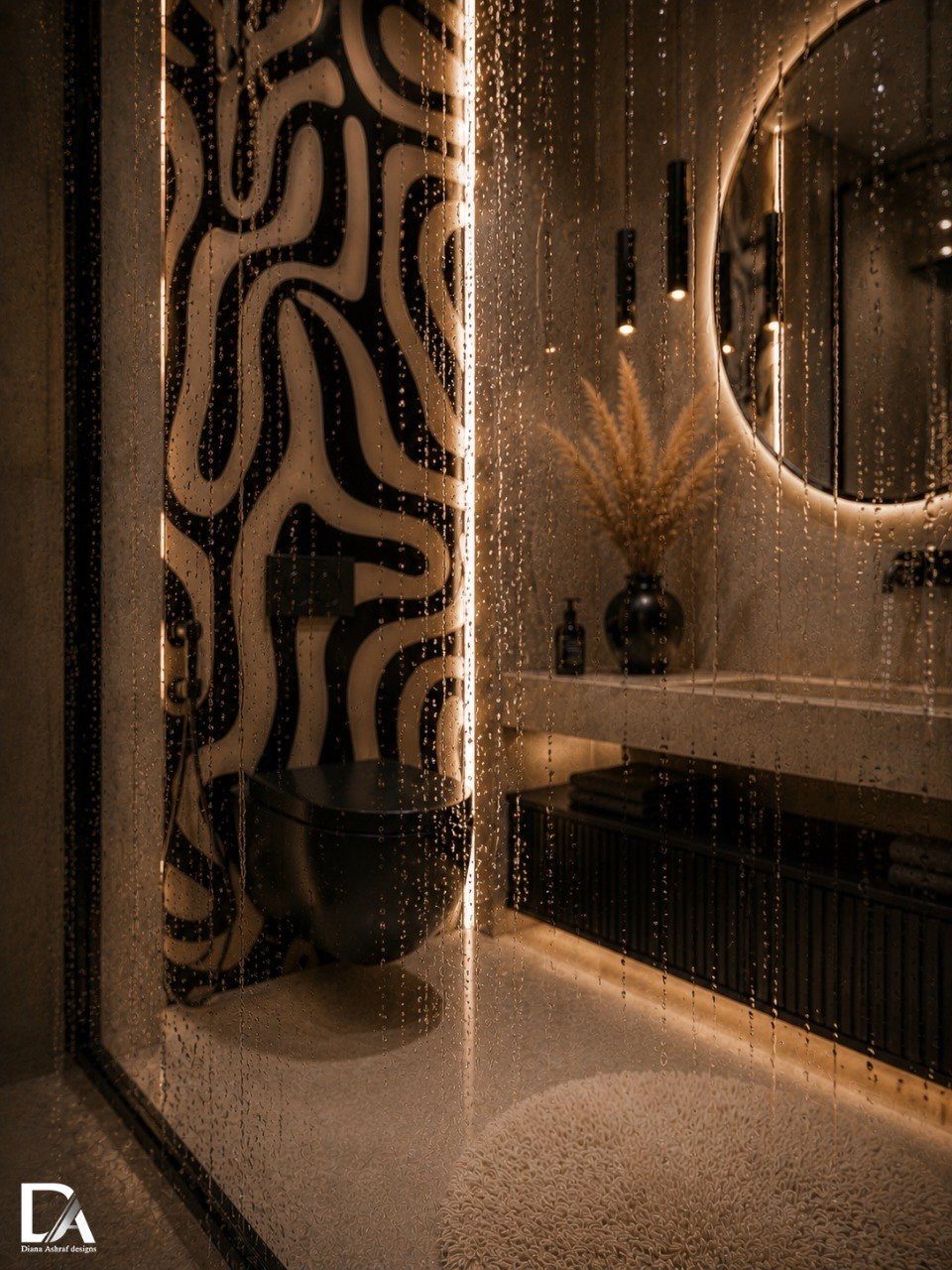
Waterproof wallpaper survives where regular paper dies: steam, splatter, and the occasional overflow from the sink. Black-and-white wave wallpaper reads expensive but installs like contact paper, which is how I got brave enough to try it in my own bathroom.
Actual waterproof vinyl is what you want, not water-resistant or splash-proof, which mean different things to different sellers. I check the backing for a solid vinyl layer and test a corner sample under running water before I commit.
Natural stone or vertical wood panels give the same spa feeling if you want texture without pattern. Stone needs sealing every couple of years; wood wants a bathroom fan that actually moves air.
Wallpaper asks only that you smooth the wall first and keep the heat running during install so the adhesive sets.
I’d pick this for a powder room or a full bath where the fixtures are white and simple. The pattern does the decorating; you add a plant and a decent towel and you’re done.

𝗠𝗼𝗱𝗲𝗿𝗻 𝟯𝗗 𝗧𝗲𝘅𝘁𝘂𝗿𝗲𝗱: 3D wood slat design creates depth and visual interest while enhancing sound absorption. Great for Bedroom, office to reduce echo and noise, both practical and stylish
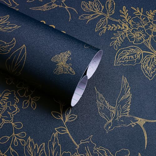
Vintage Floral Dark Blue and Gold Wallpaper: —【SIZE and MATERIAL】17.7 inch x 118.1 inch ≈14.5sq.ft.Made of vinyl, this wallpaper has strong adhesion and can be easily applied to any smooth and dry surface.
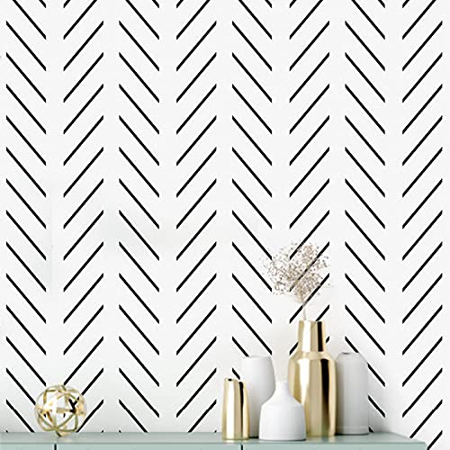
【DESIGN】:Creative and simple modern stripe design, black stripe strewn at random have sent to constitute a pair of rules and simple picture. Unique modern minimalist style, let you have a better visual experience
9. Wood Accent Walls
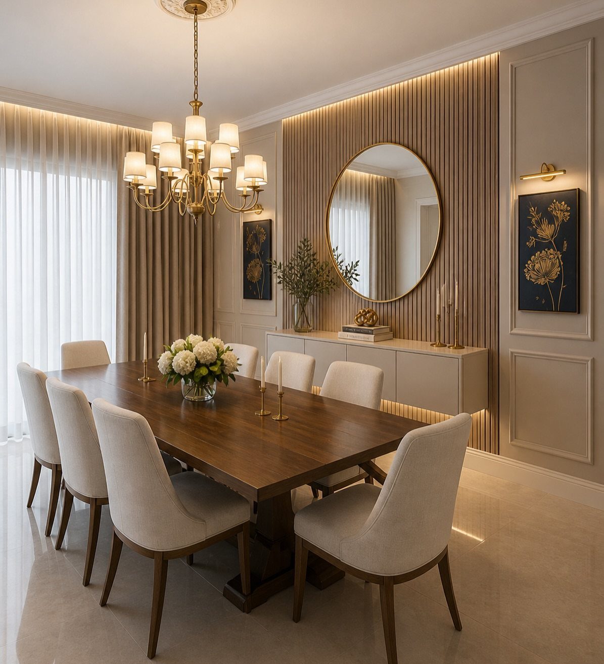
Slats spaced finger-width apart, mounted over a recessed cove, hide the LED strip entirely; you see the glow, never the source.
Reclaimed wood gives you gaps and knots that read rustic. Sleek panels with a factory finish read more Scandinavian.
I chose reclaimed for my own wall and spent a weekend sorting boards by color so the variation looked intentional, not accidental.
Slats that run floor to ceiling mean finding boards long enough or accepting a seam.
Standard ceiling height gave me trim to spare with common board lengths; in a room with taller ceilings, engineered slat panels that click together start to make more sense than raw lumber.
Dust settles between slats, and I run the vacuum brush attachment down mine every few months. Worth it for the warmth, but not if you’re allergic to maintenance.

Wildflower Design: Delicate white wildflowers on slender stems and branches rise from a soft meadow with small birds in flight over a misty sage green watercolor background
Moody Blue Botanical & Floral Pattern:This peel and stick wallpaper features a lush, layered design of white hydrangea-like blooms, silvery foliage, and deep green leaves on a rich navy blue background. The moody, sophisticated color palette and intricate botanical details create a serene, elegant atmosphere, making it the ultimate statement piece for modern, bohemian, and nature-inspired decor enthusiasts.

🏠Details: 15.8x78.8 Inch, total 8.65 sq.ft (40cmX2m). Self adhesive. Made of durable vinyl. Matte sage green wallpaper stick and peel. Oil proof. Waterproof. Fully removable. Renter friendly.
10. Wallpaper with Subtle Textures
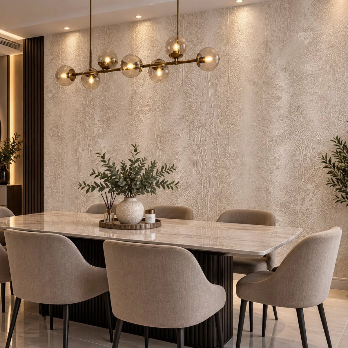
Subtle texture on wallpaper reads as plaster or fabric from across the room, but goes up in an afternoon and comes down when you move.
A tone-on-tone pattern catches light differently as the day shifts, which is more interesting than flat paint without demanding attention.
Peel-and-stick versions let you test a wall for a weekend before you commit to the full roll. One sheet extra is worth ordering; the first attempt usually has a bubble or a crooked seam, and the second try goes smoother.
Bold pattern would fight the furniture for focus. I’d use the same restraint in a bedroom behind the headboard, or anywhere you want calm rather than statement.
Check that your wall is smooth before you start. Texture telegraphing through thin vinyl is a mistake prevented with a quick skim coat of joint compound on any bumpy spots.

Sample Swatch Size – 6" x 6" travertine splitface sample piece designed to demonstrate the look, color, texture, and thickness of the full ledger panel.

【Skillful Quality Material】: Skillful quality polyurethane (PU), free from harmful substances like formaldehyde and VOCs

CREATE A COOL, CALM BACKDROP: Ice blue tones and marble-inspired patterning bring a refreshing layer of color to your room. White cabinets, pale wood, and chrome fixtures complete a relaxed, coordinated palette.
11. Color Blocking Accent Walls
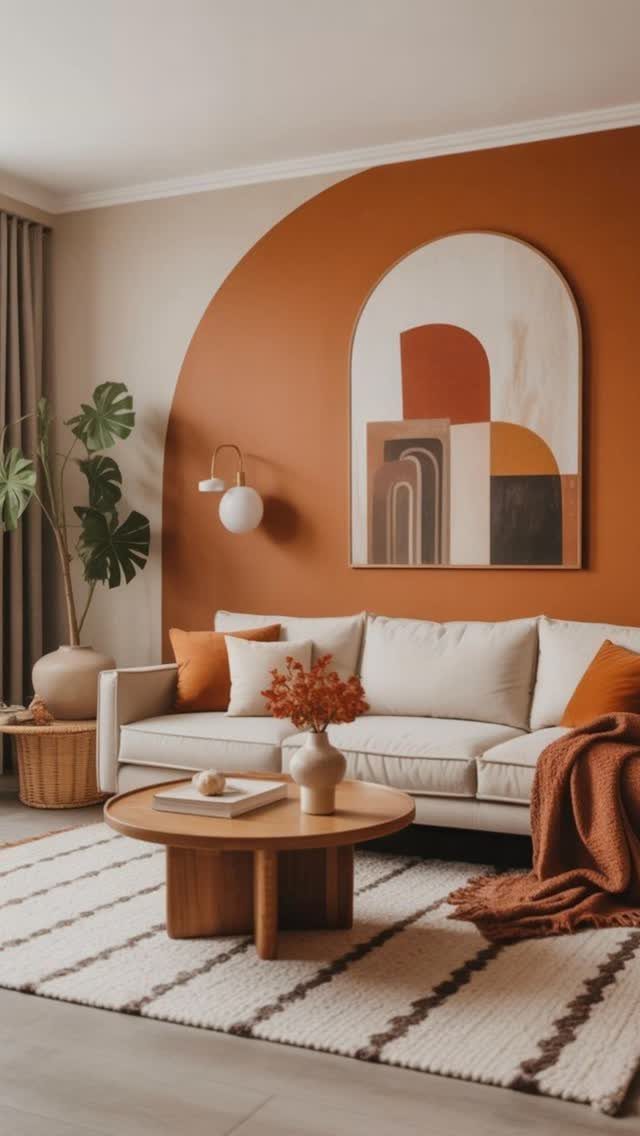
A single terracotta arch painted on beige wall costs a quart of paint and a steady hand with a template.
The curve is cut from cardboard, traced, then filled in with a small roller; freehanding it leaves a wobble that shows from the doorway.
Color blocking works on any scale.
A large arch works, but so does a narrow vertical stripe in mustard, a half-circle behind a bed, or a corner wrap in two tones that turns a rental living room into something worth photographing.
Ombré takes more blending skill than I have; solid blocks forgive brush marks.
This is the idea for someone mid-project who needs change this weekend and has little to spend. Tape matters more than paint brand; I spend the extra on FrogTape and press the edge with a plastic card before I roll.
Painted shapes take patience to undo. Unlike wallpaper, you paint over it when you’re done, which means another Saturday and another quart.
I think of that as flexibility, not downside, but I’ve moved enough to value reversible choices.
12. Stone Accent Walls
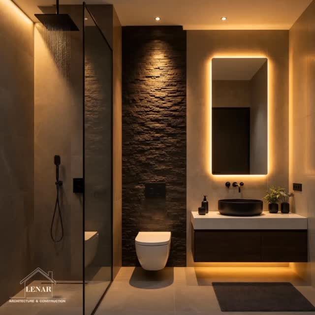
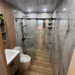
Stacked stone behind a toilet sounds odd until you see the photo: the texture turns a necessary fixture into a focal point, and the darkness shrinks the visual bulk of the tank.
Natural stone does this with weight and variation; faux stone panels do it with a hollow back you can lift alone.
Dark stone paired with white fixtures and a floating vanity keeps a bathroom from feeling like a cave. I’d add the same balance at home: light towels, a mirror that reflects window light, maybe a single plant that likes humidity.
The stone delivers impact; everything else should rest.
Natural stone needs sealing, especially near a shower. Faux stone in a wet area wants the waterproof backing specified, not assumed.
I check the product sheet for bathroom approval before I buy, because "interior use" and "wet location rated" are different certifications.
This idea suits a bathroom large enough that one textured wall doesn’t crowd you. In a narrow powder room, I’d choose the wallpaper wave or a painted block instead; stone wants breathing room to read as luxury rather than obstacle.
13. Cool Tones Accent Walls
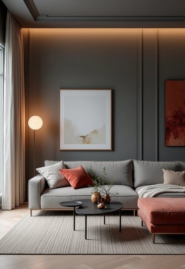
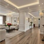
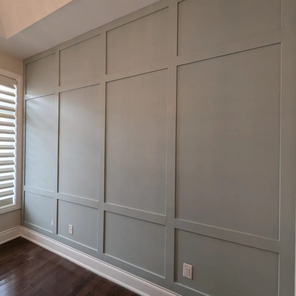
A charcoal wall with vertical molding and hidden cove lighting turns a living room into something that actually feels designed, not decorated.
Cool tones work because they recede. In a small apartment or a first home with tight rooms, a blue-grey or deep charcoal accent wall pushes the boundary back visually and quiets the space down.
Cove lighting tucked above the molding does the work of lamps so the wall stays clean, and the molding itself adds structure without clutter.
A gallon of paint and enough 1×3 pine for molding keeps this under the cost of a single floor lamp.
The cove lighting is a separate circuit; if you are renting, battery LED strips tucked behind a picture rail give a similar glow without an electrician.
I would skip this in a north-facing room that already feels dim. Calm reads as intentional rather than gloomy when some daylight reaches it.
Frequently Asked Questions
What is trending for accent walls?
Vertical wood slats, limewash paint, and large-format patterns lead the current direction. Earthy palettes like sage green, terracotta, charcoal, and warm beige replace the brighter accent walls of past years.
The shift is toward texture and quiet structure rather than bold color alone; even wallpaper has moved to tone-on-tone and subtle textures that read as plaster from across a room.
What is the rule for accent walls?
Pick one wall that your eye lands on naturally, and treat it as the focal point.
The wall behind a bed, the one facing a living room sofa, or the surface behind open kitchen shelving all work because you look at them by default.
A wall you pass with your back to it wastes the effort and the material.