These 27 pairings run from a single gallon of paint and a free weekend to polished marble floors with cream walls that only make sense once you own the place.
The right one for you depends on whether you are working with floors you chose or floors you inherited.
A dark laminate already in place, for instance, needs only white walls and sheer curtains to look like someone planned it that way.
[link-whisper-related-posts]1. Accent Walls
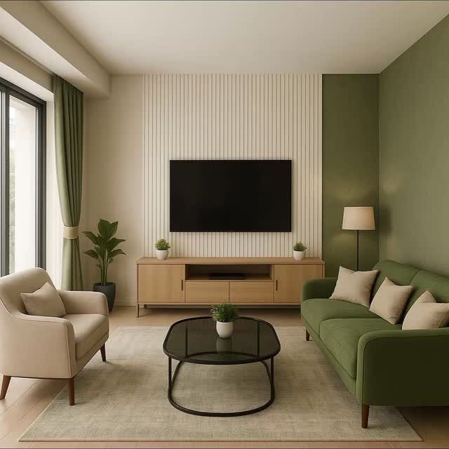
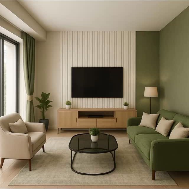
A single wall in a stronger color pulls attention without swallowing the room. Sage green borrows from nature: it sits calmly against light wood and white trim, and it lets the other three walls stay quiet.
Match the undertones first, then worry about the shade. If your floor runs warm, pick a green with yellow in it; if the floor reads cool, go toward blue-gray greens.
Baseboards in crisp white or off-white separate the accent from the flooring so the two do not bleed together. This suits renters who cannot change floors but can roll a few coats onto one wall.
An accent wall gives you personality without asking you to repaint the whole room.
2. Light Walls + Light Floors
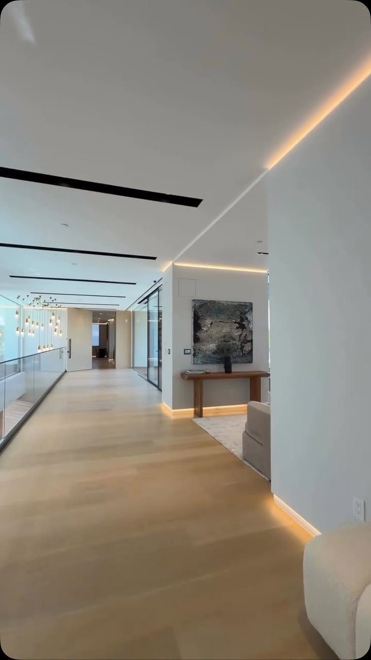
Pale floors and pale walls erase edges, which makes a narrow hallway or small living room feel like it breathes. The risk is flatness: without contrast, the space can look like a blank before the furniture arrives.
I would add texture through linen curtains, a woven pendant, or a single darker piece like a walnut side table.
For wall color, icy white or a salt-washed seafoam keeps things fresh; if you want sophistication instead of airiness, try deep charcoal or a dark cool blue against honeyed wood.
Either way, the floor does the heavy lifting, so choose one with some grain variation.
3. Cherry Hardwood Floor Wall Colors
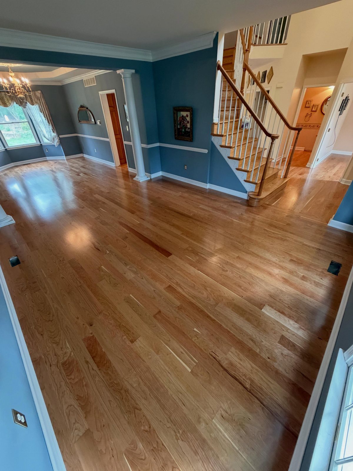
Cherry floors carry a lot of red, which sounds harder to work with than it is. Cool whites, lighter blues, and grayed tones settle the warmth down instead of fighting it.
A blue wall with white trim lets the floor glow without letting it dominate.
What changes the answer is how much natural light the room gets: a north-facing space needs a warmer wall color to avoid chill, while a sunny room can handle a starker cool.
Check your cherry in morning and evening light before you buy paint. Greige or warm taupe softens the red for traditional tastes; dusty navy gives you contrast without clashing.
4. Area Rugs for Color Bridging
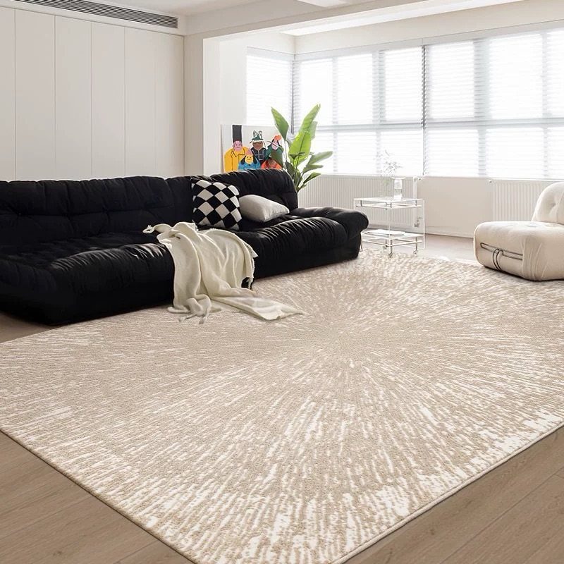
A rug that picks up both your wall color and your floor tone turns two separate decisions into one conversation.
A patterned beige rug does this quietly: it echoes the light wood and the white walls while adding enough interest to hold the middle ground.
When shopping, look for a rug with at least two colors, one that nods to the floor and one to the wall. This matters most in open plans where one flooring type runs through multiple zones.
The rug becomes the border that defines a seating area without a wall to do it. A good rug solves the problem of clashing undertones for far less than repainting or refinishing.
【Multi-Purpose Water-Based Paint】: Vigorder white touch up paint requires no sanding, primer, or multiple coats—achieve a perfect finish in just one step. Easily refresh furniture, door frames, and other painted surfaces
5. Using Bold Colors Strategically
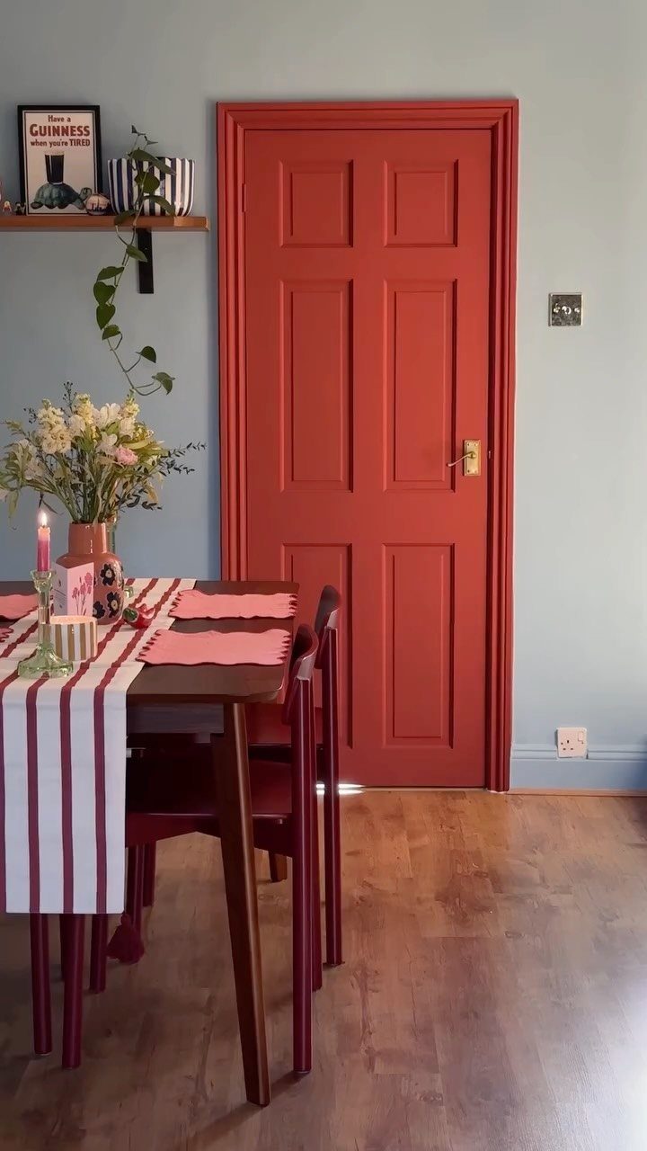
A red door works because it is the only scream in the room. Pale blue walls and light wood flooring give it room to land.
I would use this same restraint with any strong color: one door, one built-in, one piece of furniture. The rest of the space stays neutral so the eye has somewhere to rest.
This approach costs less than committing to a full room of saturated color, and it is easier to change when your taste shifts.
If you are nervous, test the bold color on something movable first, a console table or a large frame. The floor can handle the energy if the walls stay quiet.

NEUTRAL ABSTRACT RUG: This rug features a unique neutral abstract design that combines the brown and grey color, adding more warmth and cozy to your home. The carpet is good for living room, bedroom, dining room study room, home office, etc

Design: An open lattice of clean diagonal lines brings Moroccan-inspired geometry and plush dimension to contemporary interiors. Tone varies with light and screen

Elevate your home with the sleek, contemporary design of our Solid Square Pattern Rug, perfect for any room
6. Using Pastels for Softness
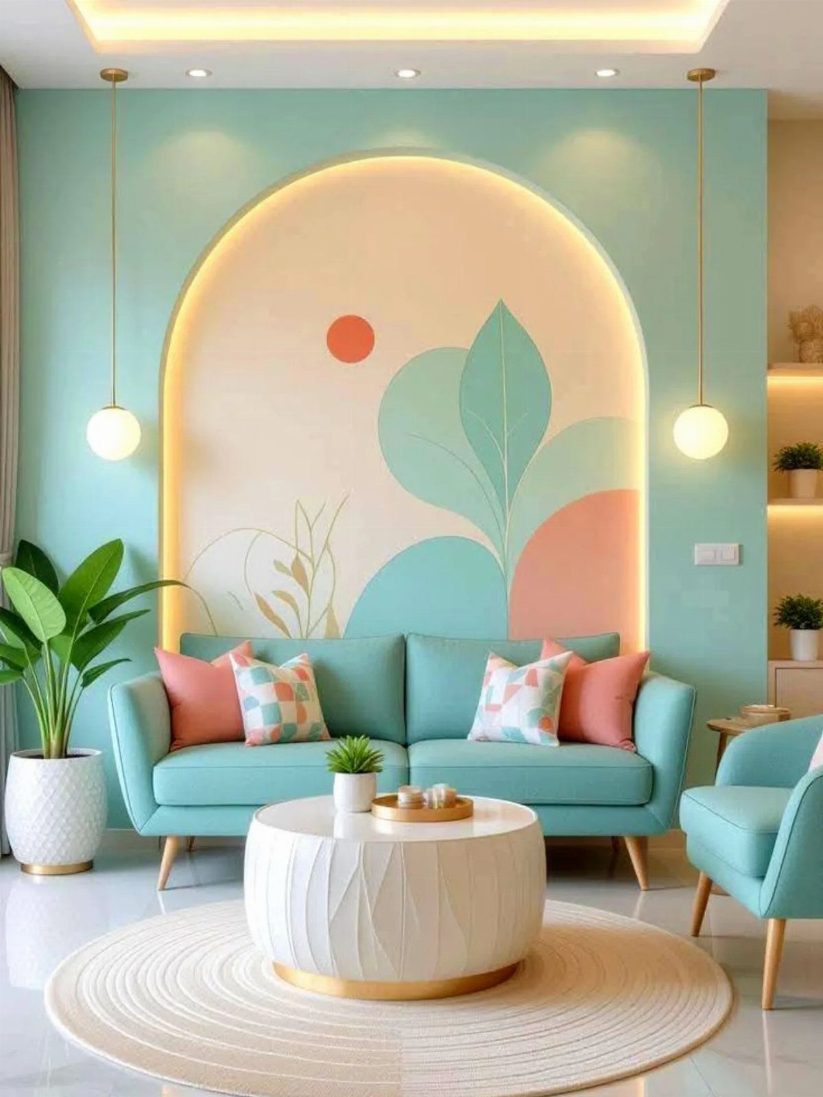
Mint and peach on the walls, paired with glossy white floors, make a room feel like a held breath. Pastels suit bedrooms and living areas where you go to unwind, not to perform.
The danger is sweetness overload, so I would ground the space with one darker element: a walnut stool, a charcoal throw, or even black picture frames.
An arched mural can add architecture where there is none, but a single pastel wall works too. For flooring, white or very pale wood keeps the mood consistent; anything darker starts a tug-of-war.
This combination rewards the patient and punishes clutter, so edit your belongings before you edit your color.

CONVENIENT SIZE - This Apple Barrel Acrylic Paint comes in a versatile 2 oz size that is great for basecoating, stenciling, and so much more

【Vintage Bird Wall Art】 Vintage gold framed wall art depicts an elegant sparrow perched on a blooming branch, surrounded by delicate botanical details against a sage green background. Vintage wall decor incorporates bird wall decor and botanical wall decor elements, adding a touch of nature to your space.

7. Gray Hardwood Floors
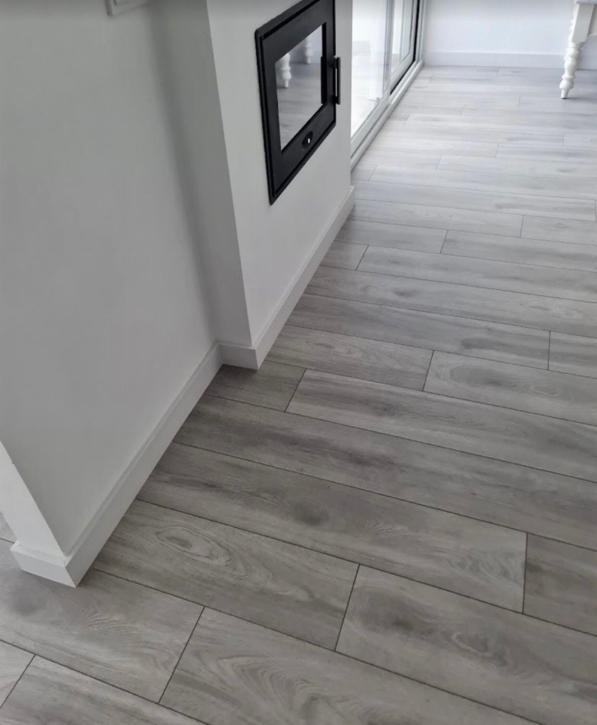
Gray hardwood floors read modern because the color itself is a deliberate choice, not a wood tone that happened naturally. The undertone underneath that gray matters more than the gray itself.
A floor that leans cool, toward blue or green, wants walls that go the same direction: teal, sage, a true gray without warmth.
A floor with warmer gray undertones, closer to taupe, can handle beige or a soft brown without clashing.
Light gray floors stay calmer with lighter walls. Darker or heavily grained gray flooring holds up to bolder color, a deep teal or navy, without the wall feeling like it is floating.
The risk is matching too close: a medium gray wall on a medium gray floor flattens everything. Go several shades lighter or darker, or shift the temperature so the two grays are not the same gray.
In smaller rooms or anywhere the light is thin, I would keep the walls lighter than the floor. The floor already carries visual weight; adding dark walls above it can turn a room into a cave.

SEAMLESS TRANSITIONS - Effortlessly bridge the gap between different flooring types with our advanced adhesive technology. No more tripping hazards or unsightly gaps. Achieve a professional finish.
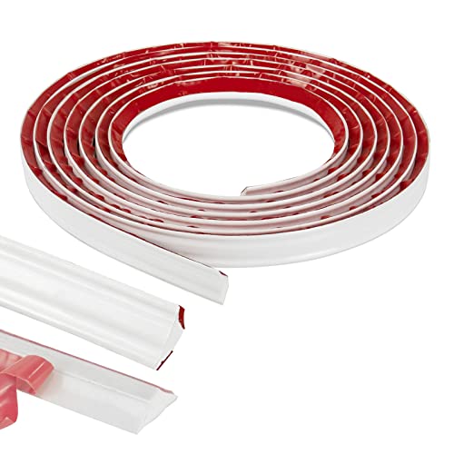
DURABLE AND FLEXIBLE - 3/4inch(width) x 16feet(length) flexible trim, made of high quality PVC material.

Superior Quality: Made of good quality and flexible PVC material, this floor transition strip is highly durable and abrasion-resistant.
8. Black Hardwood Floors
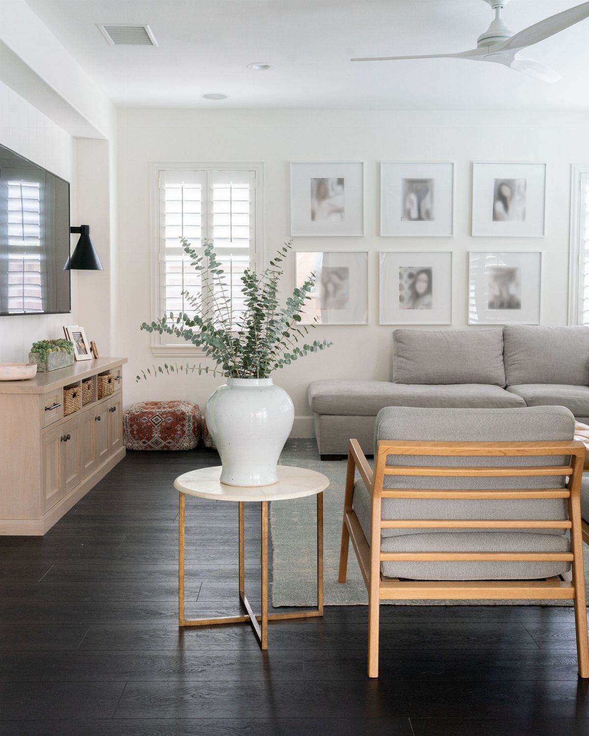
Black hardwood floors swallow light, which is the point. They make a large room feel held together, smaller, more like a place where people actually sit.
The grain still shows through, dark on dark, and that texture keeps the floor from reading as pure void.
White walls are the safe pairing and they work, but the contrast can feel stark without enough soft furnishings to break it up. Light gray walls ease the transition and still let the floor dominate.
In a room with decent windows, either choice stays balanced.
Where the light is scarce, dark walls with black floors turn sullen fast. I have seen it in a north-facing bedroom: the walls were charcoal, the floor was black, and even at midday the room felt like evening.
Lighter walls fixed it, and mid-tone furniture, neither pale nor dark, kept the space from reading as a stage set.
For a deliberate statement, emerald or navy can work against black floors. Keep everything else quiet: simple furniture, minimal pattern, so the wall color does not compete with itself.

Elegant Signature Scent: Royalty features velvety florals and subtle sweetness for a rich, elevated mop soap scent that brings a polished, luxurious atmosphere to your floors and home.

Beach Resort Scent: Brazilian Waves blends ocean breeze, citrus blossoms, and coconut into a warm tropical mop soap that leaves floors smelling fresh, elevated, and clean after every mopping session.

Wood Repair Kit: The wood repair kit includes 12 colors touch up filler sticks (0.7 OZ/20 mL), 12 colors touch up markers, wood repair putty*1(3.5 OZ/ 100 g), wood polishing wax*1 (1.76 OZ/ 50 g), brushes*4, sandpaper*2, sponge*1 and scraper*1, 1 pair of gloves and 2 finger covers. With an ample supply of furniture repair kits, can all your wooden furniture restoration needs to be met
9. Medium Wood Floors
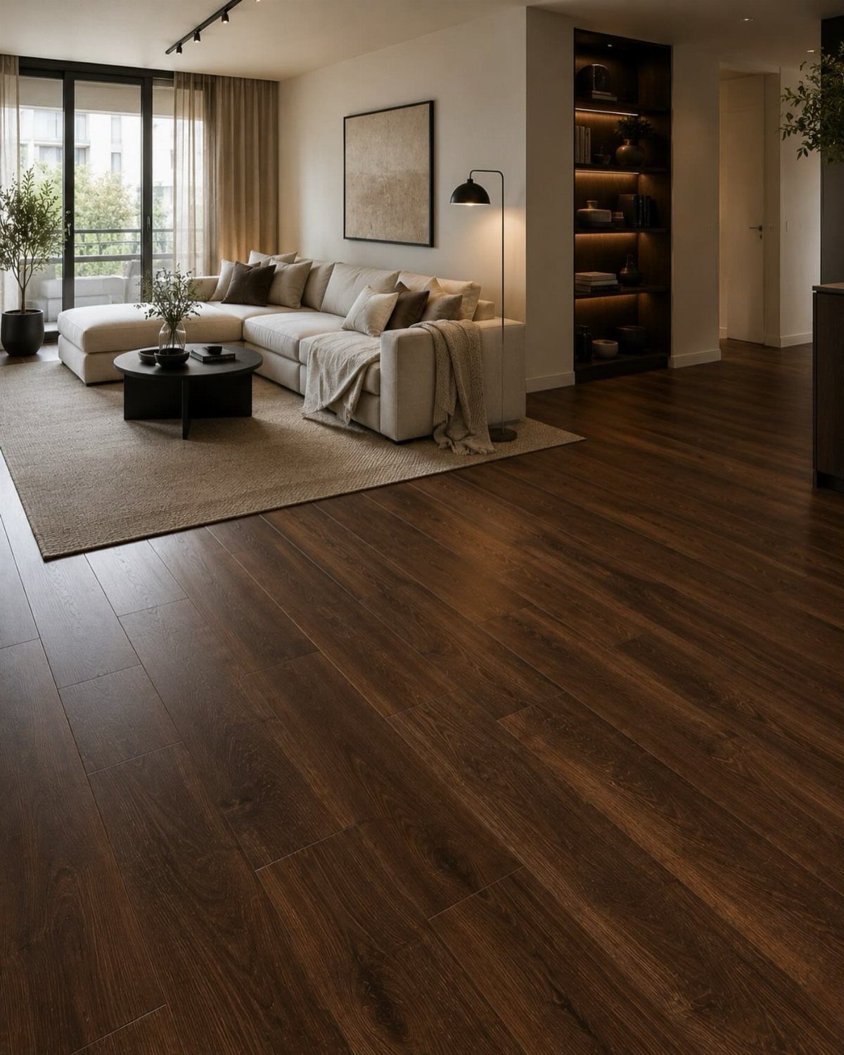
Medium wood floors, the walnut and oak that sit neither light nor dark, carry warmth that can turn orange or red in certain light. That undertone is what the wall color has to answer.
Cream and off-white are reliable because they step back. The more interesting choice is a neutral tinted slightly off-center: a taupe with blush in it, a green grayed down, a gray warmed with barely enough beige to notice.
These colors pick up the floor without mimicking it.
What does not work is fighting the floor’s temperature with a wall too close to its own warmth. Beige walls on warm medium floors, especially terracotta-leaning ones, flatten into one note.
Cooler walls, light blues or dusty greens, create the contrast that lets both colors breathe.
In a small room or one with small windows, the wall needs to read lighter than the floor. The medium wood already grounds the space; pushing the ceiling down with darker color above it shrinks the room further.
Stargazer by Behr is one paint that handles this balance, a cool light tone that opens space without going sterile.
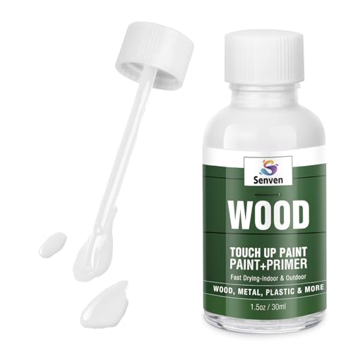
Easy Application: The innovative bottle design features a built-in precision brush, eliminating the need for extra tools. The fine brush allows for accurate and detailed repair of small blemishes and scratches, making the touch-up process effortless and worry-free. Suitable for both beginners and experienced DIY enthusiasts.

【ELEGANT DESIGN & VIBRANT STYLE】This exquisite area rug features a timeless printed pattern and fade-resistant colors to brighten any space. The sophisticated texture adds warmth and luxury, perfect for refreshing your home aesthetic with a premium, contemporary look that complements any decor style beautifully.

【All-in-One Paint Kit with Built-in Brush】: This innovative wood paint combines fast-drying paint and primer in one—no sanding, priming, or top coat needed. Just open the can, remove the seal, and attach the included brush to start your project instantly. Achieve a smooth, professional finish on any wooden surface with minimal prep and no extra tools. Perfect for quick touch-ups or full furniture makeovers.
10. Golden Wood Flooring
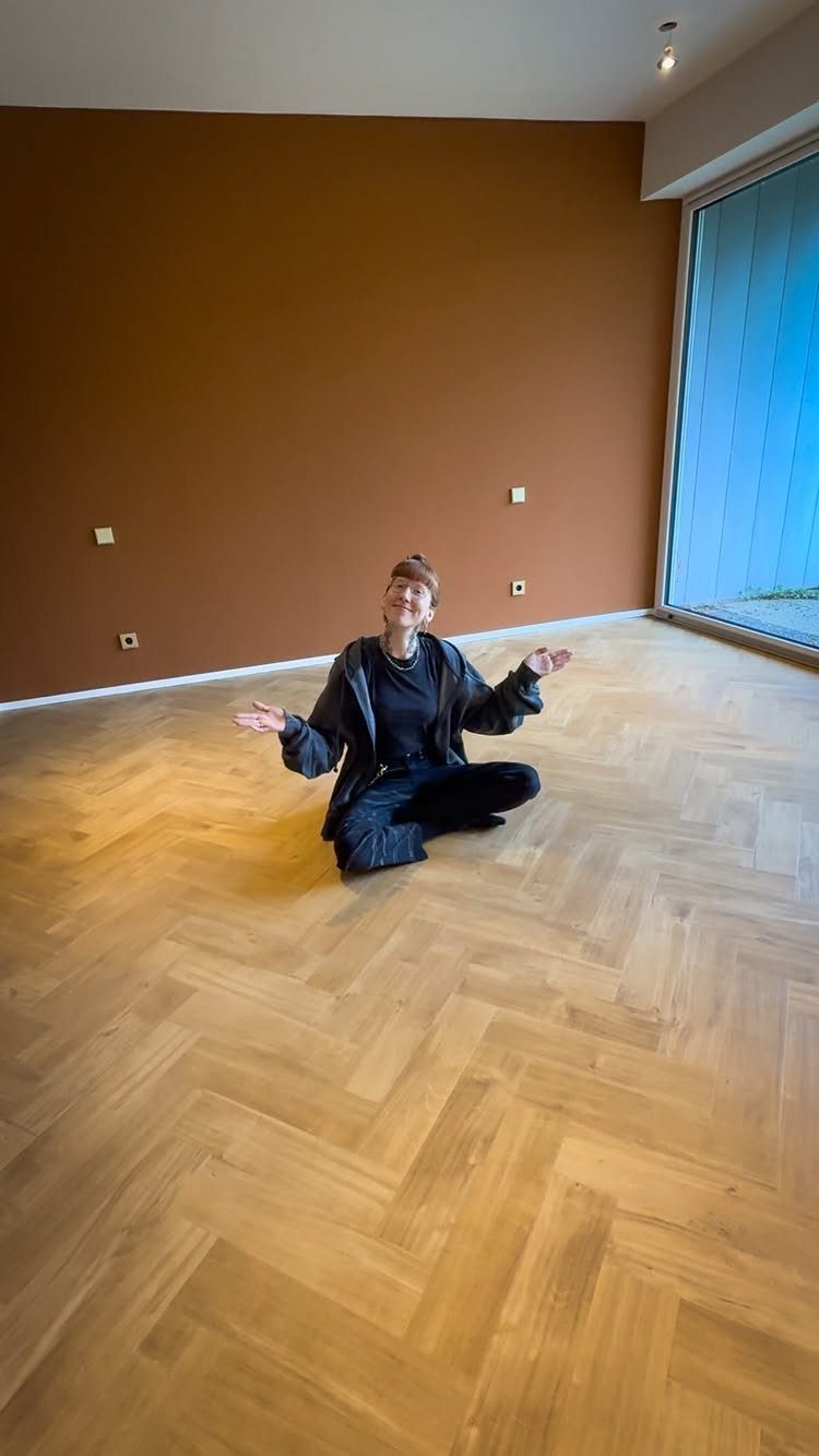
Golden wood floors, the honey and amber tones of maple or red oak, are the hardest wood to complement because every wall color either competes with that warmth or disappears against it.
The floor announces itself; the question is whether the room joins in or steps aside.
To go with the warmth, walls in terracotta, deep gold, or warm brown extend the glow. This works best in rooms meant for evening, living rooms and dining rooms where the light is lower and the mood should settle.
The risk is too much of one temperature, a room that feels like it is all the same breath.
To balance the warmth, cooler walls in soft gray or sage create tension that keeps the floor from dominating. Lighter colors suit kitchens and anywhere the task matters more than the atmosphere.
Herringbone geometry draws the eye on its own, so the wall can afford to be quieter. A plain warm brown, earthy rather than bright, lets the floor pattern stay the story.
I would not add busy art or strong pattern to a wall facing golden herringbone; the floor is already doing that work.

Safety And Non-Slip Rugs: Our area rug is made of the highest quality polyester fiber, and the non-slip TPR backing helps the carpet stay in place and hold the floor firmly, protecting your children and elderly from slipping and falling.

Classic Vintage Aesthetic: Featuring timeless traditional persian medallion floral patterns with a sophisticated faded distressed finish, this living room rug brings warm, vintage charm to your home. Perfectly blending with rustic farmhouse, boho, or modern vintage home decor, it instantly enhances any room — making it an ideal 8x10 area rug for living room, bedroom, dining room, home office, or as an cozy focal point for nursery spaces.

Thick, plush 0.5" pile height. 100% polypropylene power loomed in Turkey. Stain resistant and fade resistant. 100% jute backing is safe for wood floors. Extremely durable and very easy to clean, made to last for years.
11. Flooring and Wall Color Coordination
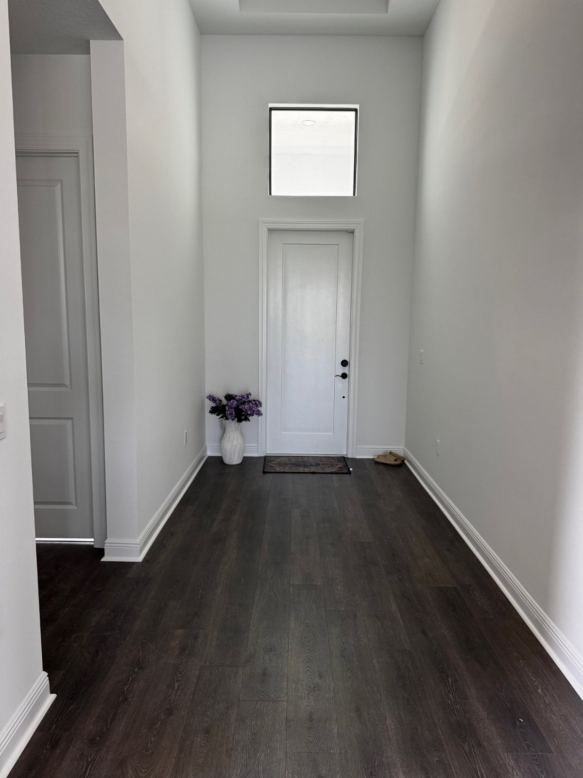
Choosing floor and wall color as a pair, rather than fixing one and hoping the other complies, saves the cost of repainting or regret.
Three approaches cover most situations. A monochromatic scheme keeps everything in one color family: light gray walls, medium gray floor, varying only in depth.
An analogous scheme moves next door on the color wheel, warm beige walls with golden floors, or cool gray walls with slate tile.
Pairing opposites for contrast is the simplest route; a dark floor and white wall is the most common version.
The mistake is treating the floor as a given and the wall as decoration. In a narrow hall like this one, the dark floor grounds and the light wall recedes, which makes the space feel wider than it is.
Reverse them and the hall closes in. The same logic applies to any room: the two colors are in conversation, and one should lead while the other follows.
If the wall color and the floor color don’t work well together, it can throw the whole room off. With wood floors, the grain, variation and undertones make it even more critical to select the best wall color to compliment them.
12. Using Textures for Interest
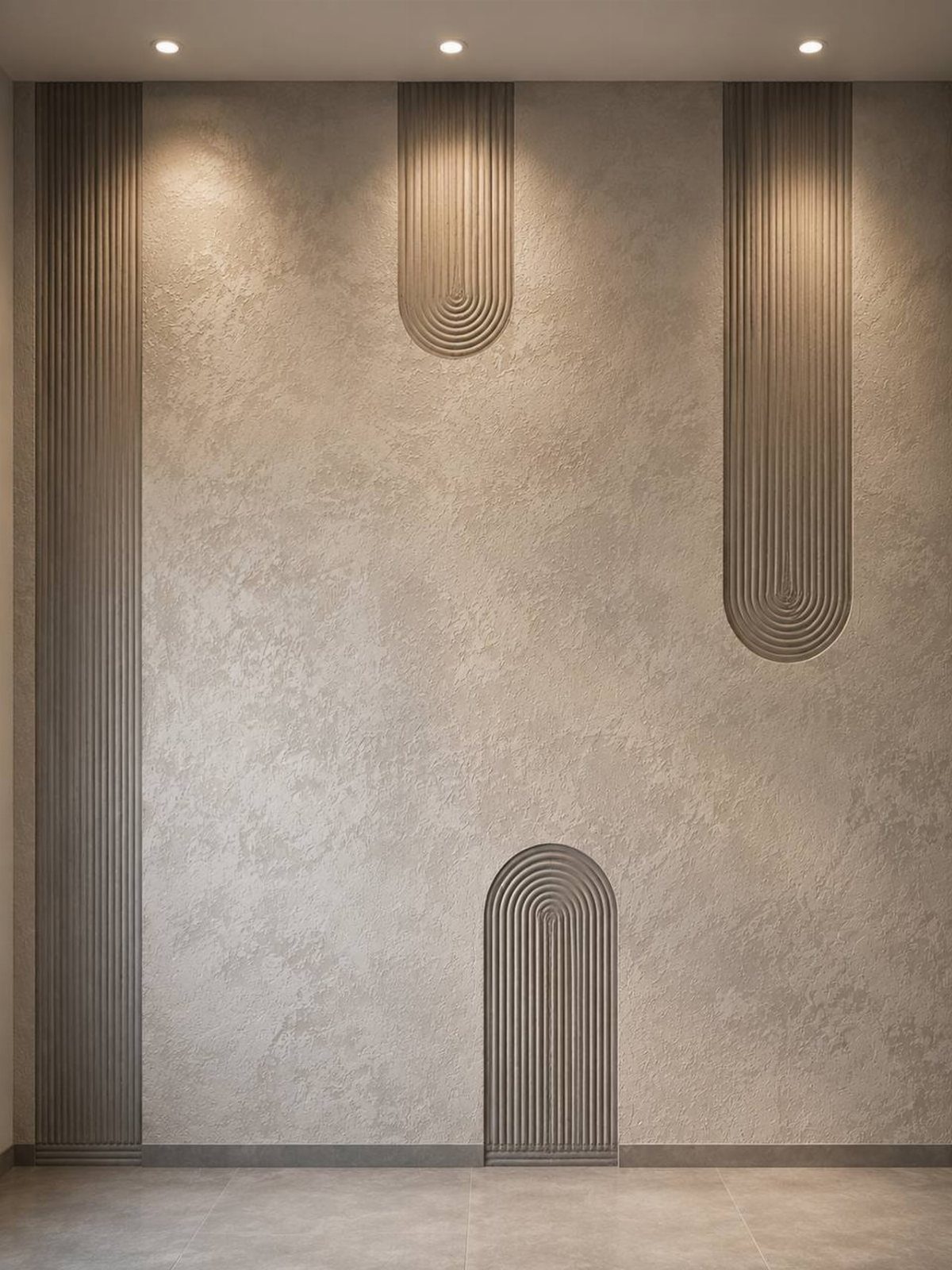
Texture does what color cannot: it creates interest without adding another hue to fight with.
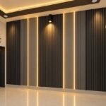
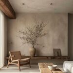
Fluted wall panels and plaster finish stay within one warm range, beige on beige, yet the room does not read as flat because the surfaces catch light differently.
Mixing textures means pairing the deliberate with the plain. Chevron tile and striped wallpaper can live together when the scales differ enough that your eye reads them as separate events.
Wood plank floors with floral curtains risk busyness unless one pattern is large and the other small, or one color is quiet enough to recede.
The safer move, and the one I would try first, is one strong texture and one smooth surface: a textured grasscloth wall with a plain geometric rug, or a fluted plaster wall like this one with simple large-format floor tile.
When the floor itself carries visible grain, wide planks, or hand-scraped texture, it becomes the anchor. The wall can echo that warmth or soften against it, but it should not introduce competing texture at the same intensity.
Let one surface speak and the other listen.
13. Color Swatches Against Flooring
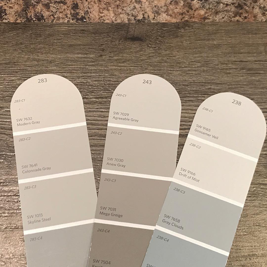
Paint chips look different in your hand than they do on a rack. Laying candidates flat and stepping back to the distance where wall color actually lives tells me more than holding them at arm’s length.
Morning light and evening light split the vote more often than you’d expect, so I photograph each pairing and flip between them after dinner. A swatch that looked safe in morning light often looks flat by lamplight.
For renters, this beats committing to a gallon; for first-home owners, it saves the do-over that taught me to start here.
14. Gray Tile with Neutral Walls
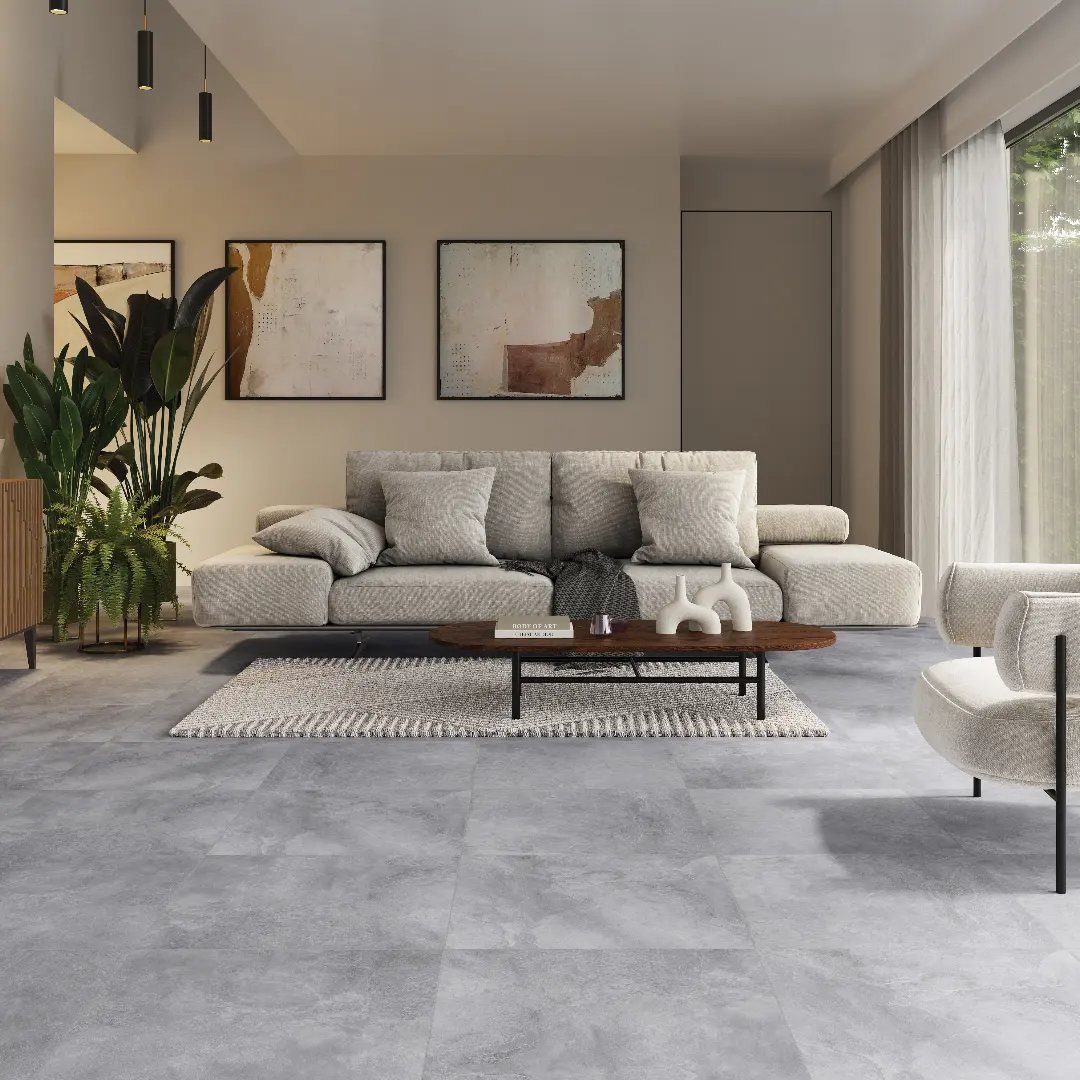
Large-format gray tile carries the visual weight of concrete without the coldness, which matters when your walls are doing the softening work.
Beige walls with abstract pieces above the sofa keep the room from reading like a showroom floor; the tile provides the structure, the walls provide the invitation.
I would skip this if your furniture runs dark, since the floor already anchors the room and you need something lighter to bounce against it.
For north-facing spaces, the gray can turn steely, so test a sample where the light actually hits before you order. The result is a living room that feels considered without feeling decorated.
15. Monochromatic Light Gray Tile
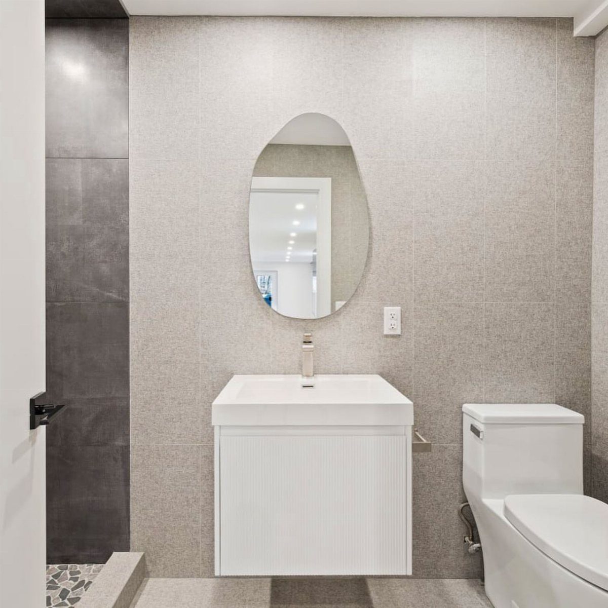
Matching tile wall-to-floor asks more of your grout choice than your tile choice. Light gray tile reads as one continuous surface when the grout disappears; a shade darker would fracture the plane into checkerboard.
I learned this in a rental bathroom where the landlord picked medium gray grout against light gray tile, and the result looked like a spreadsheet.
For this monochromatic read, order samples of two grout colors lighter than you think you need. Texture on the tile helps too, catching light differently on walls than on floors so the room does not flatten into a cube.
Small bathrooms benefit most; the unified surface pushes walls outward visually.
16. Polished Marble Floors with Cream Walls
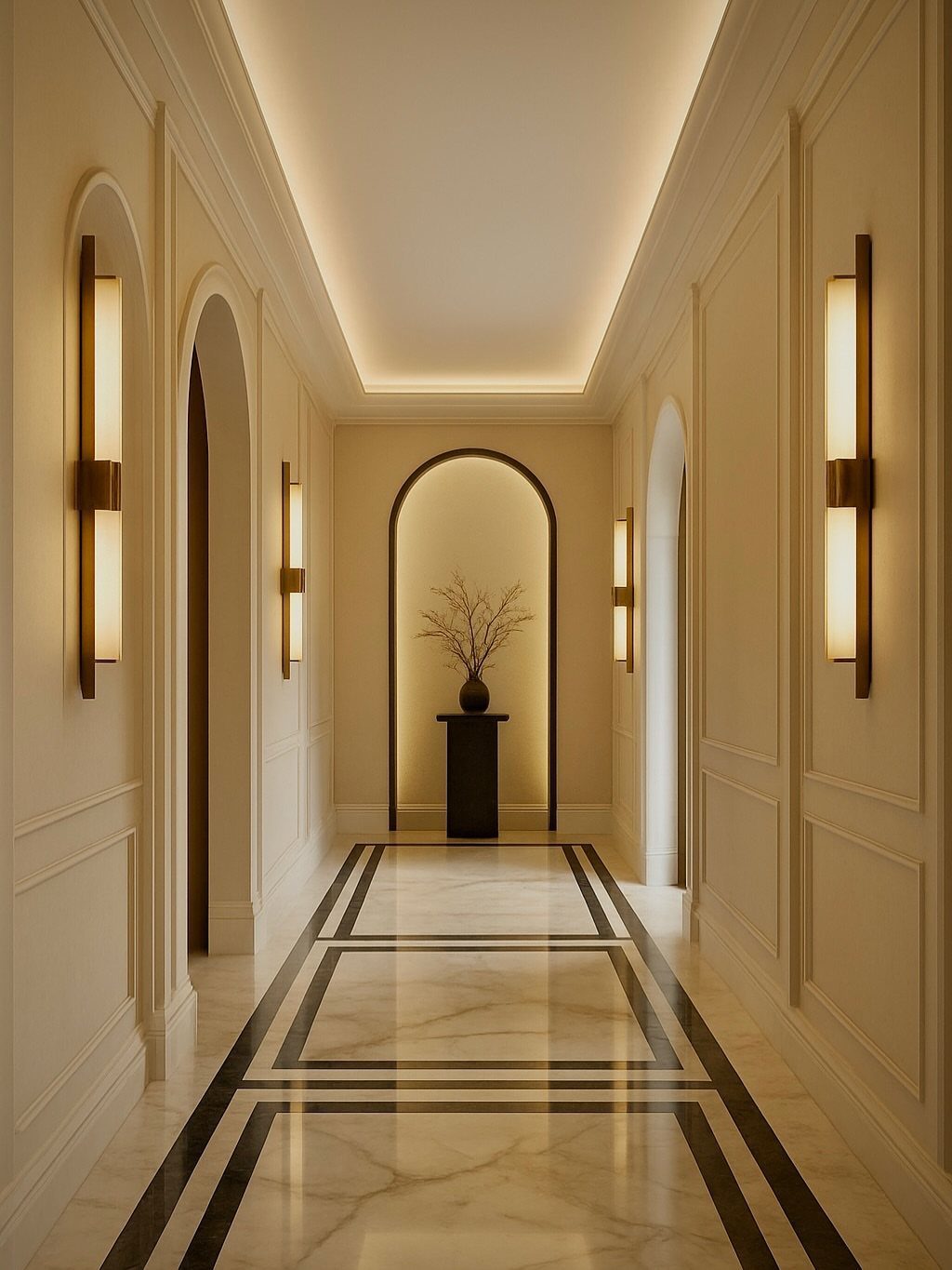
Polished marble with black border inlay is not a floor you stumble into on a starter budget. Cream paneled walls here know their job: they step back so the floor can perform.
In my own older home, I would fake this hierarchy with honed limestone-look porcelain and flat-panel walls in Benjamin Moore’s "White Dove" at half strength, which reads cream in afternoon light.
Real marble demands regular sealing and winces at heel marks; the cream walls show nothing. For anyone with actual marble, matte walls in a warm white balance the gloss without competing.
This hallway justifies its grandeur; in a starter apartment, the same floor would feel like costume jewelry.
17. Teal Herringbone Walls with Dark Floors
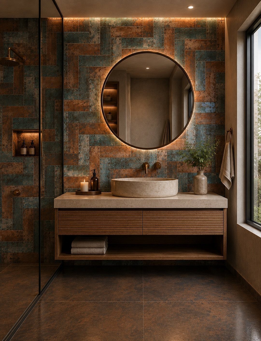
Teal herringbone on one wall, dark brown underfoot: this bathroom commits so the rest of your life does not have to.
The copper tones threading through the tile warm what could read as pool-water cold, and the dark floor grounds the whole performance.
I would not attempt this with standard subway tile; the herringbone labor costs more, and cheap material betrays the pattern. For a rental, peel-and-stick herringbone in a muted teal exists now, though the color shifts toward turquoise in some lights.
The floating vanity matters too, its wood tone picking up the floor so the room holds together. Best for a primary bath you see first thing in the morning; guest baths get this treatment when the budget allows.
18. Dark Floors with White Walls
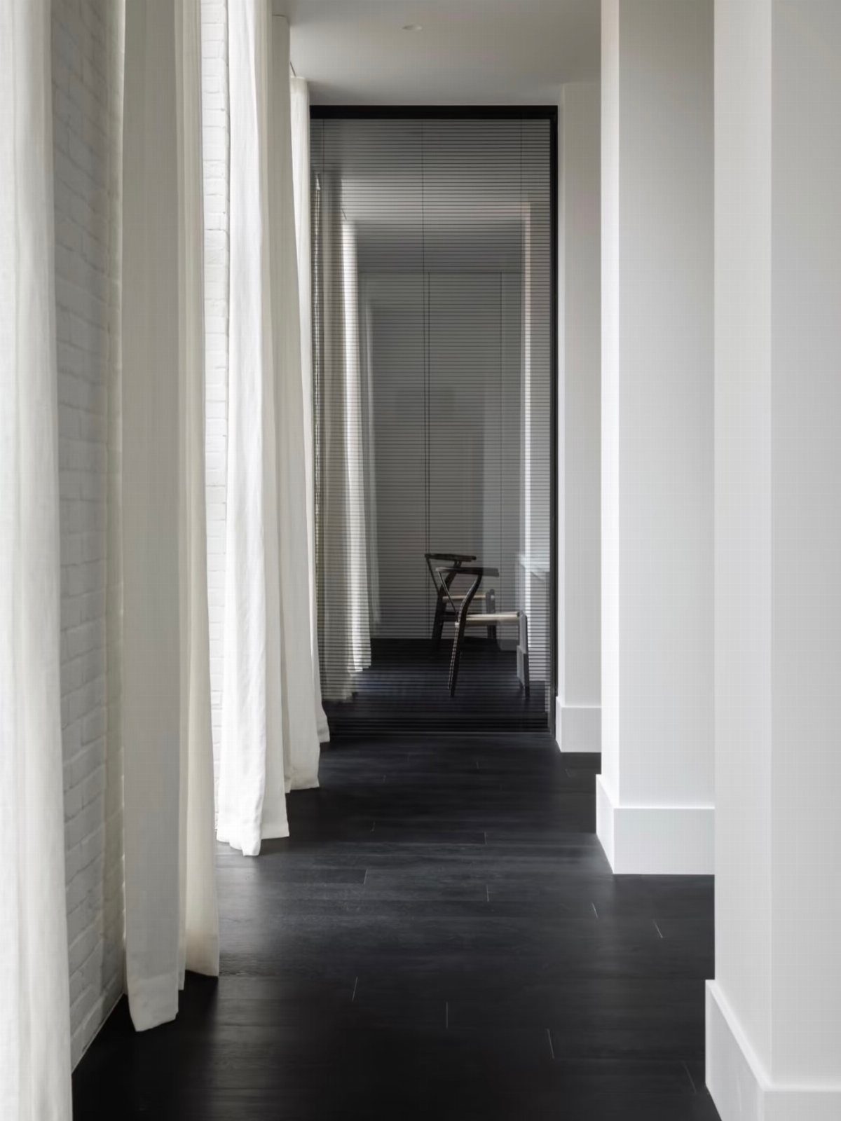
Dark floors with white walls is the combination I recommend when someone wants to look like they tried without having tried very hard.
Black wood absorbs light, white returns it, and sheer curtains soften the exchange so the room does not feel like a photograph.
This pairing hides dust better than medium wood, and white walls forgive scuffs that would show on deeper colors. The risk is sterility, which curtains solve, or a wood accent piece, or even a single warm gray throw.
For renters stuck with dark laminate already in place, this is the fastest path to intentional: one coat of white paint, one set of sheer panels, done by Sunday evening.
19. Herringbone Wood with Neutral Walls
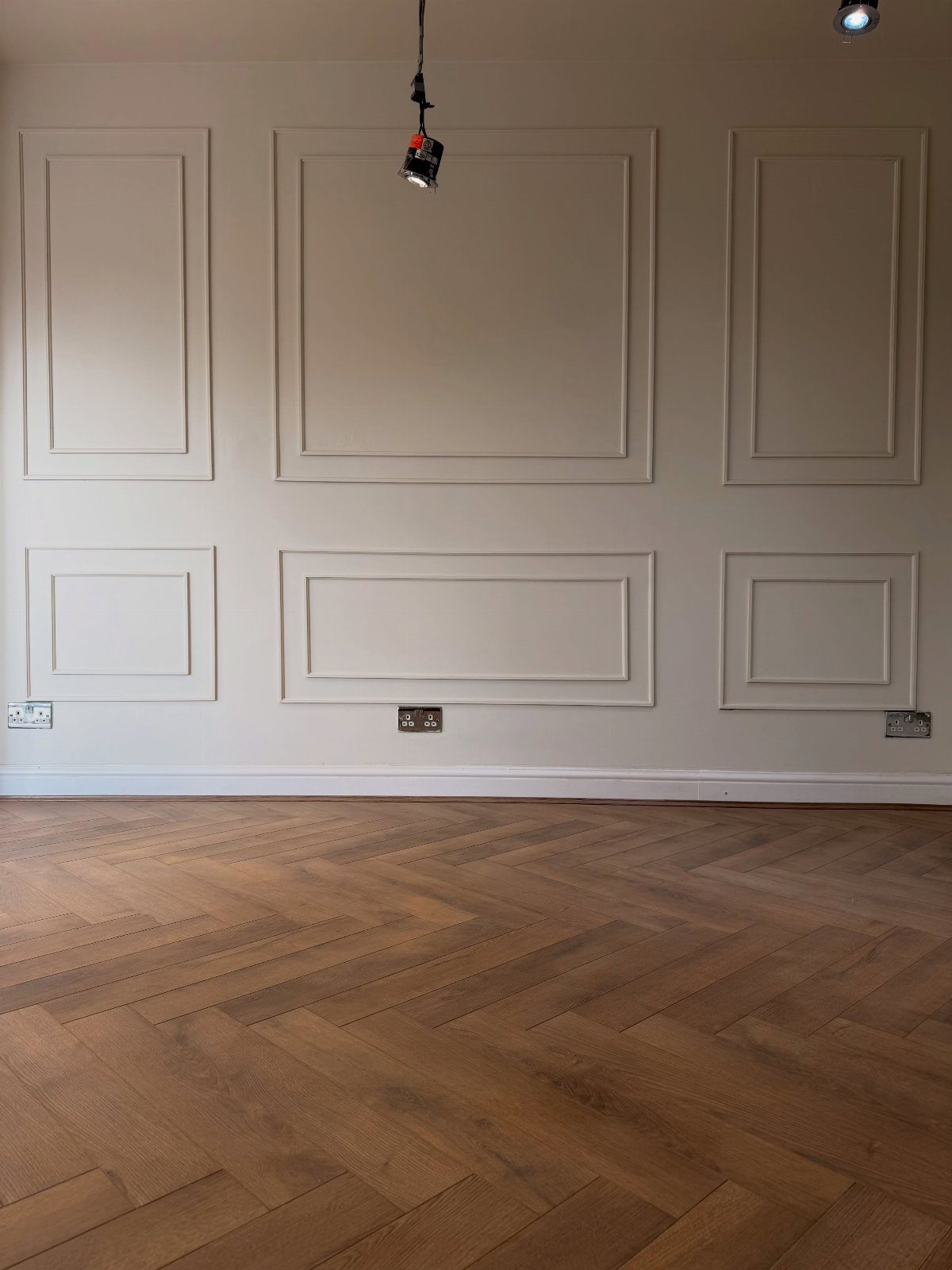
Herringbone wood floors read as the detail in a room, not the whole statement. The angled grain catches light differently than straight planks, and neutral walls let that geometry do the work without competing.
Beige with warm undertones softens the formality that herringbone can carry. Wainscoting painted to match keeps the eye moving across the wall instead of stopping at a color break.
I’d put this in a dining room or entryway where people pause long enough to notice the pattern. In a space you walk through fast, the extra labor of herringbone gets lost.
20. White Marble Floors with White Walls
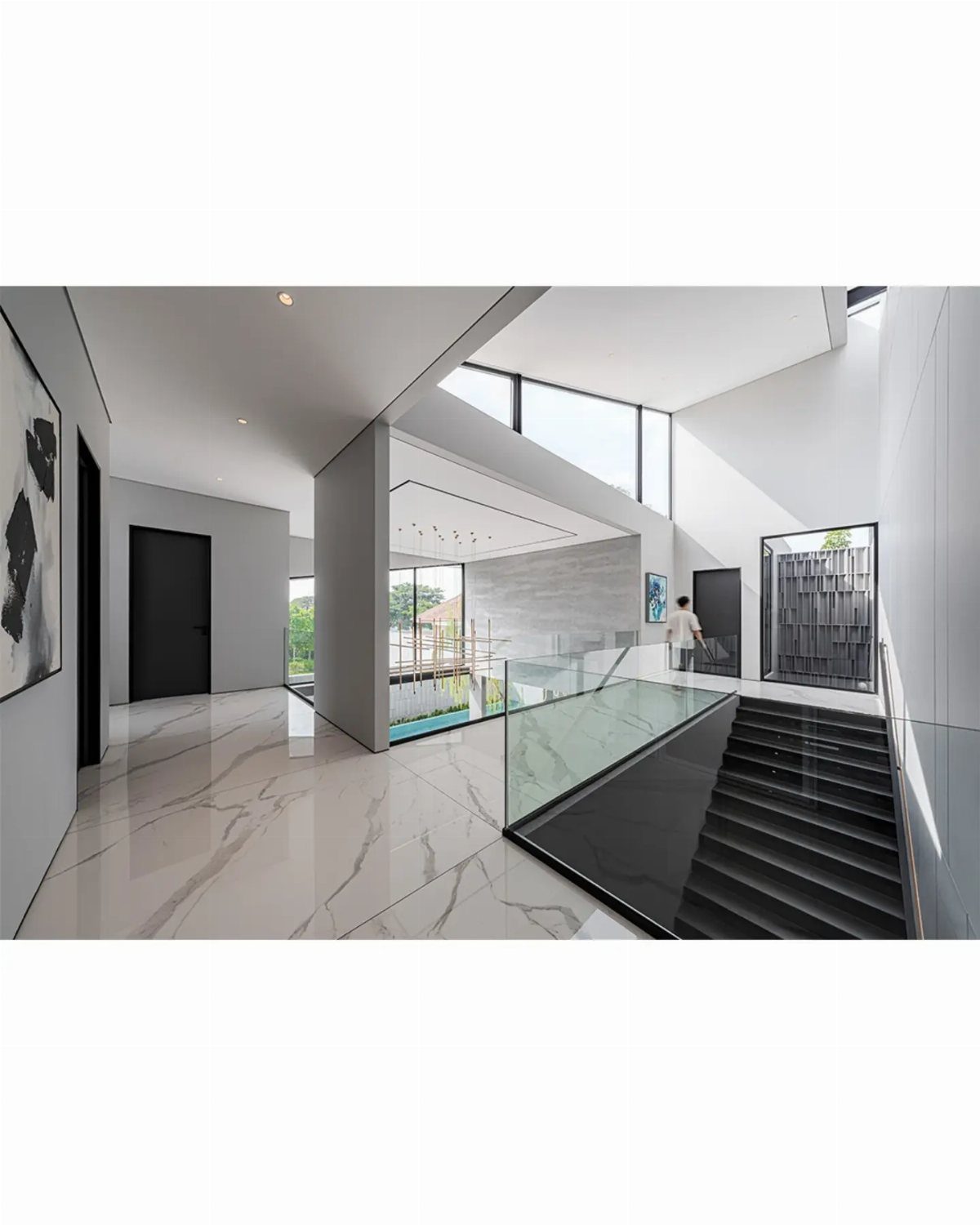
White marble with grey veining on both floor and wall risks turning clinical unless something breaks the rhythm. A black staircase does that work; in a home without architectural drama, you’d need to add it yourself.
Glossy marble reflects light upward, which helps in rooms with limited windows. It also shows every footprint and drip, so the white-on-white choice demands more maintenance than most weekend schedules allow.
A single contrasting element carries this better than scattered color. One black piece, one dark wood piece, then stop.
21. Light Wood Floors with Beige Walls
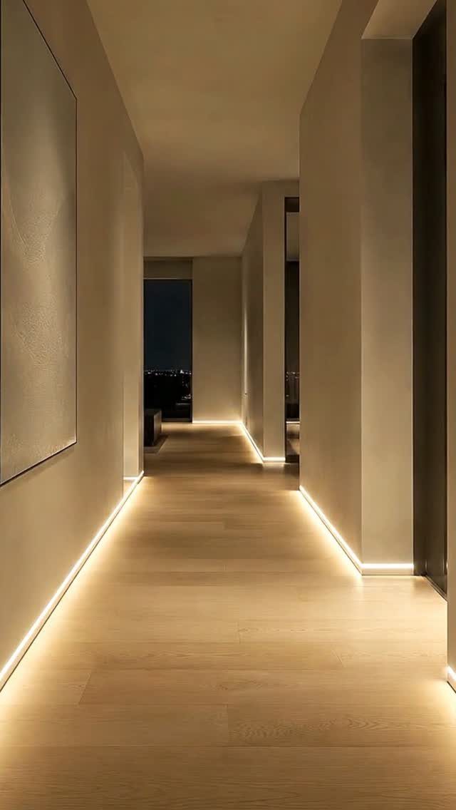
Light wood and beige read as one warm note stretched across a room. Baseboard lighting makes the point: this pairing is about how the surfaces receive light, not about contrast between them.
LED strips at floor level install in an afternoon with basic tools. The glow turns the floor itself into a fixture and keeps the walls from going flat in evening hours.
This suits long corridors and open plans where you want one continuous envelope. In a small room with furniture against every wall, the effect gets blocked and the palette can feel unfinished.
22. Dark Wood with Beige Walls
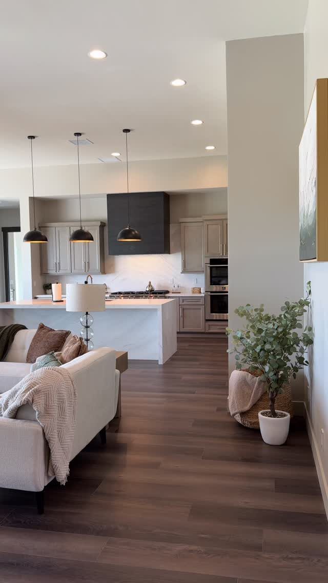
Dark wood floors with beige walls split the difference between drama and ease. The floor anchors the room; the walls keep it from feeling like a stage set.
Open plans benefit most. The dark flooring unifies kitchen and living areas that read as one space, while beige keeps sightlines soft across the whole stretch.
In a closed room, I’d want more wall color to define the edges.
Scratches show more on dark wood; the raw wood beneath reads lighter against the stain. If you have dogs or heavy foot traffic, the maintenance cost is real and ongoing.
23. Marble Floors with Light Blue Walls
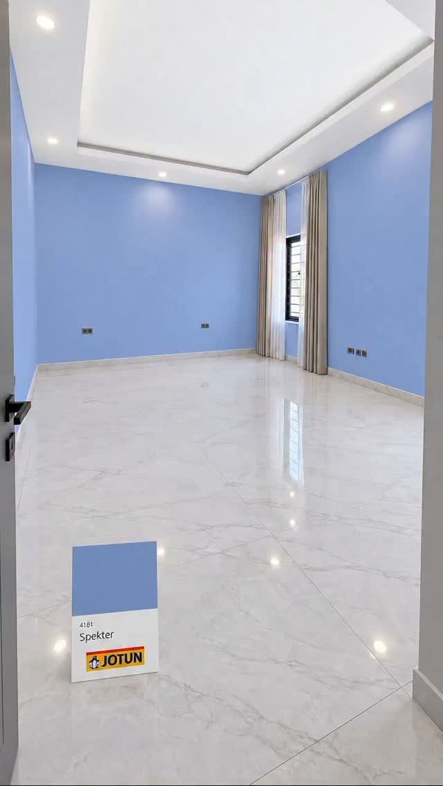
Light blue walls against white marble pull cool tones through the whole room. The veining in the marble does the connecting work; the paint just has to stay in the same watery family.
Polished marble reflects the wall color upward, so the blue reads more intensely than it would with matte flooring.
Test your swatch at floor level, not just eye level, and check it at night under the ceiling fixtures you’ll actually use.
This pairing suits bathrooms and entry halls, spaces where you pass through rather than settle. In a living room, the coolness can feel withholding over long hours.
24. Teal Walls with Light Wood Floors
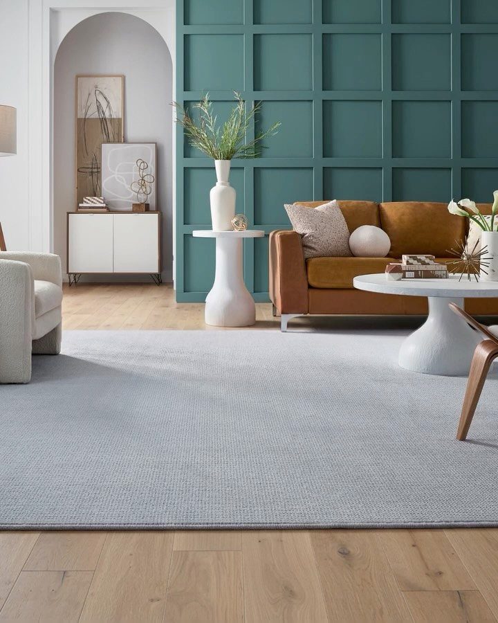
Teal this deep needs the relief of light flooring underneath. The wood keeps the wall from reading as a cave, and a rug softens the transition so the contrast doesn’t jar.
Paneling adds shadow lines that make the teal shift across the day. Flat paint on a flat wall would go dull; the boards give the color something to do.
Light wood shows fewer scratches than dark, which matters in a living room with regular traffic. I’d choose this for someone who wants one bold move and the rest easy to live with.
25. Dark Hardwood with Light Grey Walls
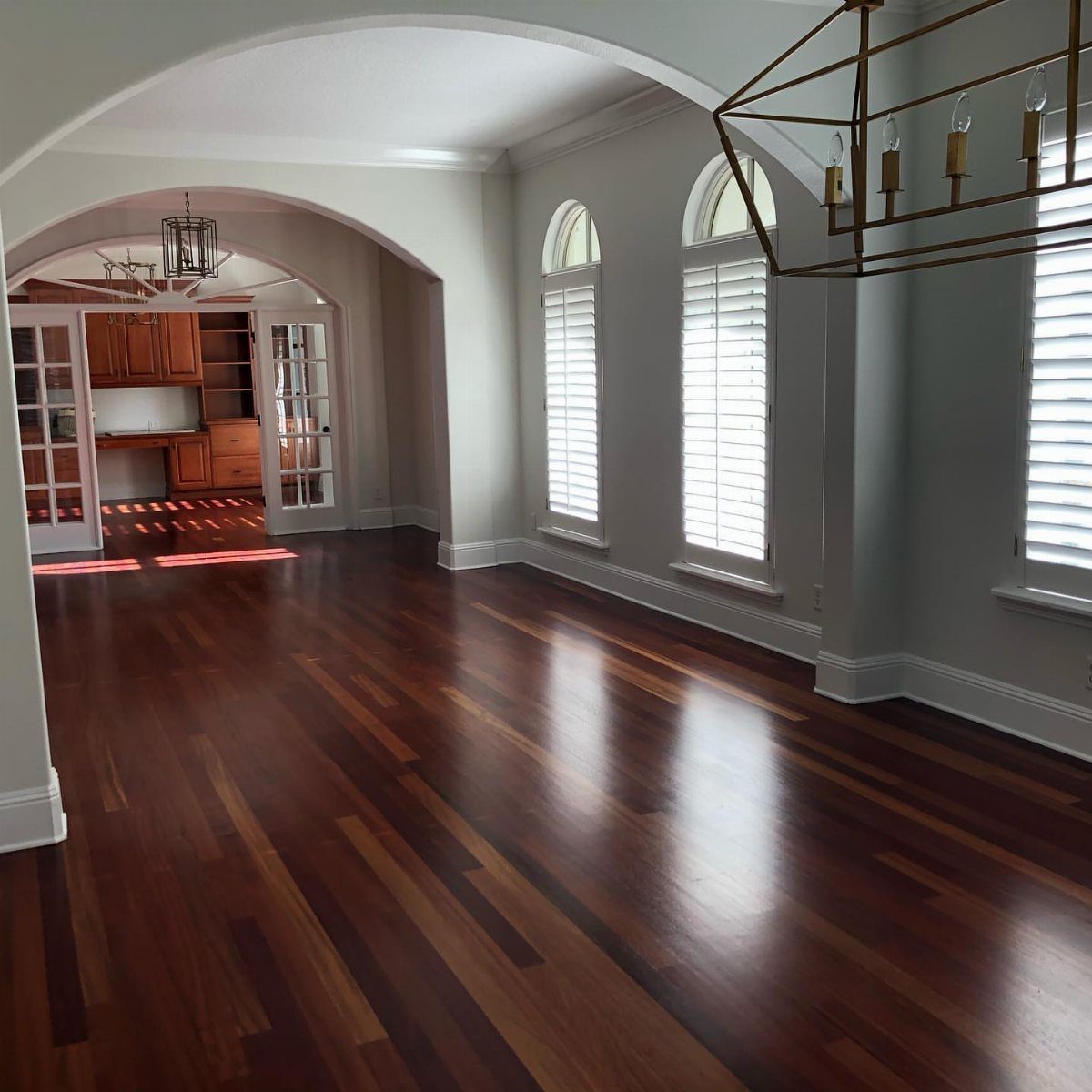
Dark hardwood with light grey walls is the combination to reach for when a room needs to feel settled without feeling heavy.
The grey reads as a color without committing to one, and against a polished dark floor it gives just enough contrast to let the wood feel intentional rather than apologetic.
Scratches show more readily on dark floors than light ones, since a typical gouge cuts through to the lighter raw wood beneath.
Felt pads matter more with dark hardwood than with natural-toned planks, something to keep in mind when placing furniture.
For warmth, I would pick a greige over a cool grey in a north-facing room, and keep trim simple rather than competing with the floor’s own statement.
26. Dark Marble Floors with Beige Walls
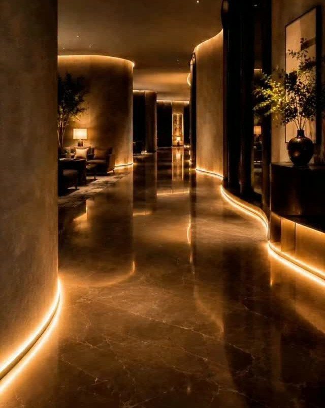
A curved hallway of dark marble and beige walls only works because the lighting is doing the actual work.
Warm LED strips at the baseboard level cast upward and bounce off the polished stone, so the beige reads golden rather than flat. Without that intervention, the same pairing can feel like a hotel corridor from two decades ago.
I would not attempt this in a rectangular room with standard ceiling height; the curve and the low glow need space to read as luxury rather than maintenance tunnel.
The marble wants to be reflective, which means daily dust shows immediately, but the trade is worth it if the household can manage the upkeep.
For a softer version, honed marble with the same lighting and a warmer beige wall loses some drama but gains livability.
27. Light Brown Floors with White Walls
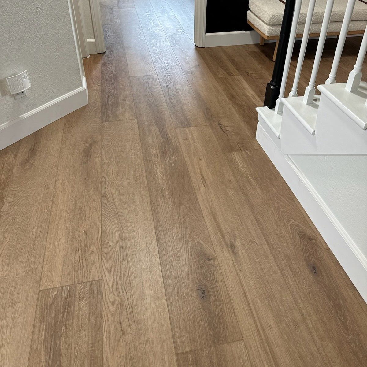
Light brown floors with white walls is the combination I would hand to anyone paralyzed by choice. It brightens without feeling sterile, and the brown adds just enough warmth that the white does not read as absence of decision.
Wood-look laminate in this tone handles the high-traffic reality better than the price suggests, though I would check plank width against the room size; narrow planks in a wide space can feel busy.
Baseboards in white rather than matching wood keep the eye moving up the wall, which matters in a hallway where the flooring runs long and the ceiling sits at standard height.
For variation without complexity, a muted pastel or soft taupe on one wall breaks the rhythm without breaking the budget.
Importance of Natural Light
Morning sun and afternoon sun are different colors, and your wall will argue with one or the other. South-facing rooms get blasted with warm light all day, which means most colors look more saturated than they are on the chip.
East and west rooms split the difference: warm in the morning or afternoon, cool the rest of the day. A color that looks perfect at 10 a.m. might turn muddy by dinner.
I would test paint on the actual wall and check it at three different times before buying the gallon.
Small rooms with thin light need one element to stay light. Dark floors and dark walls together will close the space in.
Pick one to carry the weight and let the other reflect what light you have.
Role of Furniture in Design
Furniture sits between the floor and the wall, and it can either bridge the gap or fall into it. A bold piece, an emerald sofa or a cognac leather chair, needs neutral surroundings to read as intentional rather than accidental.
Let the furniture be the statement and keep walls in soft cream or warm gray.
If your furniture is already neutral, you have the opposite choice.
Wood furniture on wood floors risks reading as a single block. A wall color that sits between the two wood tones breaks them apart so your eye reads them separately.
With gray floors, pale wood warms the space and black metal cools it; both work, but they send different messages about what kind of room this is.
Avoiding Overwhelming Spaces
Splitting color into three parts, about 60, 30, and 10 percent, keeps a room from feeling like a single shout. Sixty percent of the space stays dominant, usually the walls and floors; 30 percent secondary, often furniture; 10 percent accent, a pillow or a vase.
Break that balance and the eye has nowhere to rest.
Without textiles or mid-tone furniture, the room reads as a set rather than a place people live.
Low contrast, beige on cream, is easier to live with but risks flatness; there, texture has to do the work that color otherwise would.
A citrus orange or bright fuchsia wall against clean white tile reads loud in a way that feels more sterile than inviting.
If you are set on the color, darker grout, black or charcoal, grounds the brightness and keeps the tile from looking like a laboratory. The color gets to stay; it just needs something heavier underneath it.
Frequently Asked Questions
What is the best color combination for floors and walls?
Tone-on-tone and contrasting combinations both work, depending on what the room needs. A monochromatic scheme, like light gray walls with medium gray floors, keeps things calm; pairing opposites, such as dark floors with white walls, adds definition.
The floor should anchor while the wall either recedes or responds, not compete.
Should walls and floors be the same color?
No, matching them exactly flattens a room into one note. A floor and wall in slightly different tones give a room more depth than a single color wrapping every surface.
A medium gray wall on a medium gray floor erases the boundary between vertical and horizontal, so go several shades apart or shift the temperature.
Should the bathroom floor be lighter or darker than the walls?
Lighter floors usually win in bathrooms because they enhance the sense of space. Dark floors can work, but they need lighter walls to keep the room from feeling closed in.
In a primary bath with good light, a dark floor with teal herringbone walls can hold together if the vanity tone bridges the two.