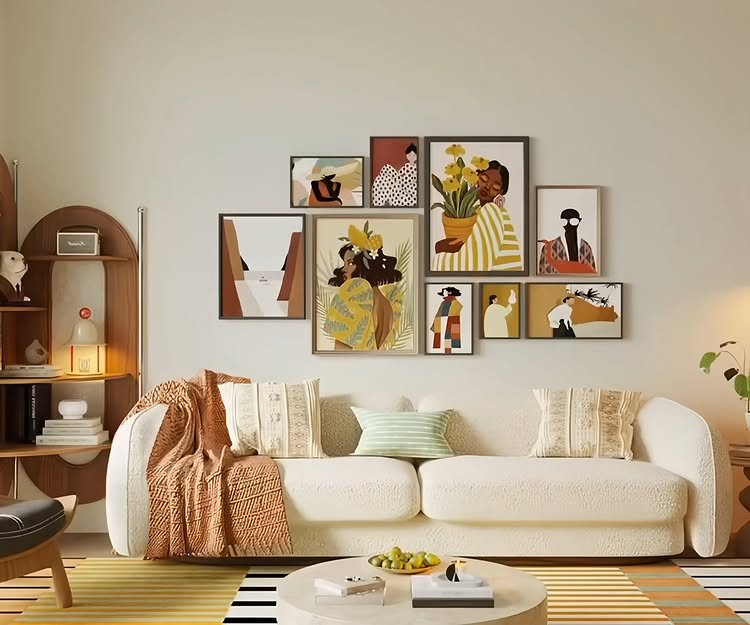
Wall decor design can run from a single woven basket to a full stone veneer installation that needs a mason, and the deciding factor is not budget but whether you own the wall or just the holes you leave in it.
Renters leaning a mirror or hanging lightweight rattan can strip it all back at move-out; owners driving screws into studs for slat paneling or a built-in entertainment unit are building for the long haul.
The post below includes both paths, starting with a gallery wall that lives or dies by spacing measured in fractions of a sofa’s width.
[link-whisper-related-posts]1. Artwork Gallery Wall
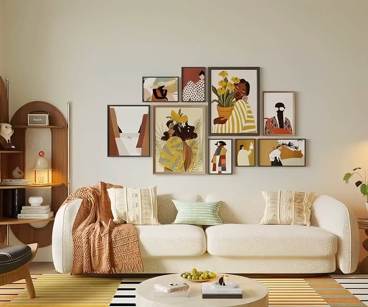
A gallery wall lives or dies by spacing, not by the art itself. Most people hang pieces too far apart and the eye reads them as lonely singles instead of one shape.
Start with a single large anchor piece, about two-thirds the width of the sofa below it, then build outward with smaller frames held close together. Paper templates taped to the wall beat holes every time.
Rotate seasonally if you keep a storage bin; the holes stay put, the mood changes. This suits renters who own a drill and a level, not people who want it done fast.
One misaligned frame ruins the whole grid, so patience is the real material here.

Complete Funky Picture Gallery Set: this 8 pieces wavy colorful frame set offers a complete gallery wall solution to transform your space; It includes one 8 x 10 inches frame, two 6 x 6 inches frames, one 4 x 4 inches frame and four 4 x 6 inches frames, allowing you to create an eclectic and fun inspired gallery wall in your living room, bedroom, dining area, or hallway

MULTIPLE FRAMES COLLAGE: Bulk of 5 pieces picture frames set in the same sizes. Perfect for pictures 8x10 with mat or 11x14 without mat. The frame opening display size will be 0.5 in smaller than the photo to hold the photo in place

Modern Minimalist Style: Our Picture frames are carefully packaged with minimalist art in mind, featuring natural colors such as black, white, and brown. Whether used as wall hangings or desk decorations,the gallery wall frame set is suitable for all seasons. We prioritize the perfect balance of aesthetics and functionality, ensuring a comfortable and natural experience for our customers.
2. Wall Sconces
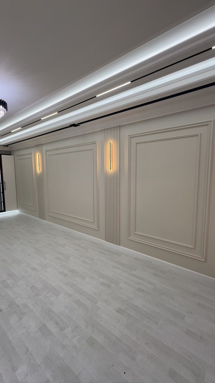
Linear sconces mounted on fluted pilasters turn a flat wall into architecture without carpentry. The light grazes the surface and picks up every vertical line, which is why textured backing matters more than the fixture price.
Install at eye level, measured from floor to center, and wire for a dimmer if possible. The same sconce at full brightness reads office; dimmed low, it reads evening.
This works best on walls that already have some relief: board and batten, slat paneling, even heavy texture. On flat drywall the effect falls flat too.
Budget per fixture varies widely, and check whether your box location hits a stud; retrofitting power down a wall is where costs balloon.

【Creative Design】This living room wall sconce features a naturalistic style, with a metal disc reflecting a warm glow. The combination of simplicity and light luxury exudes a warm and elegant atmosphere, not only presenting a modern and light luxury texture, but also filling the space with a romantic atmosphere. It pays more attention to the visual experience of space, with a strong sense of fashion, making your home more outstanding.

ELEGANT FLOWER GLASS & CRYSTAL ACCENT:Crafted with clear glass shade and a sparkling crystal bead detail, this wall sconce diffuses breathtaking light waves, blending French vintage style with modern luxury

Wireless & Easy to Install: Depuley wall sconces set of two battery operated with two E26 USB charging led bulb, say goodbye to outlet and wired limitations, only takes 20 min to install. Our sconces wall decor set of 2 will elevate your room with a sleek and modern design. Great for halloween decoration.
3. Mirrors
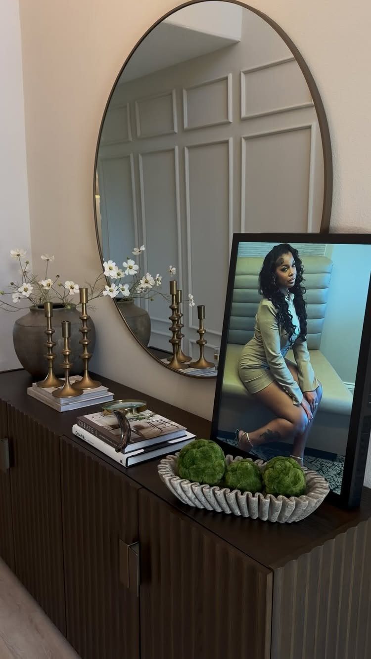
A mirror above a console does two jobs: it throws window light deeper into the room, and it doubles whatever vignette you build below it. A round mirror softens a hallway or entry that might otherwise feel like a corridor.
Leaning works if the base is deep enough and there are no small children; hanging is safer and sits closer to the wall. For either, scale to the furniture beneath it, not to the wall width.
A mirror wider than its table looks top-heavy.
Oversized rounds suit entries and bedrooms where you want quiet, not statement. Cleaning is the downside; fingerprints show on every curved edge.
I’d pick aged or antiqued glass for a busy household, since the mottling hides what perfect reflection broadcasts.

Gold 16x9.2 inch Oval Mirror: Gold PVC Plastic frame of wall mirror, simple and modern design, high-definition imaging without distortion, suitable for any room, bathroom, bedroom, living room, hallway, entrance, etc.
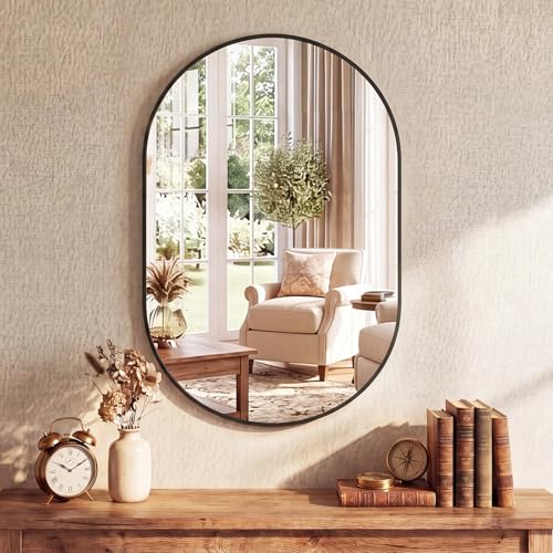
【Premium HD Tempered Glass】Experience a flawless 1:1 reflection with our bathroom mirror for wall. The high-definition tempered glass is shatter-resistant and safer than normal glass, providing clarity that makes your daily routine more precise

Unique And Design : This irregularly oval shaped mirror is a wall decoration. The modern asymmetrical design is an artistic display in itself, both simple and sophisticated, for the living room, bedroom or hallway
4. Floating Shelves
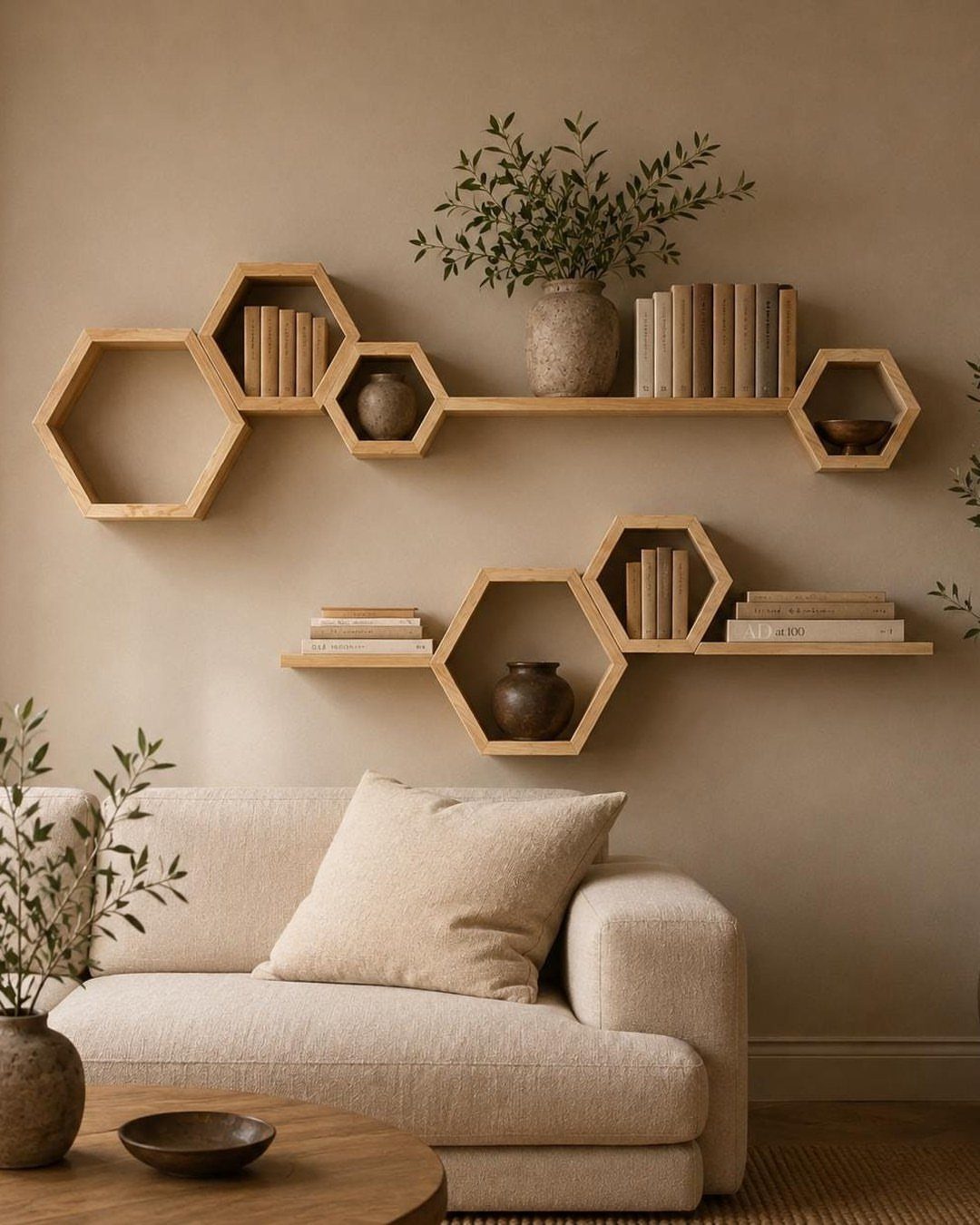
Hexagonal shelves break the rectangle habit that makes most floating installations look like afterthoughts. The geometry forces you to edit: a round vase, a stack of small books, a single trailing plant.
Clutter looks intentional on a straight plank; on angles, it just looks messy.
Mount into studs or use toggle bolts rated for the load; the visual weight is light but books are not. Stain to match existing wood tones or paint to disappear against the wall.
These suit renters who can patch small holes later, not people who want to swap weekly. The honeycomb reads modern; for traditional rooms, straight ledges in stained oak are the safer bet.
Cost per hexagon adds up fast for decent plywood construction.

[Quality Material] These round wall decorations are mainly made of woven grass. They are not easy to deform or fade and are hand-woven. The surface pattern is smooth, orderly, safe and wear-resistant.

Set of 12 decorative baskets: The Classic assortment includes twelve handwoven pieces in mixed sizes and patterns for a coordinated woven basket wall display.

The package includes: you will receive 6 boho wall basket decorations for indoor and outdoor use, and you can use them to create different shape combinations to stimulate your inspiration and create an artistic atmosphere for your home, making your furniture style more attractive
5. Wood Paneling
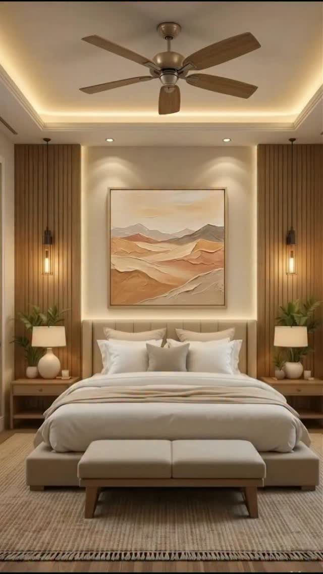
Vertical slats with recessed lighting behind them turn a headboard wall into a fixture you notice even with eyes closed. The glow at the seams is the point; without the cove, you have expensive texture and no atmosphere.
Pine slats spaced 1/2 inch apart, painted or stained, mount on furring strips that create the cavity for LED tape. The light source stays invisible, which means planning before the first slat goes up.
This is a weekend project that stretches to two if you prime between coats. It suits bedrooms and media rooms where you want low light without lamps.
The downside: dust collects on every vertical edge, and the channels need vacuuming with a brush attachment.

NATURAL MOSS WALL ART: Made with real preserved reindeer moss in a handcrafted wood frame, bringing fresh, natural greenery into your space.

Premium Moss Planting - Pre-filled with natural blond sphagnum moss, this living frame eliminates soil while retaining moisture, nutrients, and air. Ideal for succulents, orchids, and indoor planters, the moss supports healthy growth. Perfect for living room wall decor, farmhouse kitchen accents, and boho bathroom wall art.

Bring the Serenity of Nature Indoors: Each piece of wall art features a handcrafted wooden frame and filled with lush, green preserved moss. Bring a touch of greenery to your home and enjoy the beauty of nature year-round
6. Symmetrical Wall Decor
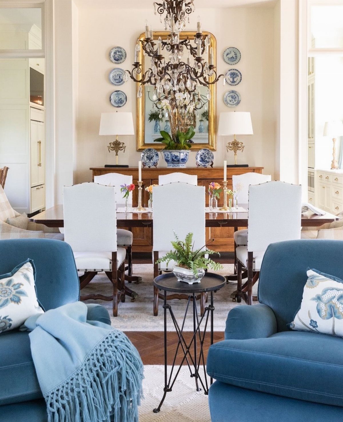
Symmetry calms a room because the eye completes the pattern once and stops searching. Center a mirror, then repeat plates left and right in identical arcs; match the lamps too and the whole wall locks into place.
The result feels formal, which is why it works in dining rooms where you want pause before conversation.
To do it yourself, start with the centerline of the wall, not the furniture. Measure twice, hang once, and use a laser level for the mirror; everything else keys off that anchor.
The plates need plate hangers, not sticky discs, since the weight is real and the arrangement is permanent.
This suits people who own their home and their taste, since asymmetry is easier to adjust later. The cost is time more than money: finding pairs, waiting for the right second lamp, accepting that one plate will arrive chipped.
For renters or the restless, a single large piece and a plant to one side is the more honest choice.

Versatile Sizes for Display: Vittanly 15-Pack Multi-Size Picture Frame Set includes 3x 8x10", 6x 5x7", and 6x 4x6" frames. Ideal for showcasing family photos, artwork in living rooms, bedrooms, and offices

CLEAR ACRYLIC & SOLID BUILD: Crafted from engineered wood that is lightweight yet sturdy for effortless handling. It features a clear acrylic cover instead of traditional glass, offering a safe, crystal-clear view of your cherished memories. Each frame measures 12.86 x 12.86 x 0.47 inches and weighs just 13.1 oz, while the 9-piece set has a net weight of 7.4 lbs. This thoughtful design significantly reduces weight pressure on your wall, allowing for easy and secure hanging

Durable Material: YESKAY 11x14 picture frames made of MDF wood, stable structure, premium texture, and well-made quality. The HD plexiglass front also protects your treasured photos from damage and keeps them in good shape for years.
7. Oversized Art Piece
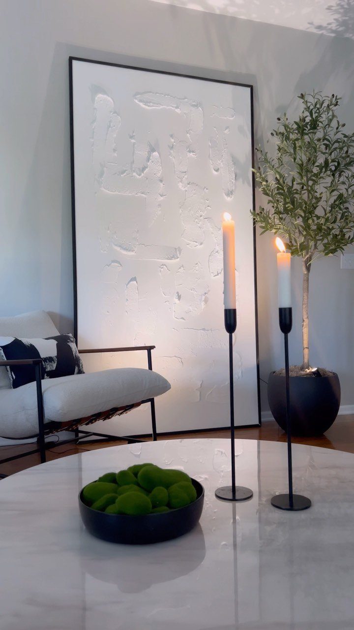
A single oversized piece does the work of a whole gallery without the measuring. Leaning the canvas against the wall skips the drill entirely; shift it when the afternoon sun moves.
Size up one step from what feels safe. Art that is too small looks hesitant; a piece that reaches toward the edges of the furniture below it reads intentional.
For renters, leaning avoids patchwork later. For owners, the same piece hung at proper height anchors the room permanently.

【Effortless Wireless Setup】Brightown battery operated wall sconces set of two come with 2 E26 USB rechargeable LED bulbs and 2 detachable magnetic bases. Completely wire-free and outlet-independent, they can be fully installed in just 20 minutes. Boasting a sleek modern look, this sconces wall decor set of 2 effortlessly upgrades your indoor wall decor and living space ambiance.
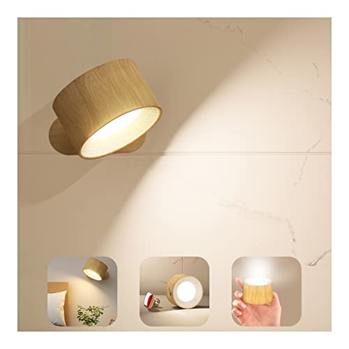
【Touch Control 3 Brightness Levels & 3 Color Temperature & ON/OFF】Dimmable wall lights Lightly touch button to adjust between low, medium and high 3 brightness and ON/OFF. Long press to adjust the 3 color temperature : 2700K(Warm White), 4000k(Natural White), 5700k(White Light).You can DIY the brightness and color temperature. Cordless LED wall sconces will help you remember the last mode and brightness that you used for more convenient to next time.

Versatile lighting: Ideal for bathrooms, bedrooms, hallways, or entryways with a classic satin nickel finish that blends easily with many styles
8. Embrace Asymmetry
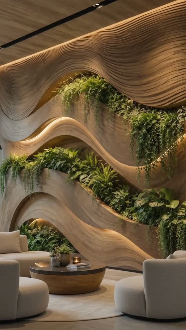
Symmetry is the safe default, but an off-center placement wakes up a room that feels too arranged. The curves run left to right, and the plants fill the recesses that happen to be there, not slots a grid assigned.
Start with the sofa or chair below. A smaller piece set slightly left or right of center, paired with paneling or a strong color on the wall, reads as considered rather than accidental.
A piece placed timidly off-center looks like a mistake; one placed decisively looks like a choice.
Check what sits opposite. A window, a door, or nothing at all changes whether the asymmetry balances the room or simply claims one wall.

Black 16x9.2 inch Oval Mirror: Black PVC Plastic frame of wall mirror, simple and modern design, high-definition imaging without distortion, suitable for any room, bathroom, bedroom, living room, hallway, entrance, etc.

Modern & Stylish Oval Design: Combining a unique oval shape with a modern stylish look, this oval bathroom mirror easily refreshes your space. Perfect for entryway, bathroom, bedroom, and living room—making your space creative and unique.

Soft Classic Silhouette: The smooth oval outline balances straight cabinetry, consoles and dressers, while the continuous 3/4-inch polished bevel creates subtle glass-edge depth without a visible frame.
9. Rattan Wall Decor
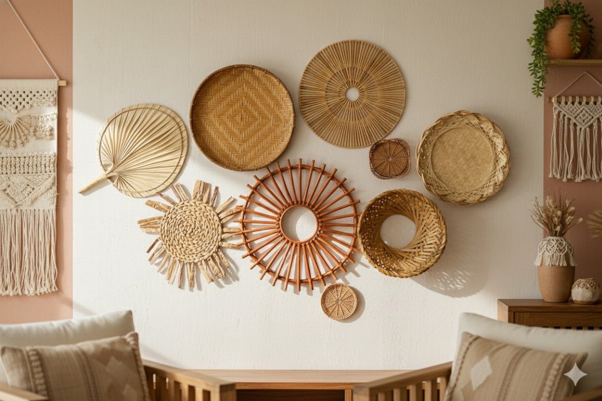
Woven pieces add warmth that painted walls and metal frames cannot match. The cluster above the bench mixes rattan, straw, and macrame in varying weaves and scales, all of it organic against the plain white behind it.
Plaster, raw wood, and rattan are surfacing heavily for 2026 interiors. They forgive scuffs and soften rooms that trend too graphic or too sleek.
The quick move is pairing smooth with rough: a glass lamp near a rattan fan, a stone tabletop below a woven hanging, so the textures argue a little.
This suits renters who cannot paint and owners who want change without construction. The pieces are light, hung on simple nails, and rearranged in an afternoon.

【Premium Basket】The boho wall basket decor is mainly knitted by bulrush, which is light but strong, boast excellent moisture resistance. With premium workmanship, each rustic basket not only has a high quality, but also has a distinct touch and rustic charm. The enjoyment and aesthetic is endless when you decorate your space with these woven wall baskets.

Package Includes: you will receive 7 pieces of Bohemian style basket wall decor set, with 7 different styles, which are exquisite and beautiful; Sufficient quantities can meet your decoration and replacement needs, and you can also share them with your family or neighbors

𝐔𝐍𝐘𝐈𝐄𝐋𝐃𝐈𝐍𝐆 𝐂𝐑𝐀𝐅𝐓𝐒𝐌𝐀𝐍𝐒𝐇𝐈𝐏 & 𝐃𝐔𝐑𝐀𝐁𝐈𝐋𝐈𝐓𝐘: Handwoven by skilled Vietnamese artisans, these wall plates feature carefully processed jute fibers tightly knitted around ultra-sturdy metal frames. They will not warp, bend, or lose shape due to humidity or environmental changes, and they won't sag or fall off the wall, ensuring a flawless, lifelong display.
10. Gallery Wall
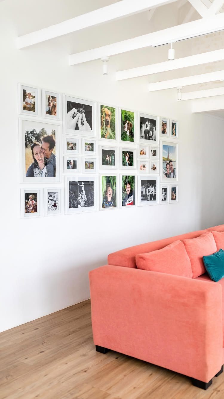
3 meters of wall, every gap identical, hook placements marked with a soft 6B pencil just under the hardware on each frame back.
The discipline is the point. Eclectic gallery walls work when the frames share one element, color, or finish; symmetrical ones work when the spacing is machine-precise.
For this reader, with a weekend and a level, the grid is the surer bet.
Measure the wall, subtract the total frame width, divide by the number of gaps. That number, not your eye, governs where the first nail goes.

Wall Art for Living Room & More – Add a touch of nature-inspired elegance to your living room, bedroom, bathroom, or office with this stunning real moss wall decor.
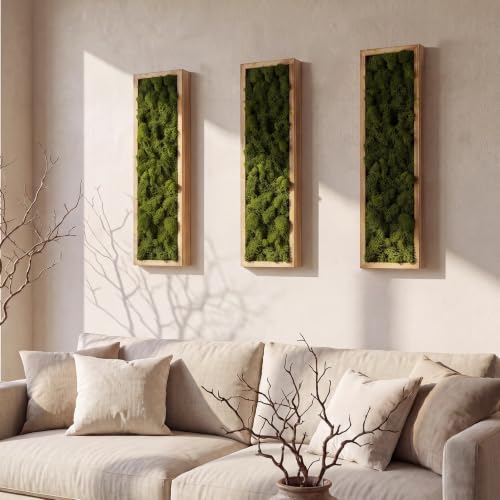
Set of 3 Vertical Panels: each set includes 3 wooden moss wall art (each measures 16.5"H x 4.7"W x 1.6"D); The vertical design is ideal for narrow spaces, hallways, or as a vertical accent next to a window; SIZE NOTE: please check the dimensions carefully before purchasing to ensure it fits your space perfectly

【Realistic 83" Artificial Vines with 72 Leaves】:Create instant jungle vibes with 12 premium faux vines! Each 83-inch vine features 72 vibrant silk leaves - perfect for jungle vines decor. Non-toxic, no watering needed, easy to clean. Ideal as wall vines for bedroom or ceiling decorations.
11. Hanging Round Baskets
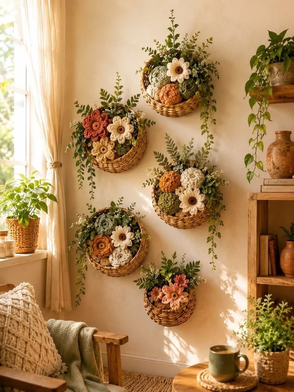
Round shapes interrupt the rectangles of doors, windows, and furniture. The baskets hang empty or filled with crochet flowers and cut greenery, their circular rims repeating at different scales across the cream wall.
One oversized woven piece can carry a whole wall alone. Several smaller ones cluster best in odd numbers, the largest offset from center so the grouping feels gathered over time rather than installed at once.
The maker filled hers with artificial stems; fresh would need water and rot the weave.
Renters gain here: baskets weigh little, hang on a single nail each, and leave pinpricks that vanish under a dab of spackle. The round form is the decoration; what sits inside is seasonal and cheap to change.
12. Bold Accent Wall
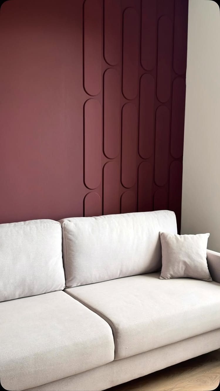
The 3D relief catches light across the day, so the color shifts from wine to near-black depending on the hour.
Paint is the budget path; removable wallpaper with texture printed on it costs more but travels when you do. The moulding here is architectural and permanent, suited to owners.
Renters can fake the depth with peel-and-stick panels that read similarly in photographs and satisfy until move-out day.
Dark walls need more light sources than pale ones. Plan for a floor lamp or sconce you would not bother with against white.
The trade is atmosphere for brightness; this suits north-facing rooms that never felt airy anyway.
13. Three-Dimensional Objects
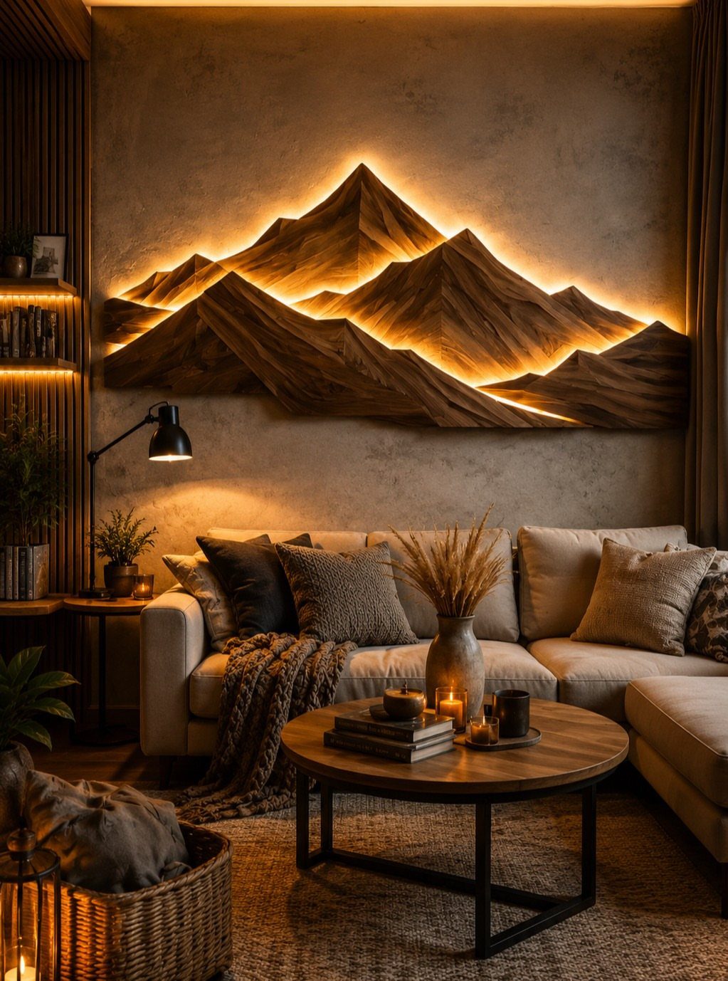
A 3D mountain sculpture turns a flat wall into something you walk toward.
A weekend budget goes further with vintage plates from estate sales, woven baskets collected trip by trip, or a single backlit wood piece that casts its own shadow.
Depth matters most; light hits each surface differently as you move through the room.
Group objects with some space between them so each shadow reads. I like plates for a kitchen or hallway where the shape echoes dishes you already own.
Baskets suit a softer space, a bedroom or reading corner. One large sculptural piece wins in a small room where a cluster would read as clutter.
14. Peel-and-Stick Brick Wall
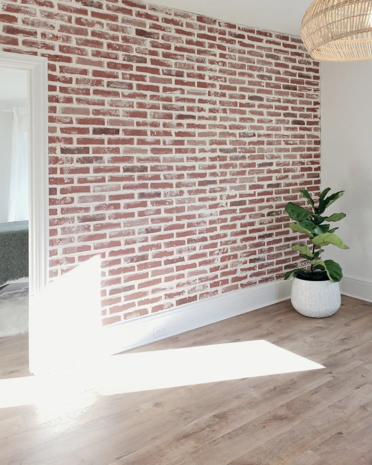
Peel-and-stick brick paper gives the exposed look without the landlord call or the masonry bill. Peel-and-stick brick reads real under daylight, and the white mortar line keeps it from going cave-dark in a small space.
Clean the wall first, any dust or oil left behind will bubble the adhesive within a month.
Start from a corner and work across, using a level to keep courses straight; the eye catches a slanted brick faster than a crooked picture frame.
Prices vary by brand and coverage, so measure twice and buy from the same dye lot.
This suits renters who want texture they can strip at move-out, or owners who need to test a look before committing to the real thing.
15. Picture Ledge
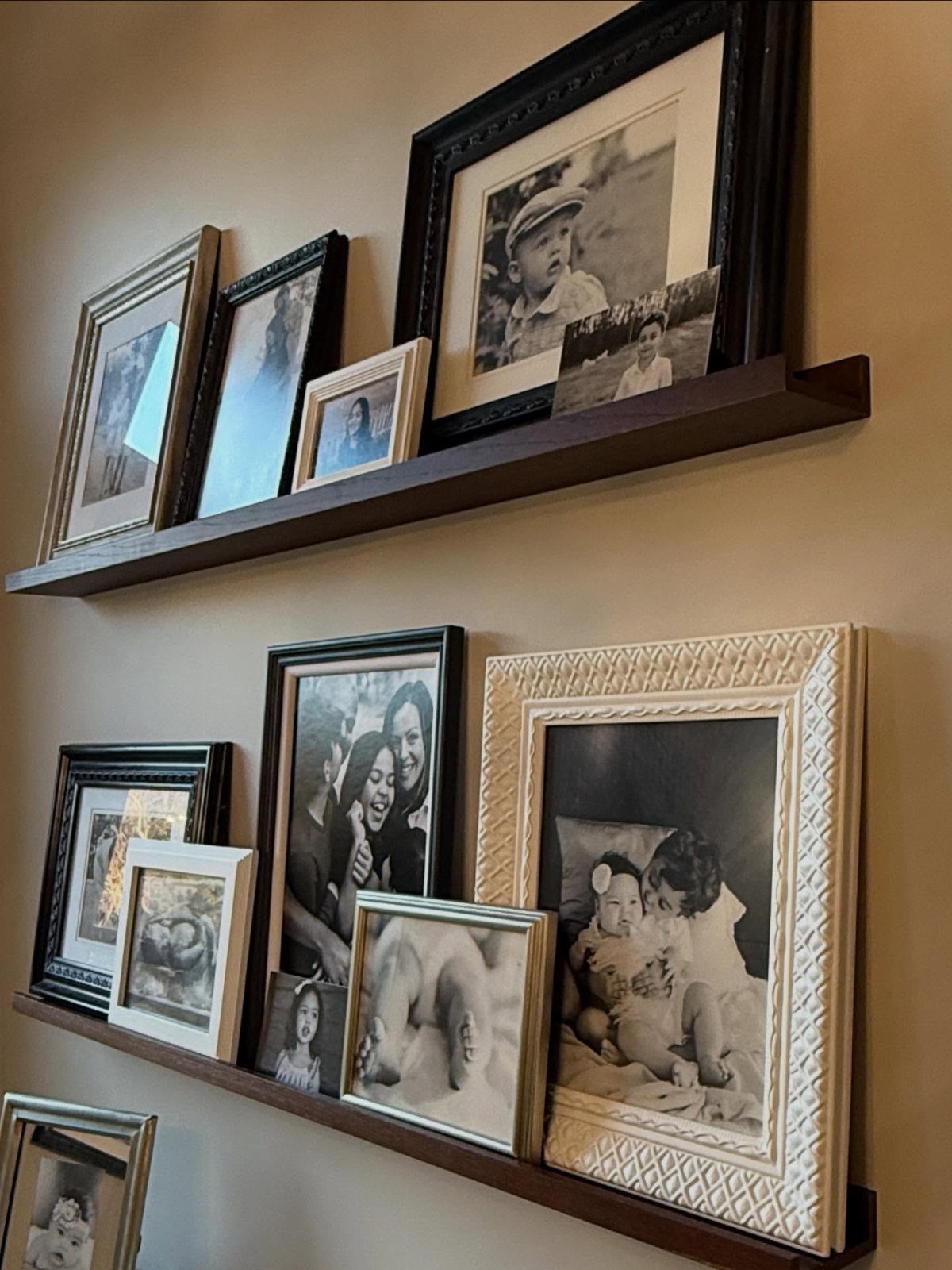
A picture ledge lets you swap prints without fresh nail holes, which matters when your taste shifts often or your phone holds more photos than you keep meaning to print.
Standard ledges come in several lengths; check the weight rating before loading frames. Vertical spacing matters more than exact inches; leave enough breathing room that the grouping reads as intentional, not squeezed.
Lean rather than hang, and add a small dot of museum putty behind each frame if you have kids or a curious cat.
16. Picture Light
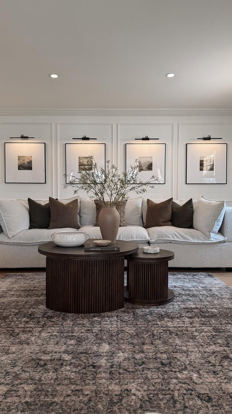
A picture light turns a print into a destination. The four black fixtures above the white paneling each cost less than a decent frame and draw the eye the way overhead room light never will.
Wired-in models look cleaner but battery-operated LED bars install fast with a screwdriver, no electrician. Mount the light above the frame top, angled to wash the surface without glare.
Warm tone suits black-and-white photography; cooler light works for color prints or watercolors.
I would skip this in a bright south-facing room where sunlight does the work half the day. For a dim hallway or a wall that faces away from windows, the fixture earns its place.
17. Wall-to-Wall Drapery
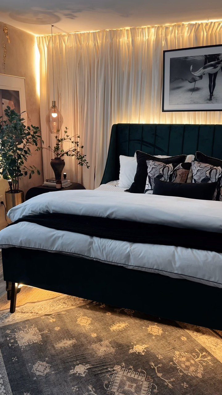
Floor-to-ceiling drapery turns a blank wall into a soft backdrop, and white panels prove it does not need a window to work. The hidden light above the rod does the heavy lifting, making fabric glow like a lantern shade.
Mount the rod below ceiling height and extend it past the bed width on each side; this fools the eye into reading a wider room. Fabric choice drives cost more than hardware; shop remnant bins and online closeouts.
Best for a bedroom where you want calm over clutter, or any room with one strong wall color that needs softening.
18. Design a Memento Moment
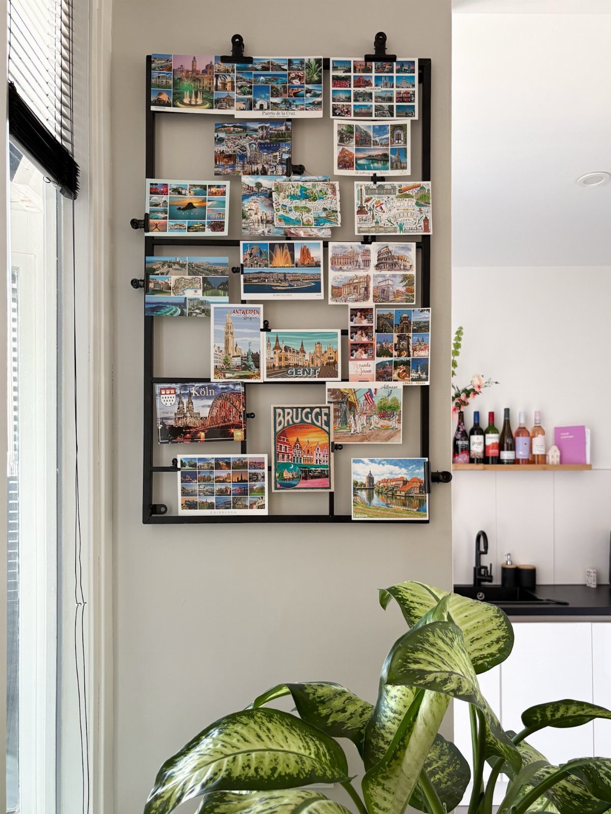
Postcards overlap like a conversation, which is the point: this is memory, not museum display.
Any grid works, from wire bakery racks to purpose-built photo mesh. Clip with small black binder clips or wooden clothespins, and vary the card sizes so the eye travels.
I add a new card after each trip and retire one if the grid gets crowded, which keeps the wall alive rather than frozen at one vacation.
This suits the person who collects ticket stubs, maps, or pressed flowers and never knows what to do with them.
Visual busyness adds up fast; in a room already full of pattern, keep the grid small or move it to a hallway.
19. Modern TV Feature Wall
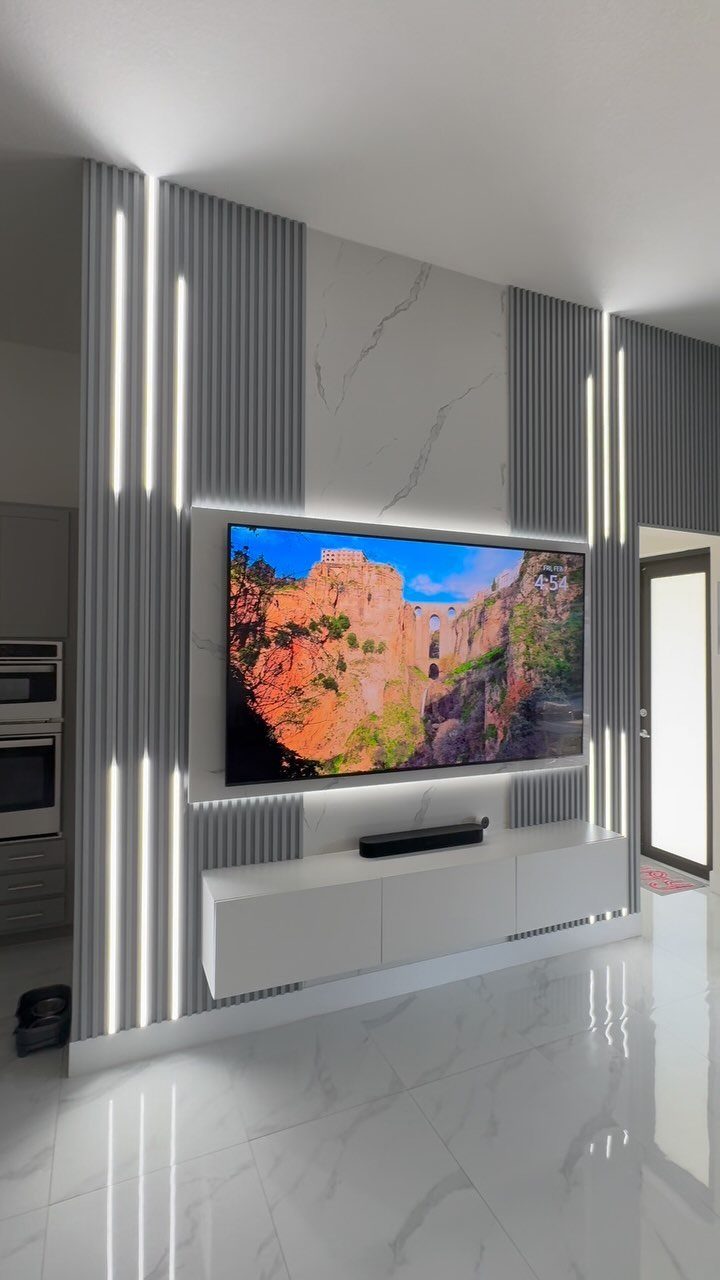
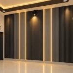
Vertical fluted panels give a TV wall the rhythm that flat drywall never manages, and the LED strips tucked between them do the actual work of making the screen feel intentional rather than apologetic.
The marble-look backing behind the set is the visual anchor; the floating console below it keeps floor space open, which matters in apartments where every square foot counts.
I would run the math twice on that console depth; minimal looks great until you try to fit a gaming console or a cable box.
Slat panels, a laminate sheet, and a prefab float unit bolted to studs read luxury without the custom price.
The hidden cost is the electrical: plan for an outlet behind the TV and another inside the console, or you will stare at cords forever.
Best for renters willing to patch anchor holes on move-out, not for anyone in a month-to-month situation.
20. Textured Stone Accent Wall
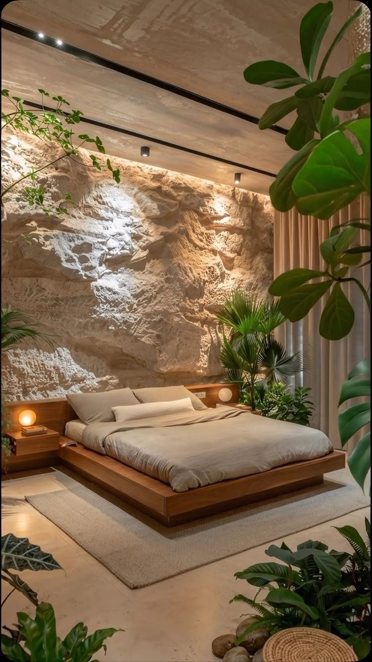
Rough stone against a low platform bed turns a bedroom into something that feels excavated rather than decorated, and the warm overhead wash matters more than the stone itself; without it you are sleeping against a cave wall, with it you get texture that shifts from dawn to dusk.
The weight is the real constraint: veneer panels run light per square foot, full stone runs heavy, and that difference decides whether your wall needs structural reinforcement or just a few extra screws.
I have seen veneer fail at the edges where the pattern repeats, so order extra over your square footage and sort the slabs at delivery, mixing the grain before the installer arrives.
Plants in the room help, the stone wants something soft against it.
Not a weekend project. Budget for a mason if you are holding real stone, or a patient afternoon with a level and a helper if you go veneer.
21. Vertical Tile Feature Wall
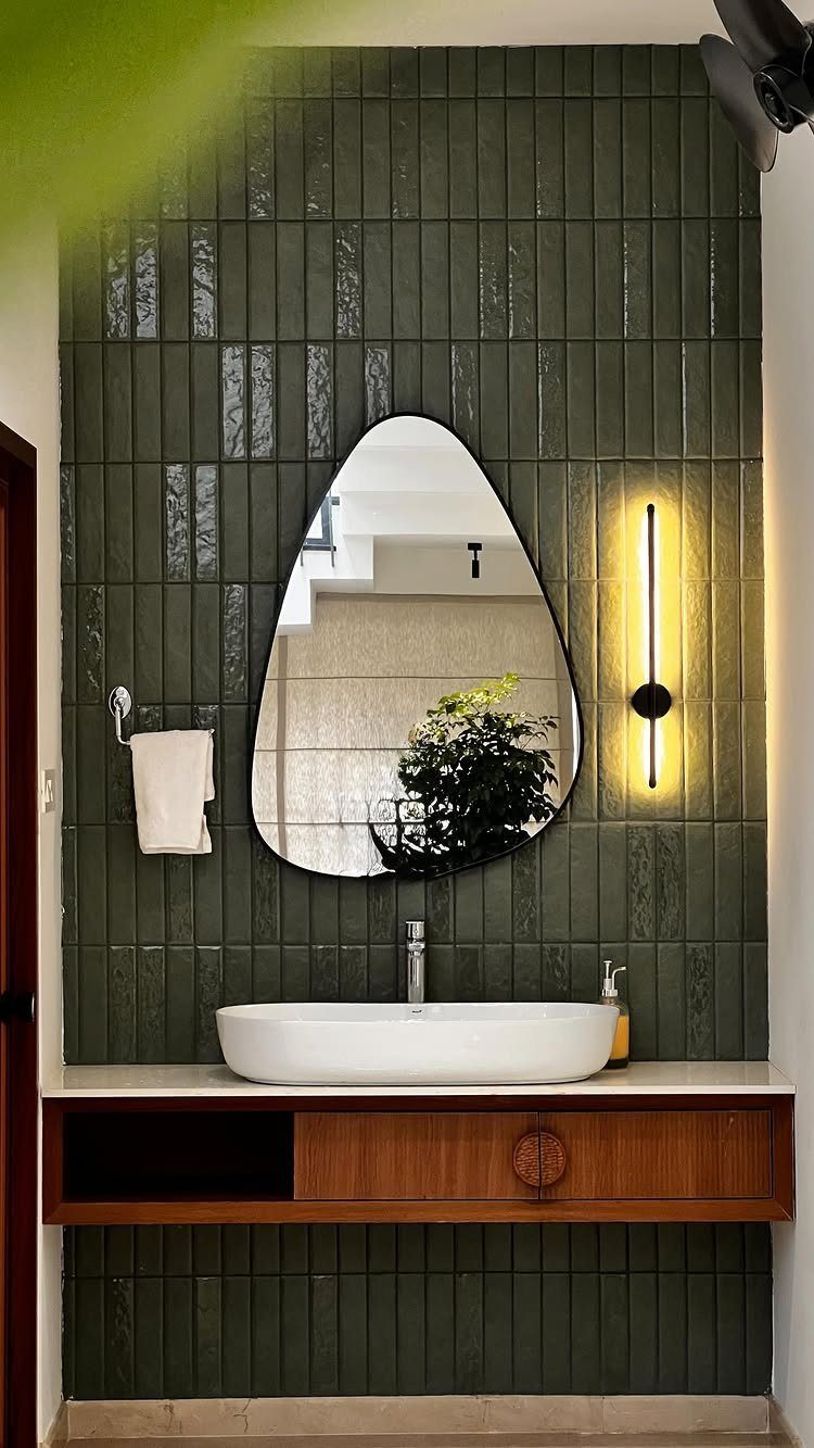
Vertical stacking changes how tile reads; the same dark green rectangles running horizontal would feel like a diner backsplash, turned on end they stretch the ceiling height and catch light differently across each glossy face.
The asymmetry in the mirror and sconce placement is what keeps it from looking like a showroom display; one off-center element saves the whole wall from rigidity.
I would check the grout spec before falling for the tile, narrow joints need unsanded and a steady hand, wider ones forgive more but change the graphic effect.
Cost splits hard here: the tile is often moderate per square foot, the install doubles that if your walls are not plumb.
Small bathrooms benefit most; the vertical lines do the work of making the space feel larger without adding a single inch.
22. Living Moss and Rock Wall
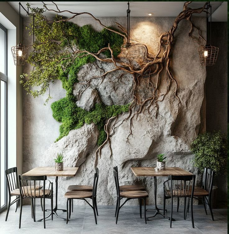
A wall of stone and moss is maintenance theater, the roots and branches do the sculptural work while the moss needs misting, indirect light, and a humidity level most heated apartments fight all winter.
The stone base is real, the moss is often preserved or hybrid systems now, and knowing which you are buying changes whether this is a living thing or a very convincing taxidermy job.
I would ask the supplier directly: living moss walls need irrigation, preserved ones need nothing but dusting and the occasional touch-up where the green fades to khaki.
The cafe look has the advantage of staff and commercial humidity; at home, a preserved installation behind glass or in a bathroom with a shower nearby is the safer bet.
Budget well beyond what stone veneer alone would cost, and accept that the organic look means no two walls will match.
23. Built-In Entertainment Unit Wall
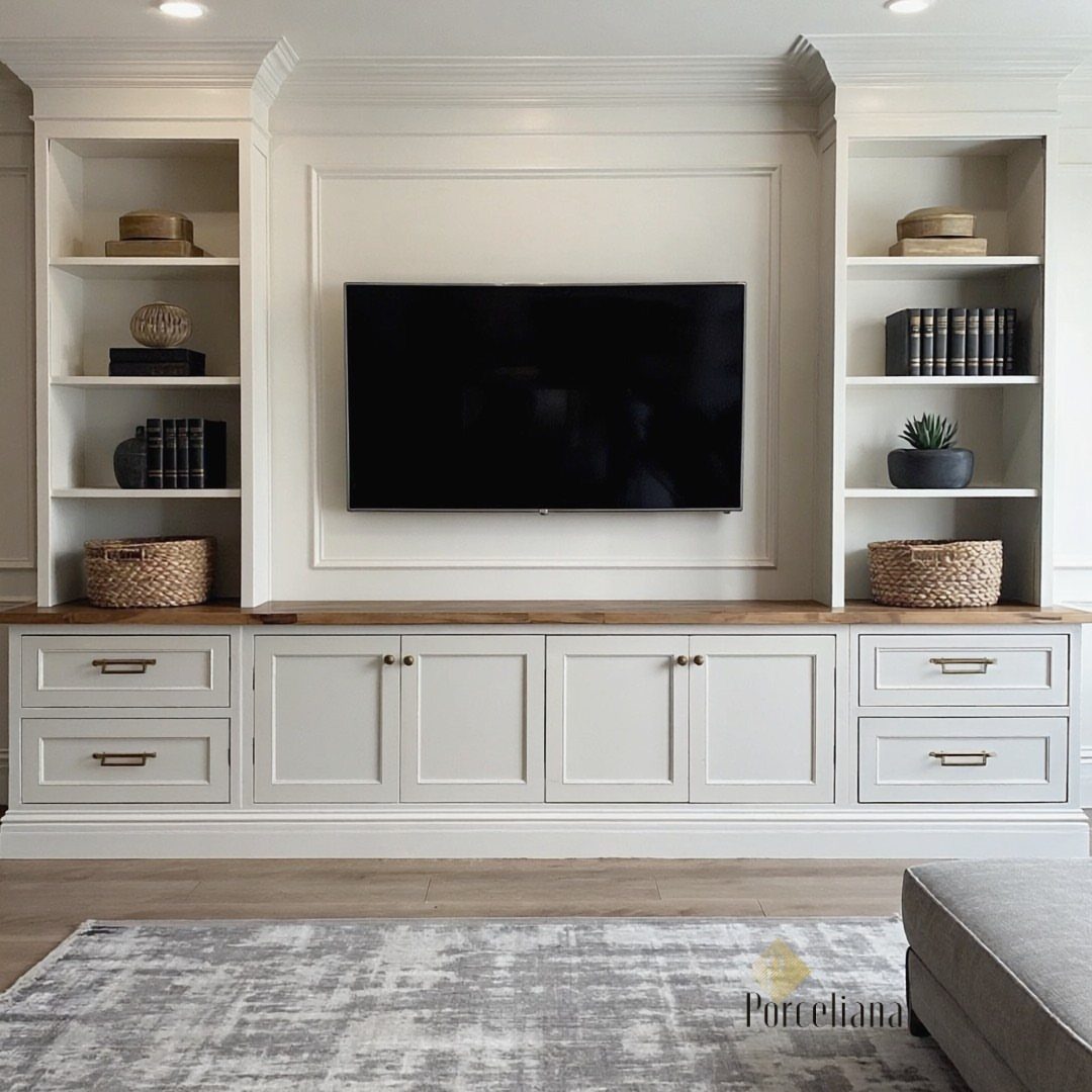
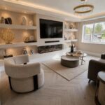
A full-wall built-in turns the television from a black rectangle into one element in a larger composition, and the open shelving flanking it is where personality lives; the closed cabinets below hide the cables, remotes, and the console collection you do not want to display.
The wood countertop running across the lower section breaks up the white paint and gives you a landing spot for a soundbar or a tray of drinks.
I would build the TV cavity larger than your current set on all sides; the next upgrade always comes sooner than planned, and reframing is not a Sunday task.
The real decision is the door style: slab fronts read modern, shaker reads transitional, and mixing them on the same unit looks like a catalog mistake.
Renters should skip this entirely. For first-home owners, this is the project that justifies buying a proper miter saw and learning to scribe trim against old plaster.
Layering Textures and Materials
Flat walls forgive everything; textured walls stick in memory. Matte frames next to glossy accents, linen against metal, that contrast keeps a wall moving without turning loud.
A fluted wall treatment built with joint compound catches light across vertical lines and pulls the eye upward, which reads as height where there was none. The work is slow, but the effect is architectural.
Photo tiles that lift off the wall add another moveable layer. Framed art hung beside them lets you shift the arrangement without fresh holes.
The contrast between smooth and ridged, soft and hard, does more than either alone.
Importance of Scale
A grand wall swallows small art and makes it look misplaced. Go one size larger than instinct suggests; hesitation reads as apology.
In a bedroom, a mix of dimensions in the same media keeps the wall from feeling catalog-ordered. The shifts in scale add interest without structure.
For tighter walls, the same rule applies in reverse: one piece that fits with breathing room on each side beats a crowded cluster.
Personalization in Decor
Themed collections gain force when grouped. Sailboat paintings scattered through rooms stay decoration; hung as a set they become a story.
Inherited pieces, travel photographs, or a single medium pursued over years all work the same way.
For bedrooms, restful subjects matter more than statement: landscapes, soft abstracts, your own photographs printed large. Fabric panels behind floating frames soften the edge where art meets wall.
A wall should say whose room it is, not read like a gallery picked it out.
Using Lighting Effectively
Picture lights above frames turn prints into destinations; sconces graze texture and make it visible after dark. Both need dimmers.
Full brightness flattens everything; low light lets the wall recede or step forward as the evening changes.
Wall lighting also frames artwork the way punctuation steers a sentence. The fixture itself is part of the composition, not merely functional.
In rooms that face away from daylight or sit on the north side of a building, artificial light does the work the sun won’t. Plan for it from the start, not as correction after the art is hung.
Frequently Asked Questions
What are the current wall decor trends?
Texture, mixed media, and modular layouts are what I am seeing for 2026.
Plaster finishes, raw wood grain, and rattan weaves are showing up in more rooms lately, and the sterile look is giving way to walls that look like someone actually lives there.
The fastest way in is to put a smooth surface next to a rough one and let them fight it out a little.
What is the rule of wall decor?
Hang art at eye level, measured from floor to center of the piece. A mirror over a console table needs to match the furniture scale underneath, not stretch to match the wall.
The centerline of the wall matters more than the furniture when you are building symmetrical arrangements.