Laundry room floors run from standard subway tile arranged herringbone to solid cement that needs a subfloor rated for its weight. The right choice depends on whether your space is a basement workhorse or a pass-through guests actually see.
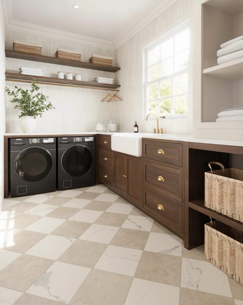
Porcelain that mimics limestone skips the sealing but keeps the look, while a narrow board and batten ledge somewhere else in the house shows how height decisions can guide an entire room.
[link-whisper-related-posts]1. Ceramic and Porcelain Floor Tiles
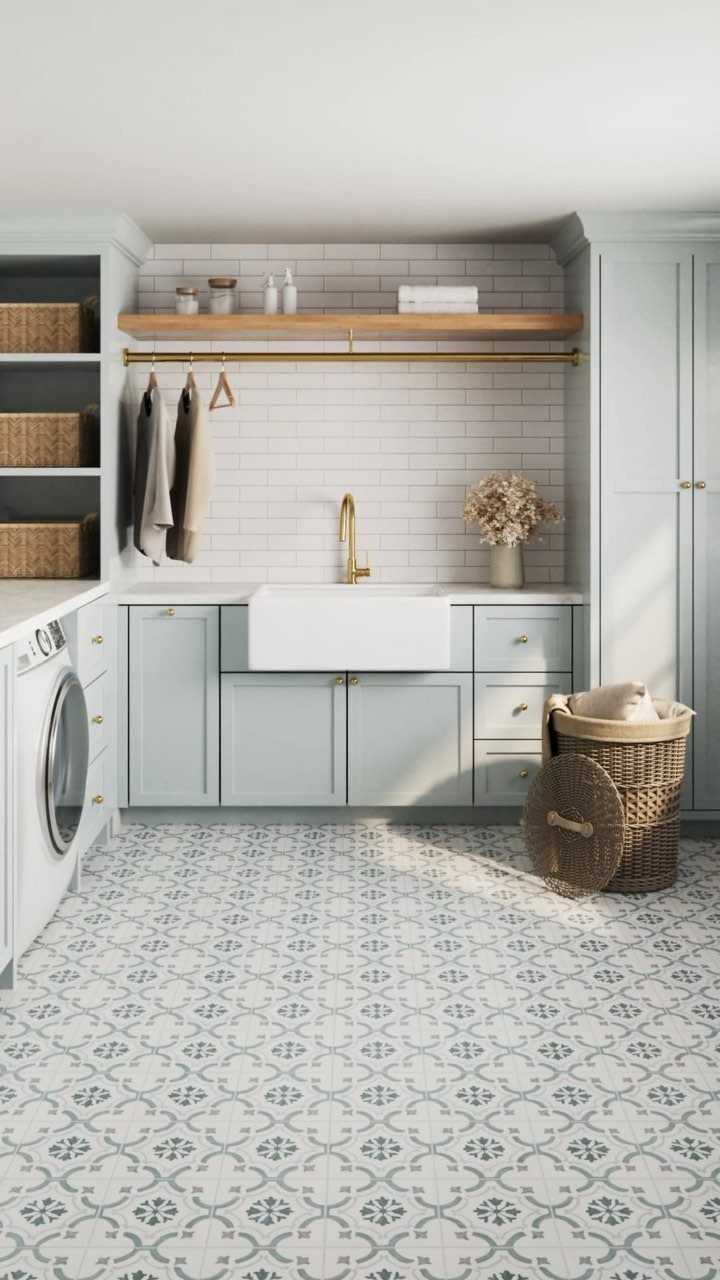
A water-resistant glaze makes ceramic and porcelain the default choice for laundry rooms that see real use. I have watched these tiles shrug off bleach splashes and muddy shoes without needing anything beyond a damp mop.
Ceramic and porcelain come in enough range to match whatever mood the room needs: a blue and white floral if you want pattern, or something plain that lets the cabinets do the talking.
Porcelain costs more but absorbs less water, so it handles freeze-thaw if your laundry sits in an unheated mudroom. Either material needs grout sealed once a year.
Skip the tiny mosaic sheets unless you enjoy scrubbing; larger formats mean fewer seams to collect lint.
2. Cement Tiles
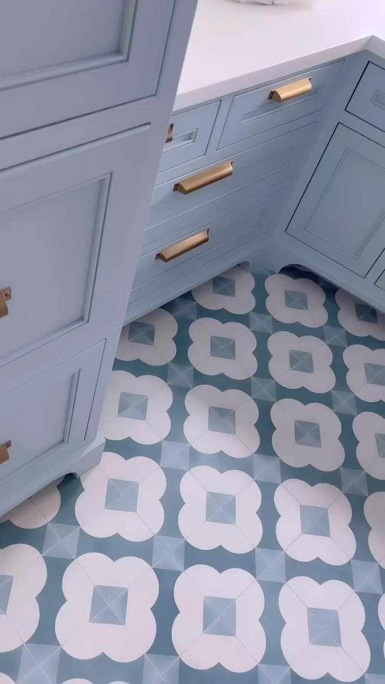
Color this saturated usually comes with a warning label, but cement tiles earn it through sheer mass. Each one is a solid chunk of pigmented concrete, so the pattern runs deep enough to survive decades of foot traffic.
That heft is also the catch: they need a subfloor that can handle the weight, and installation is not a first-timer’s project.
The reward is a floor that looks like it belongs in a Copenhagen townhouse rather than a suburban utility room.
I would only commit to cement if the rest of the house can handle the visual weight; in a cramped galley laundry, the pattern fights the walls.

Retro Tiles: Retro Floor Tiles give you the expensive hand-painted look without the cost or installation mess. These beautifully designed tiles recreate fresh and inviting patterns that will look stunning in any room. No messy glue or adhesives needed.
3. Black and White Tile Laundry Room
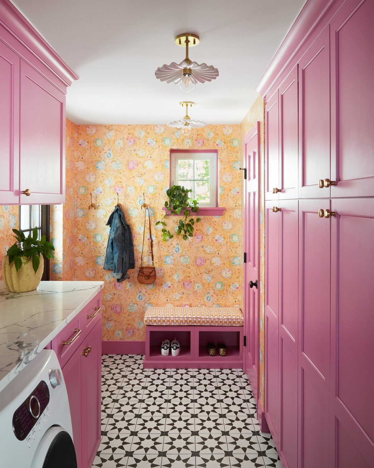
The pairing survives every trend cycle because it forces you to decide what matters. A diamond pattern in penny rounds reads vintage; large checkerboard squares read modern.
Busy geometry works when it has something to push against; pink cabinets this bold would overwhelm anything subtler underneath.
Black and white grout choices matter more here than with other palettes: white grout brightens the pattern but shows every speck of lint, while dark grout hides dirt but can look like a grid of thin black lines.
I would match the grout decision to how often I sweep. High-traffic households with shedding pets should probably go dark.
4. Hexagon Tiles
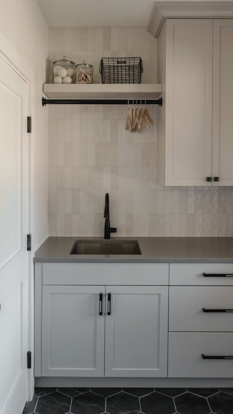
Geometric shapes read contemporary because they break the tyranny of the grid. Black hexagons set with light grout throw a honeycomb shadow that flat rectangles cannot replicate.
Scale is the decision that matters: smaller hexagons mean more grout lines and more scrubbing, while large-format ones approach the visual calm of plain tile.
A narrow laundry closet chokes on tiny hexes, but a spacious mudroom can handle the drama of larger ones.
Dark colors show water spots and dust less than light, which is worth remembering in a room where spills are the point.
5. Dark Gray Rectangular Tiles
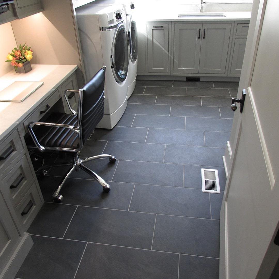
A rectangular format in charcoal reads more office than utility, which is useful if your laundry room doubles as a desk nook or command center. Long planks run the length of the room, a visual trick that stretches narrow spaces.
Dark gray forgives the grime that lighter floors broadcast; I have seen it hide everything from spilled detergent to tracked-in driveway grit. Dark gray shows lint and pet hair, so keep a broom handy or invest in a robot vacuum.
Pair it with white appliances for contrast, or commit to gray-on-gray for a space that feels designed rather than assembled.
6. Blue and White Patterned Tile
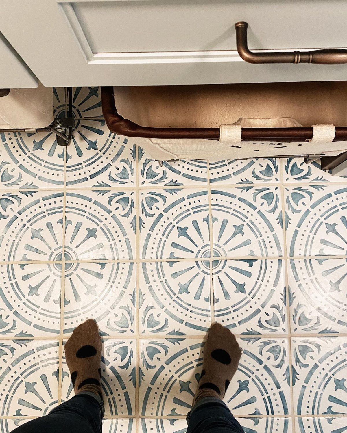
Pattern this specific turns the floor into the room’s personality, which means everything else must quiet down. White cabinets, simple hardware, no competing wallpaper: that is the approach that lets patterned tile hold the floor without a fight.
Hand-painted ceramic with a blue floral motif exists for walls and backsplashes, where glaze slipperiness does not matter; for floors, stick to machine-pressed or porcelain versions that keep their grip when wet.
I would use this in a laundry room that guests pass through, where the floor gets to be the conversation. In a basement workhorse space, the pattern wastes its charm on no one but the spiders.
7. Geometric Quatrefoil Floor Tile
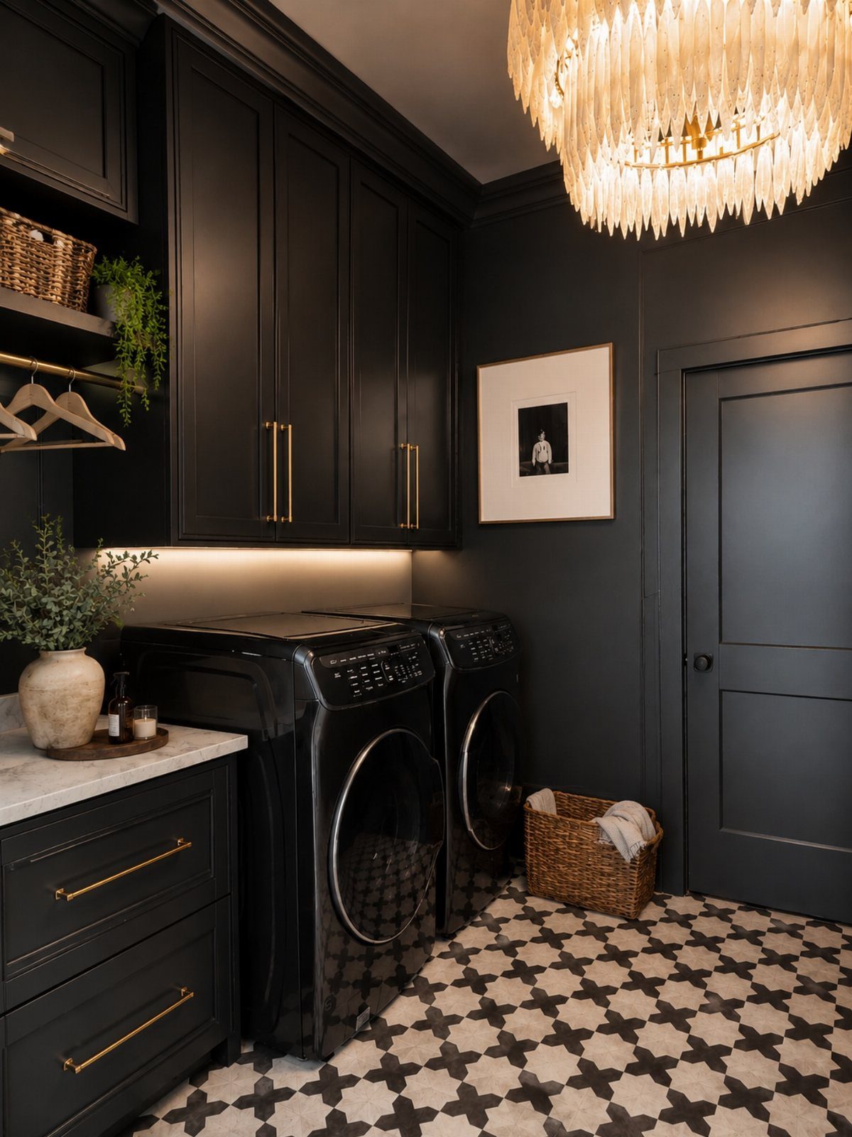
A quatrefoil pattern reads as a cross at first glance, then resolves into overlapping circles once you look longer.
That second look is what makes it work in a laundry room, where you want something that holds up to daily traffic without announcing itself every single trip.
The high-contrast black and white version pairs naturally with dark cabinetry, though the same pattern in softer greys would open up lighter spaces.
Porcelain or ceramic bodies carry the pattern best; cement versions exist but need sealing against bleach splashes and detergent drips. My preference runs to matte finishes here, since gloss can make busy geometry feel slippery and insubstantial.
This is a pattern that commits. It suits someone building the room around the floor rather than fitting tile into an existing scheme.
8. Floral Pattern Floor Tiles
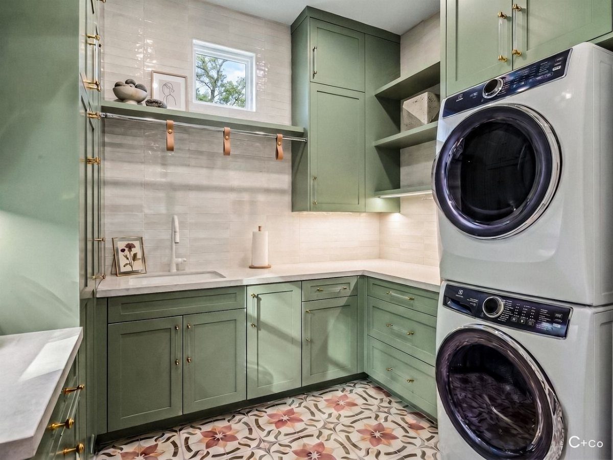
Warm terracotta and cream florals against sage cabinetry pull a laundry room toward cottage garden territory without ever quite reaching kitsch.
Scale matters with these motifs: large enough to read as pattern from the doorway, not as individual flowers you study up close.
Painted ceramic carries the design most accessibly, and the glazed surface wipes clean after bleach oopses or muddy shoe deposits. The same motif comes in blues and greens if your cabinets run a different direction.
I would watch out for small repeating florals that turn busy in a narrow room; the star-like structure here keeps the eye moving rather than trapped.
Best for someone who wants their utility space to feel considered, not merely functional.

DESIGNER COLLABORATION - CHRIS LOVES JULIA - A Grey and White Marble colorway; highlights the Bonneville design; with recognizable Chris Loves Julia collection details.
9. Herringbone Floor Tile
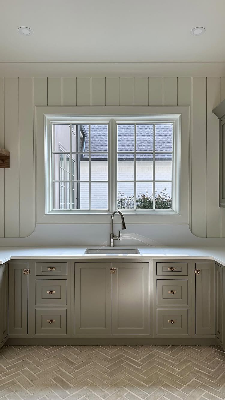
Herringbone reads as effortful because it is, but the effort lands in layout, not in material cost. Standard rectangular subway tiles or bricks, usually the cheapest shape on the shelf, achieve it with nothing fancier than a turn at installation.
A light color matters as much as the pattern for keeping the room open.
Dark herringbone tightens a small room; pale greys and warm whites bounce window light around and let the geometry do the visual work without closing walls in.
Grout choice becomes the quiet decision here: matching tone hides the grid for a smoother field, contrasting emphasizes the weave.
I would not attempt this pattern as a first tile job. The cuts multiply fast, and a wavering centerline ruins the effect more obviously than with straight lay.
Budget for a day or two extra, or for someone who has done it before.
10. Neutral Stone Look Tiles
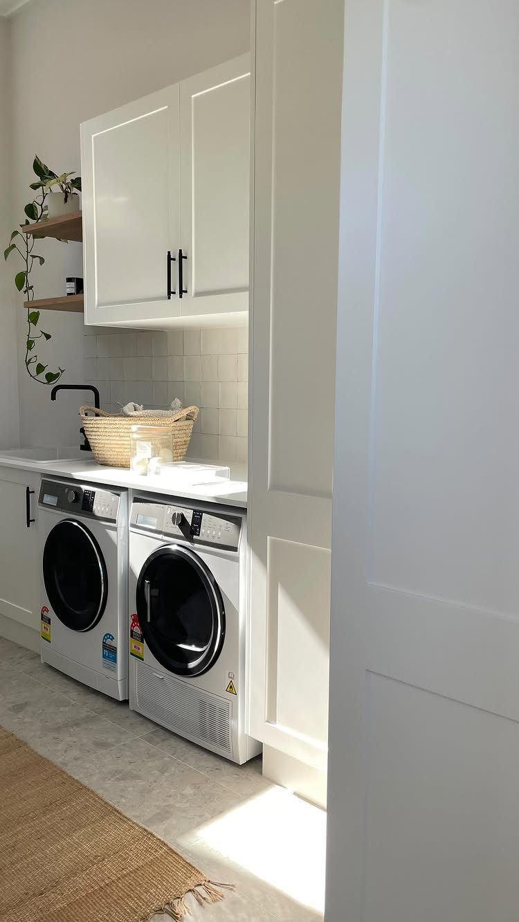
Stone-look porcelain gives the warmth of limestone or slate without the sealing, staining, or cold-to-the-foot mornings.
Large format tiles mean fewer grout lines to trap dryer lint and detergent dust, and the jute runner on top adds texture you can lift and shake out.
This is the practical choice masquerading as the safe one. It coordinates with white cabinetry without demanding it; the same tile would settle equally under wood tones or painted blues.
Vinyl alternatives exist at lower cost and softer step, though they lack porcelain’s long indifference to washing machine leaks.
Suits the homeowner who wants their laundry room to whisper rather than speak, and who values vacuuming over mopping.
11. Checkerboard Pattern Tiles
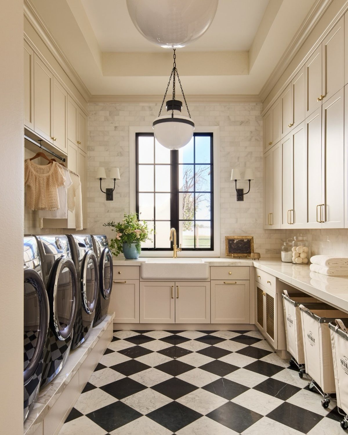
Checkerboard carries immediate nostalgia, which can tip into diner-kitsch or period elegance depending on tile size and surrounding details.
Black and white reads farmhouse because of the sink and cabinetry; the same floor with chrome fixtures and open shelving would shift decades.
Dirt hides well here, especially in the black squares, which matters in a room that sees muddy shoes and spilled detergent.
The pattern also stretches perceived floor space if the room is small, though I would keep tiles large; tiny checkerboard in a tight room feels like a dollhouse.
This is a commitment to a mood. It suits someone who knows their style and builds around it, not the browser still figuring out whether they prefer calm or character.
Tile Installation Tips
A laundry room floor fails at the seams, not the surface. Start with a subfloor that is clean, dry, and level; any flex underneath telegraphs through to cracked grout in a year.
A waterproof membrane across the entire surface buys insurance against the washing machine hose that eventually leaks. Liquid compounds brush into corners and seams where sheets struggle to lie flat.
Porcelain and ceramic bond with standard thinset, but cement tile needs a subfloor rated for its weight. A mudroom over a crawl space may need reinforcement before a single bag of mortar opens.
Skip the temptation to stretch leftover mastic from another project; adhesives rated for wet locations cost marginally more and save the tear-out later.
Choosing Colors and Patterns
Patterned tile does spatial work that plain tile cannot. In a narrow laundry room, the right scale of pattern reads as depth rather than clutter; the wrong scale turns walls inward.
Small rooms tolerate bold geometry better when the tile size stays generous, letting the eye travel without counting grout lines.
Coordinate with adjoining spaces at the threshold, not the center of the room. A floral that fights the kitchen tile three steps away will irritate daily.
Subway tiles in stacked or offset patterns stay quietly versatile; herringbone or checkerboard commit to a mood that cabinetry and hardware must support.
Maintenance and Cleaning
Unglazed materials, natural stone, and cement demand sealing on a schedule you will actually keep; otherwise, the first bleach splash becomes permanent. Matte finishes hide water spots and detergent haze better than gloss, which shows every footprint until it dries.
Radiant floor heating pairs well with porcelain’s thermal conductivity, though verify compatibility before buying. Robot vacuums handle lint and pet hair on large formats; mosaic sheets trap both in grout valleys that require hand scrubbing.
Reseal grout annually in a room that sees daily traffic and occasional floods. The time spent on prevention measures in hours what replacement costs in weekends.
Water Resistance Importance
Porcelain absorbs less water than ceramic; both survive the humid breath of a running dryer and the puddle from a detached hose. Manmade materials handle this better than natural stone, which needs sealing to avoid darkening at every spill.
Non-slip finishes matter in a room where water meets bare feet and tile meets socks.
Wood-look porcelain now exists for homeowners who want warmth without vulnerability; the material conducts like tile but reads like grain underfoot.
Entryway laundry rooms see road salt and mud in addition to detergent, multiplying the case for surfaces that do not stain.
Waterproofing beneath the tile matters as much as the tile itself; a floor can only be as dry as what lies under it.